
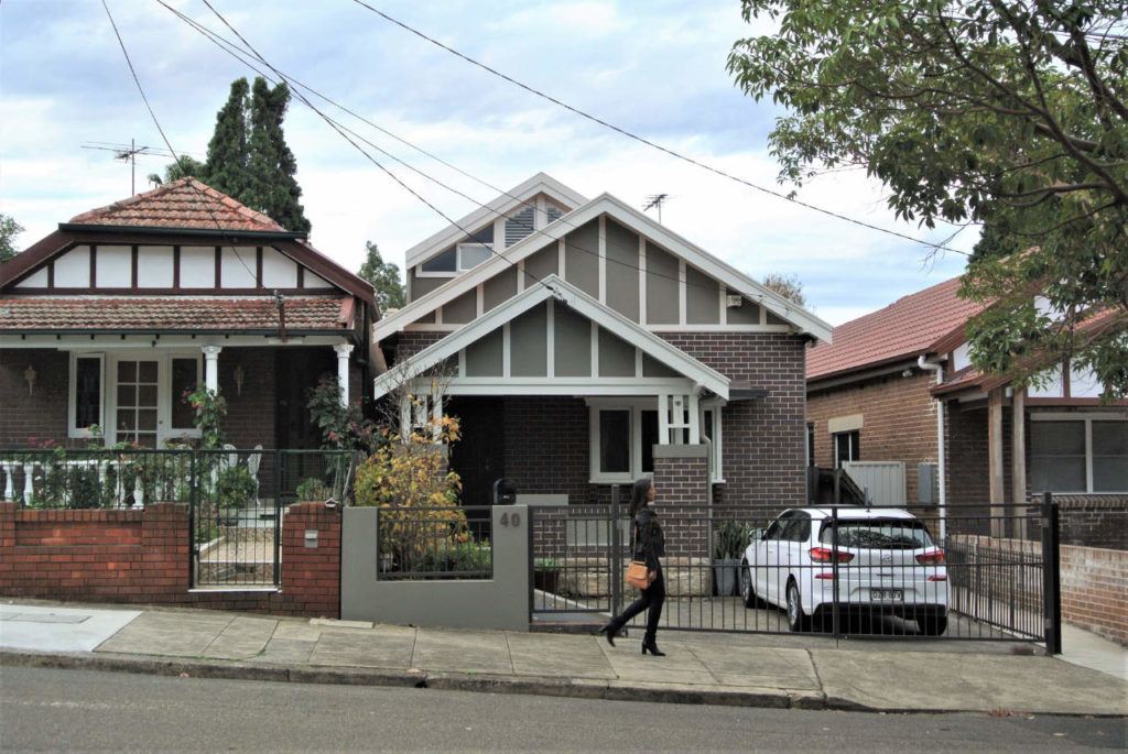
Proving that well-designed home renovations are more cost-effective than moving, the latest home project by Sandbox Studio turns a 2.5-bedroom 1920s bungalow into a light-filled 4-bedroom family home.
A young couple of environmental scientists needed two extra bedrooms and a bathroom for their growing young family. They also wanted to improve connections between the house and the rear courtyard.
The interior was dark and a series of ad-hoc additions over time had resulted in an awkward layout with the laundry marooned at the back of the house, and no clear connection between living space and the small rear garden.
The original building footprint already occupied the allowable site coverage, leaving nowhere to go but ‘up’ for an extension. And the budget was also a consideration.
Being creative on a budget is something that Sandbox Studio architects Luke Carter and Dain McClure-Thomas relish, as it aligns with their ethos of sustainability.
“The idea for this project was to be smart and keep as much of the existing building intact to save money. We kept and refinished the floorboards, and existing internal brick walls were left exposed or repainted,” says Luke Carter.
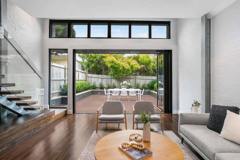
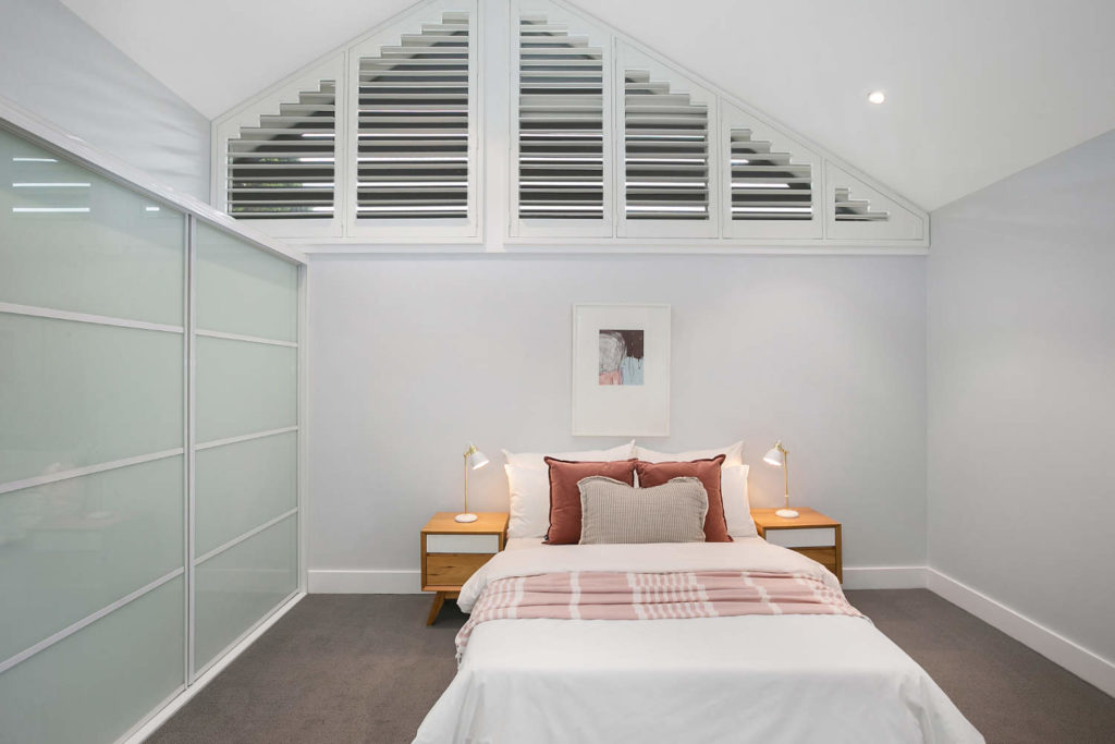
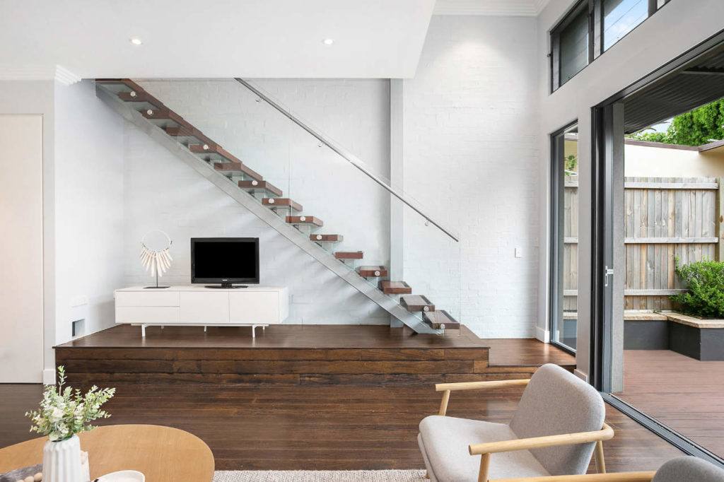
The renovation removed the lean-to laundry/loo from the back of the house and integrated the space as a new living room opening out to the garden through concertina glass doors. Upstairs, two comfortable bedrooms and a bathroom were added, under a gabled roof, designed to match the original roofline, so as to blend in from the street.
This upstairs addition peels back from the rear wall, creating an unexpected void space above the living that delivers extra light and a unique spatial-quality. Adding to this is the reverse staircase of recycled timbers, elevated on a timber plinth.
“The intention was to create a built-in joinery piece that turned into the stairs at the end. That changed for budget reasons, leaving the staircase more open, but it’s still possible to add that joinery later if budget permits,’ says Dain McClure-Thomas.
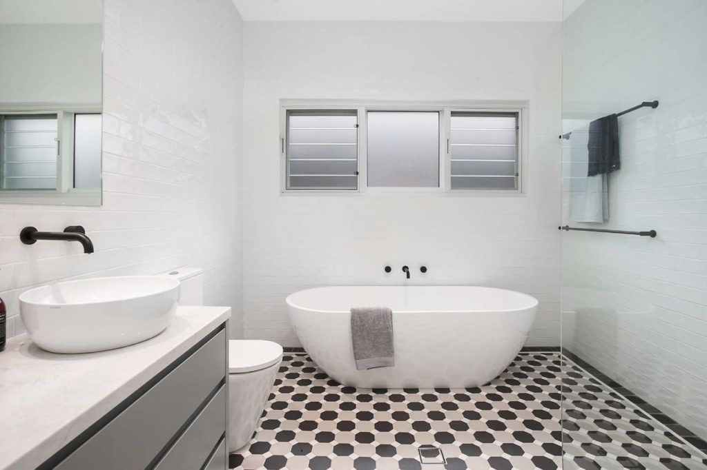
An existing downstairs main bathroom was remodelled in the same crisp black-and-white palette as the new second bathroom upstairs, using a period tiling scheme to reference the original era of the house. To unify old with new, original front rooms were refreshed and repainted, while the existing (functional) galley kitchen was retained as a budget-saving.
The appearance of the extension was tailored to be discreet from the street. The new roof form and segmentation of its first-floor windows are designed to reference the detailing of the existing rooflines. This gave the house a holistic aesthetic, as opposed to an obvious 'box on top' addition.
The main environmental design benefit is through passive solar design. New windows are screened externally with aluminium louvres that significantly reduce the heat load on the glass. Whatever existing building fabric could be rationed was integrated into the downstairs room.
This was the clients’ first experience of working with an architect, and, they say, a positive one, adding value beyond their expectations.
“The biggest improvement was the new living area including the suspended first-floor void which allowed a complete flow from inside to out with bi-fold doors. The internal laundry was also very well thought out. But our favourite element is the recycled timber staircase,”
say the clients, Sean and Kellie


comments