The renowned Peruvian Chef Martin Morales and his team, Ceviche Family, contact El EQUIPO CREATIVO because they wanted to celebrate the uniqueness of Peru in their new restaurant. The Spanish motto « con mucho cariño », with loving care, and the tradition of producing things and cooking with dedication and love is the core of Andina Restaurant and Bakery.
Introduction to Andina Notting Hill
The creative process started with a trip to Peru with the client to dive into the Andean culture and get inspired by colors, flavors, traditions and most of all by Picanterias, the restaurant at the heart of communities across the Andes. The design team was impressed by the sense of family, the careful attention to details and the passionate craftsmanship of these people. Picanterias indeed played a key role in the development of the design. With this heritage in mind, the architects were committed to creating a design that embodies/ personifies the real values of these places, and that could transport the guests of Andina to a journey to the Chef grandmother’s kitchen in Peru. They tried to mix discretion, simplicity and the handmade with London’s creative style.
The project, located in the neighborhood of Notting Hill in London, consists of two main gastronomic spaces. On one side, the Restaurant and on the other the Café-Bakery.

The design
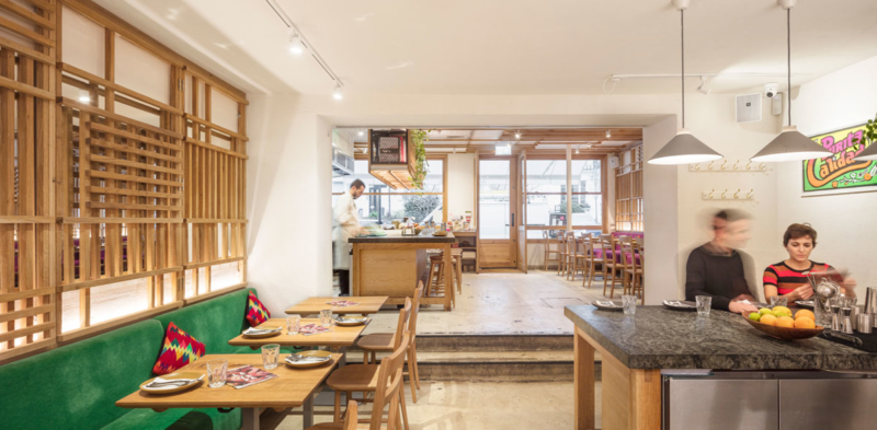
The clean design focuses on traditional materials like wood, ceramics, and stone and creates a unique and warm atmosphere where delicious and vivid food is the main character. Just a few touches of bright and vivid cherry, green and mustard yellow can be found in the upholstery (and cushions) of the lounge banquettes. The interiors of the Café-Bakery, as well as the Restaurant, are filled with light and visible to the passers-by thanks to the large bright windows.

The restaurant
This space echoes the most traditional Peruvian Picanteria, a family-run restaurant become the culinary hub and social space of the community.
EL EQUIPO CREATIVO proposed a design with no filters where the open kitchen, a home-style chefs table, is visible to guests and people in the street. The core of the project references a typical kitchen with light wood shelves, hanging pots and pans, plants, flowers and a dark orange rustic finish in the background that recalls the domestic hearth.
In this familiar environment, large tables acquire fundamental importance in defining the space. In the Restaurant, there are two focal poles the open kitchen and the cocktail counter in the back. They recall the big traditional kitchen table, a shared space between those are cooking and the guests tasting their colorful meal. The tables have a wooden structure with granite stone countertop reference to the typical Peruvian kitchen table. Clients can see the dishes that are being prepared as it happened in most rural Picanterias.
Light oak lattices rise from the soft velvet banquette and create a screen on the ceiling a modern homage to the common wicker feature of Andean Picanterias. The white walls and poured cement floor emphasize the brightness of the restaurant and the authentic and pure simplicity of things well designed and handmade.

The Café-Bakery
The Café-Bakery is all about craftsmanship. This bakery, « panaderia » in Spanish, is designed as an enchanted world entirely dedicated to the subtle art of making things.
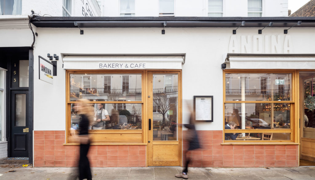
In this context, the unusual combination of terracotta and wood stresses the handmade aesthetic. El EQUIPO CREATIVO wanted to create a feeling of artisan workshop in this space, and so we proposed natural materials and played with their textures. For example, there are bricks on the wall, wood tables, and clay quarts counters.
At the entrance of the Café-Bakery, there is a big bar where all the delicious pastries are on display, and in the backside, the customers will see Pastry Chefs at work and the baking oven where the magic happens. In Andina Bakery, two crafts like pottery and pastry are united in a close bond testified by the porcelain pendant lights and the ceramic plates and pitchers on the shelves. The whole design plays on the hues of sienna with some splash of yellow on the seating inspired by the subtle world across the Andes.

The façade
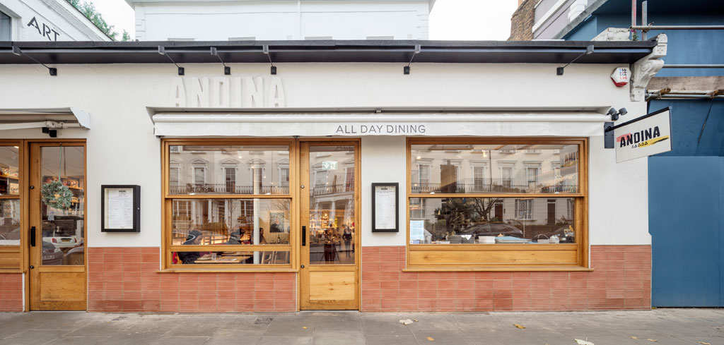
From the outside, the façade of Andina Notting Hill is a modern interpretation of the layering of traditional Cuzco buildings where plinth in stone has been replaced with terracotta and the upper part made of white plaster.
Like in the design of the interior, the vibrant sign is the only element disconnecting the bright finish and giving a bit of color to the façade.
comments