
Born of hospitality passion by industry purveyors Manny Spinola (Grand Pacific Group) and Marco Ambrosino (Fratelli Paradiso; 10 William St), the project delivered H&E a creative and rare opportunity to engage this tightly-held precinct and find cut-through via informed and acute execution that stands apart.
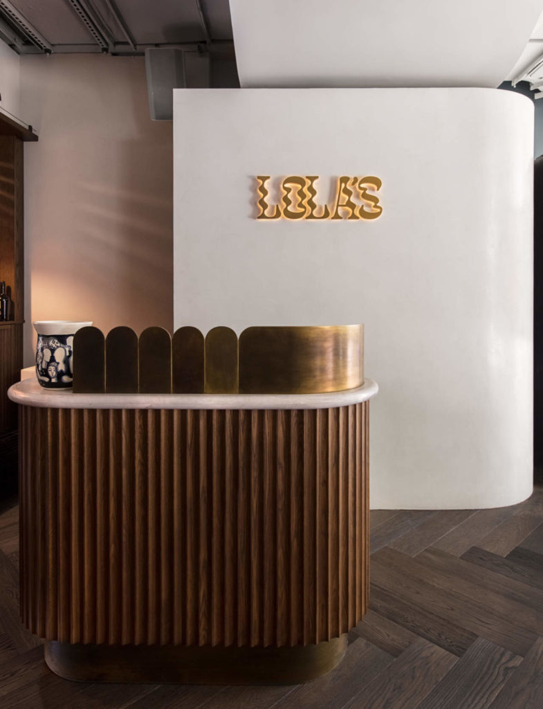
Lola’s, elevated one level above ground, rests on Campbell Parade with uninterrupted views across Bondi Beach and the wider Pacific Ocean.
The design approach stemmed from a desire to reflect contemporary Mediterranean motifs married to the identity of the so-called ‘Lola’ – a creative character in essence, and one here to make a scene without the obnoxious connotations such a sequence of words may evoke. Taking from such a foundation was to realise a new sensory experience that engenders a balance of relaxation and excitement for its patrons. The design response is a deliberate abstraction of traditional sensibility and modern composure.
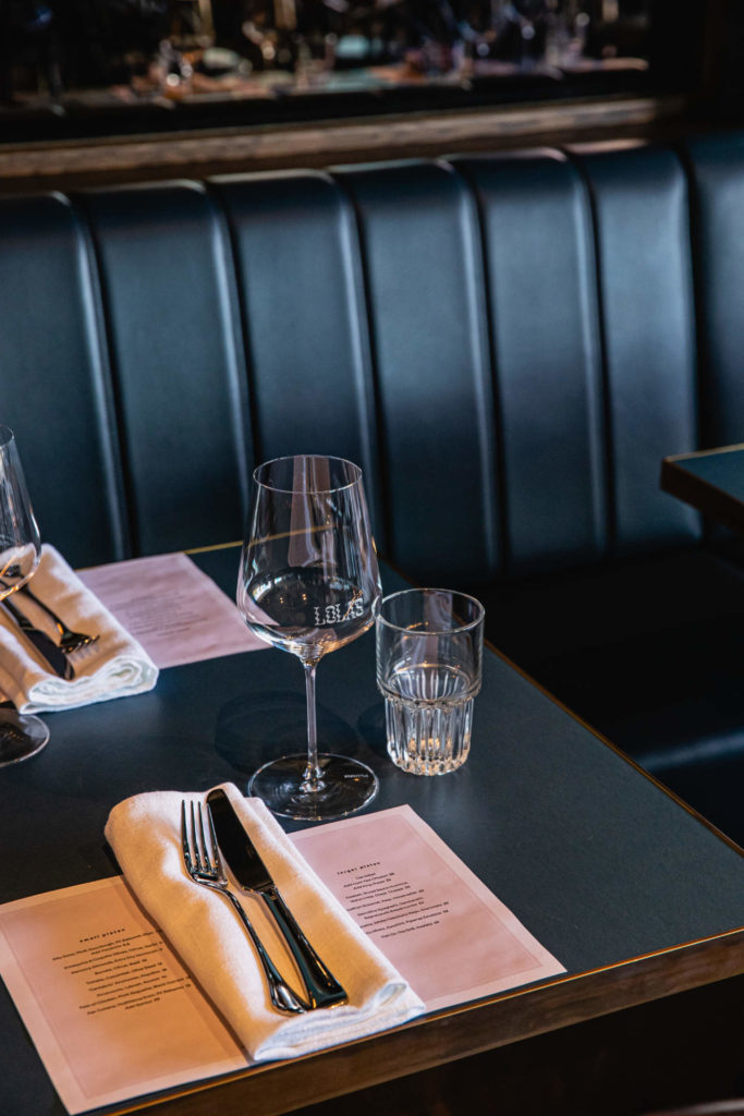
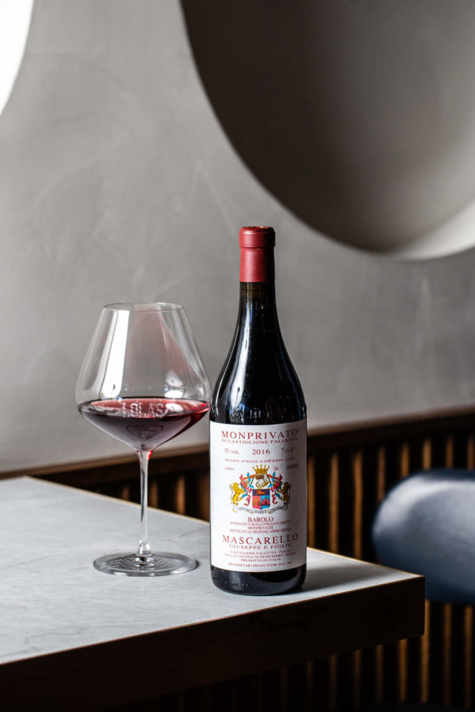
The material and finish palette provides an eclectic mix of metal, leather, timber, plaster, ceramics and concrete. There is a softness and tactility evident throughout. The dark moodiness provides a welcome counterpoint to the bright buzz of Bondi below; deep colours embraced to echo the expanse of the ocean and soften the often-harsh summer sunlight.
Due to constraints of servicing within the existing building and available budget (much was achieved on very little), the location of the kitchen was pre-defined.
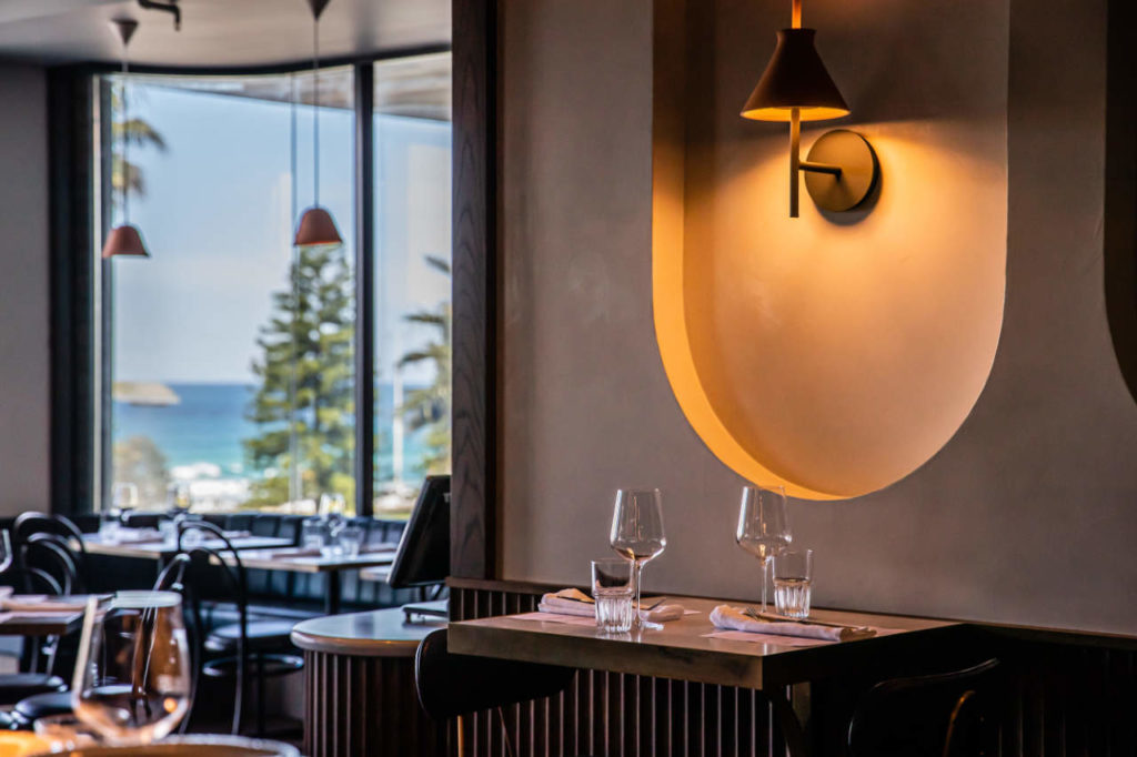
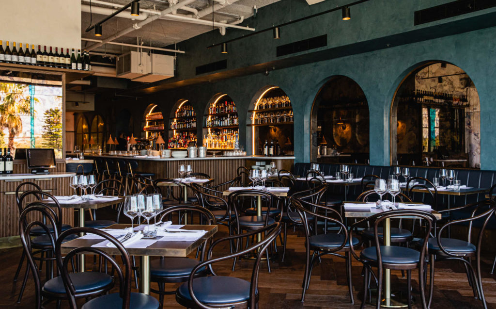
The decision to position the bar central to the wall of arches is a definitive move making the bar and its theatrics the venue’s focal point. This also established the central circulation spine between bar and kitchen -- both effective and efficient and also focussing movement towards the centre of the small venue and its lively atmosphere.
A blue stucco wall punctuated with a rhythmic arrangement of arches forms the spine of the space. Sometimes the arches lead to other places – a back bar or a back rest, all framed by a
vibrancy that is overlaid by the integration of signage, product displays, classic furnishings and feature light fittings as alluring touchpoints.
Lola’s is both welcoming and timeless; a scene and a reprieve; creative and constrained -- just as the client envisioned of their imagined ‘Lola’.


comments