
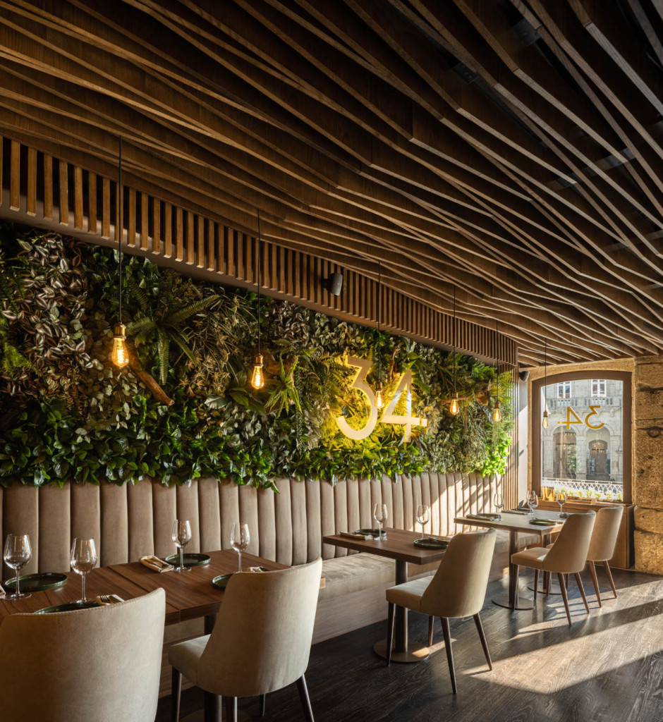
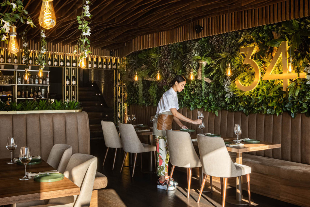
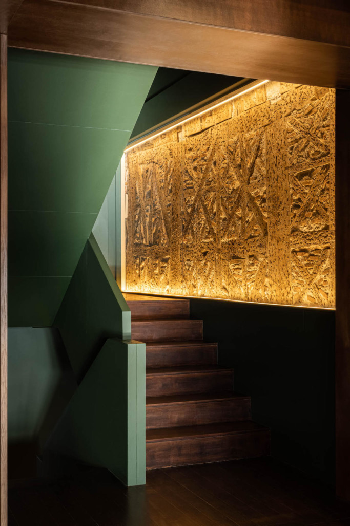
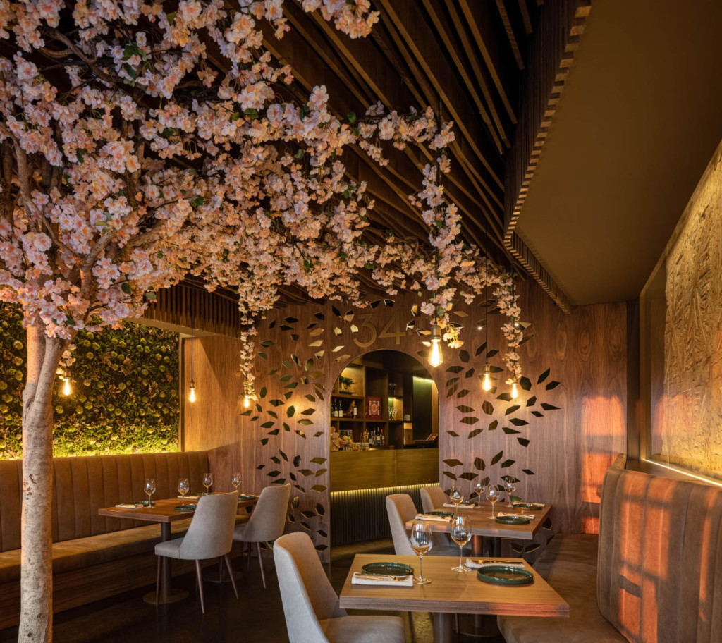
The assignment arose from the client's need to move an existing restaurant to a larger space, without losing some of the characteristics of the old venue - intimate, with green and wooden elements that confer the restaurant its own identity.
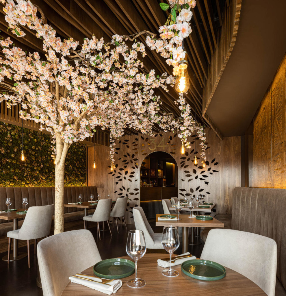
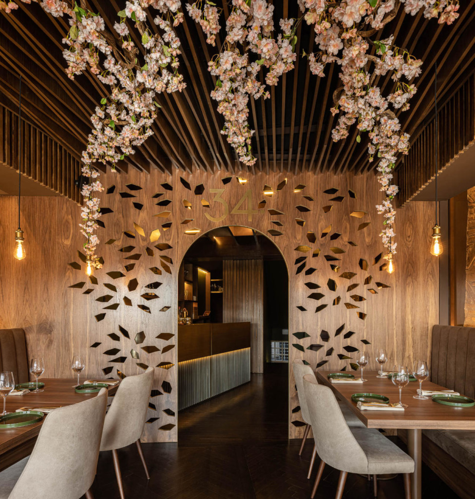
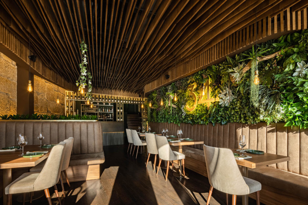
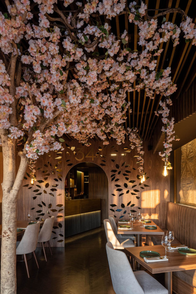
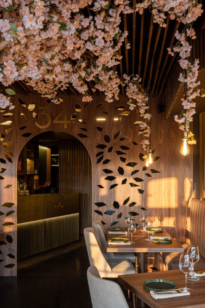
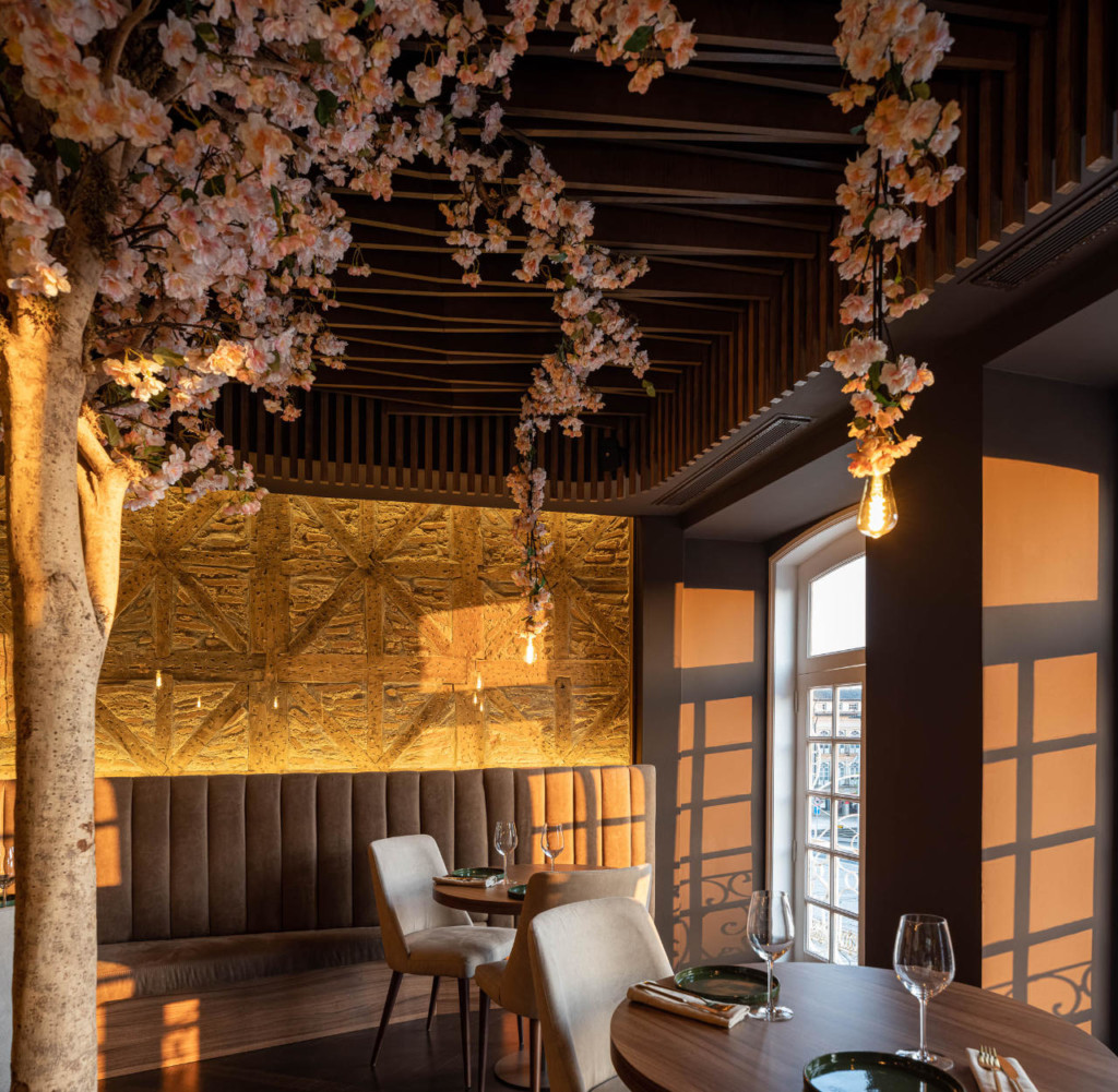
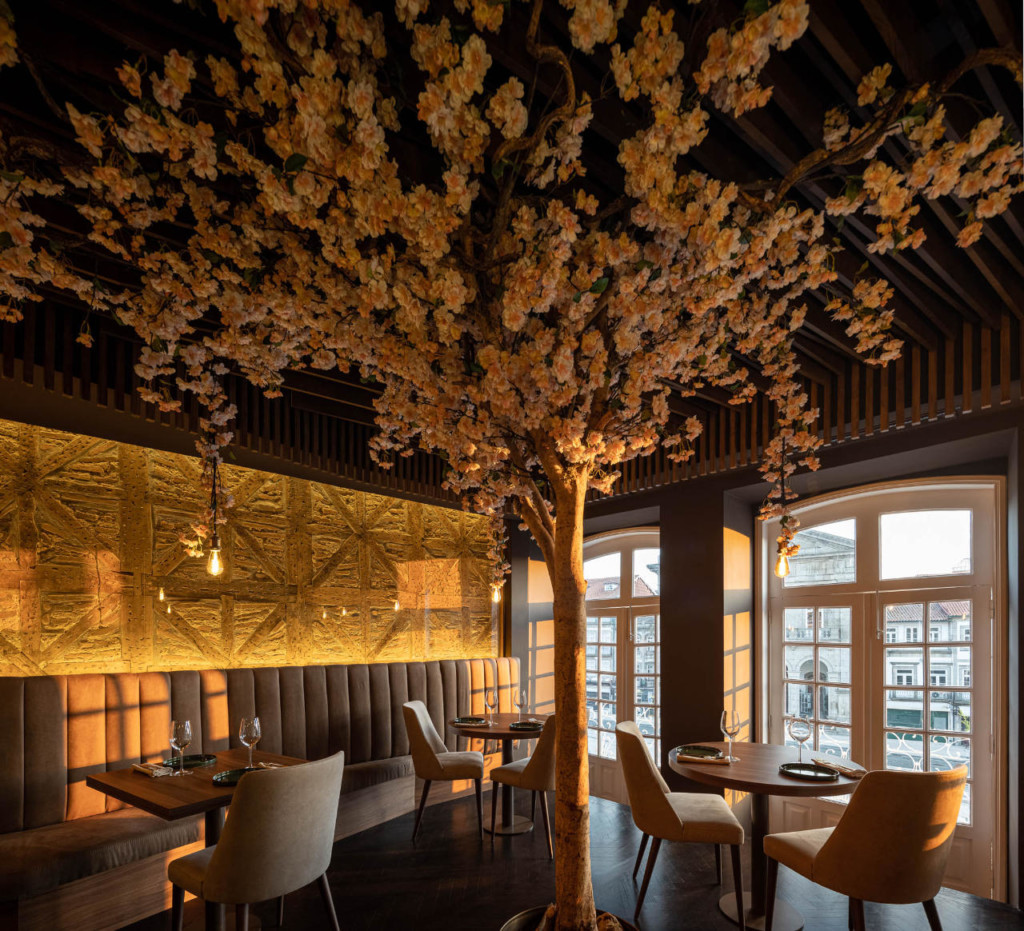
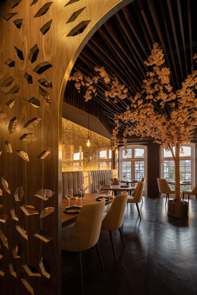
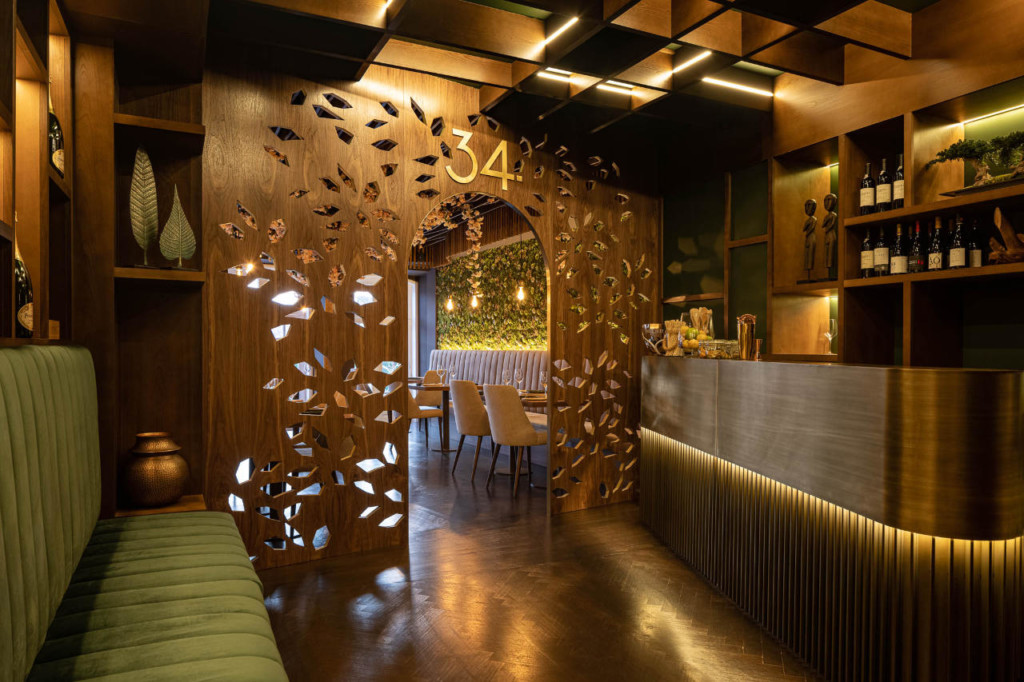
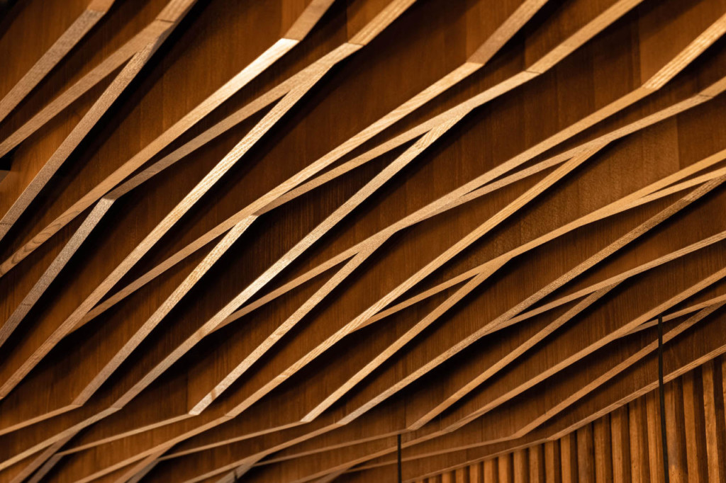
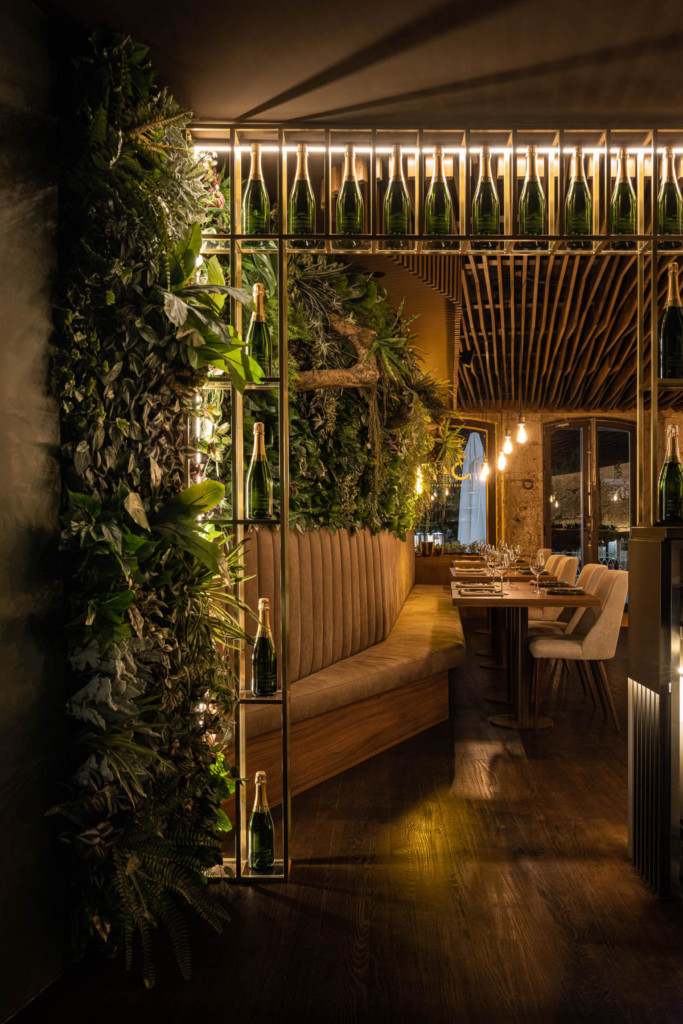
This condition drove the architects to explore an aesthetic-spatial concept that implied a deconstructed approach from the "art nouveau" movement; from chromatic characteristics (brown/green), to the curved/ondulating and asymmetric forms that shape the spaces, the repetition of decorative elements (wood of the ceilings and moldings) instead of the "intertwined" elements so typical of this artistic movement, as well as the use of plants, all of which are detached from the project's structural elements.
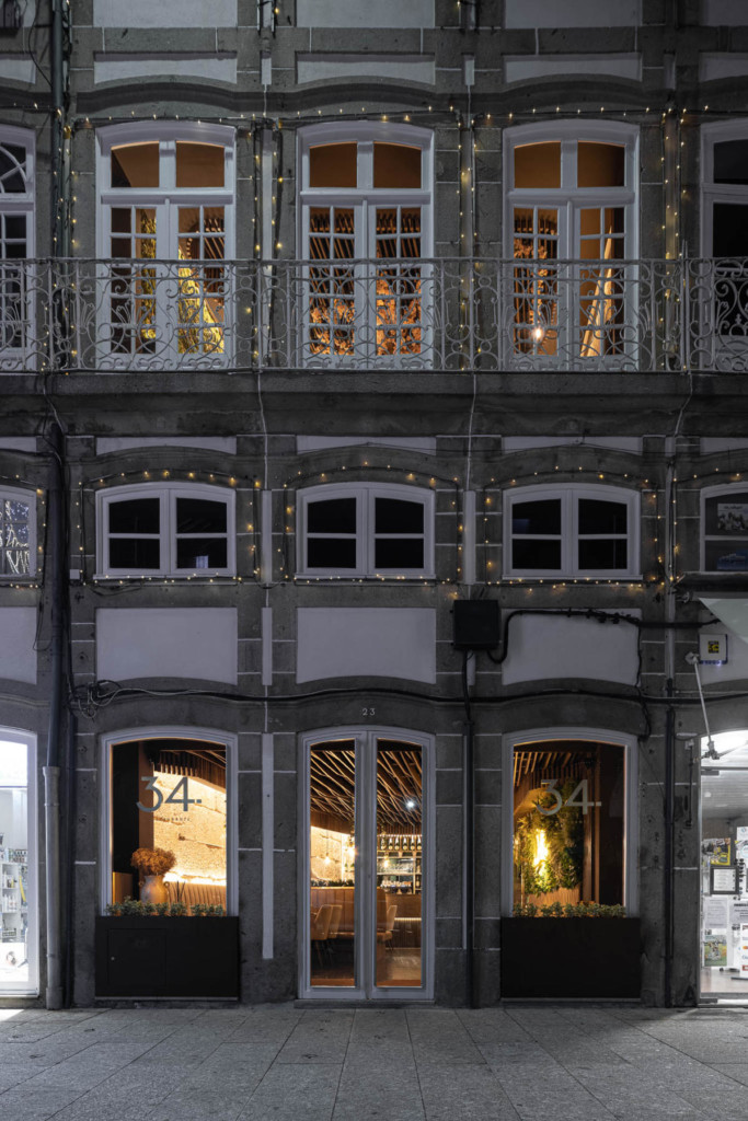
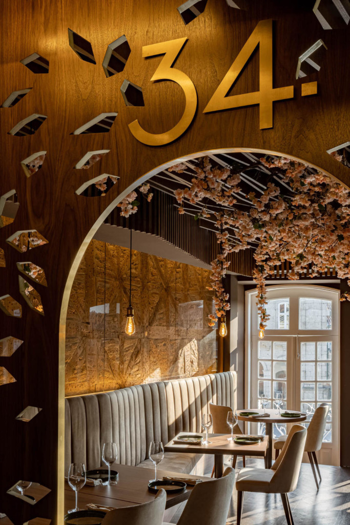
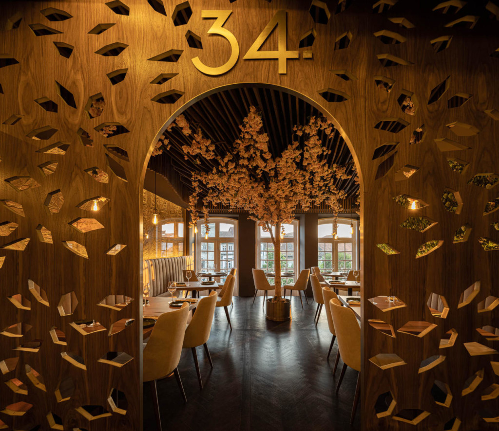
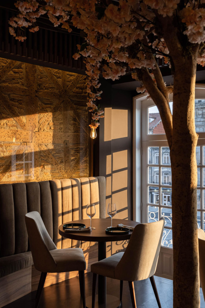
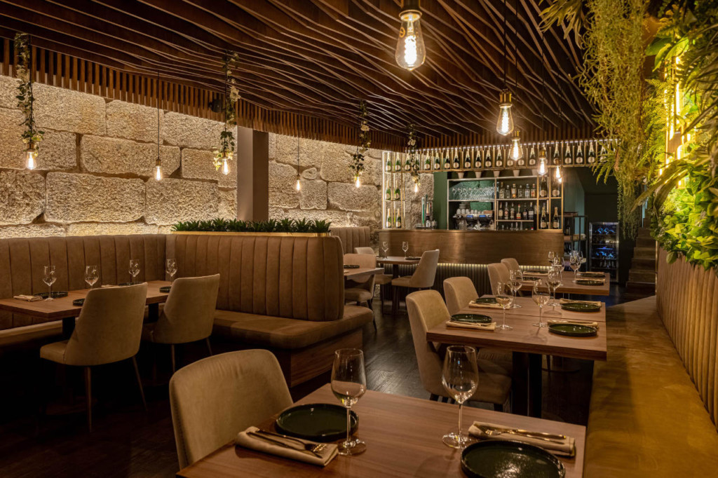
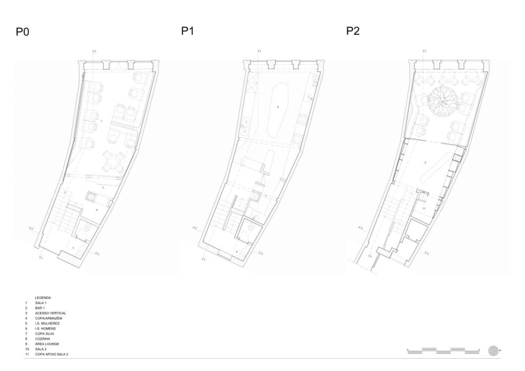
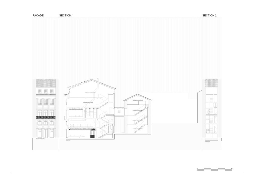
The new space, located in the very historical center of the city of Guimarães, is characterized by a typically medieval plot that defines the building with an irregular geometry, which tapers down to the patio. Given this spatial characteristic, REM'A decided to outline the rooms with elements at the floor and ceiling levels, by means of long sofas, with parallel ceiling moulding, which allowed them to embed technical infrastructures.
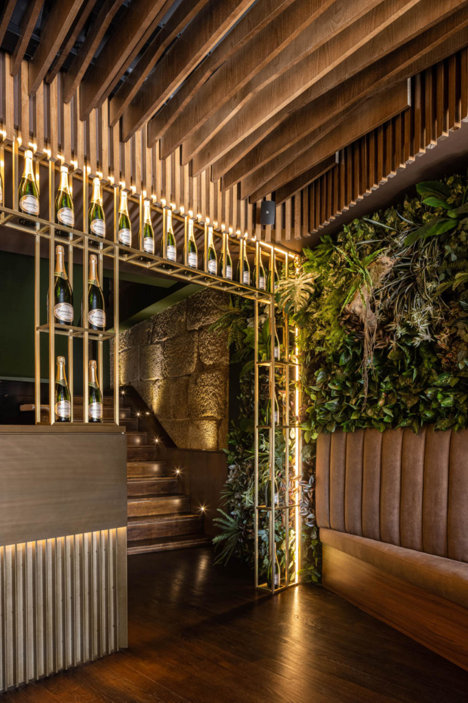
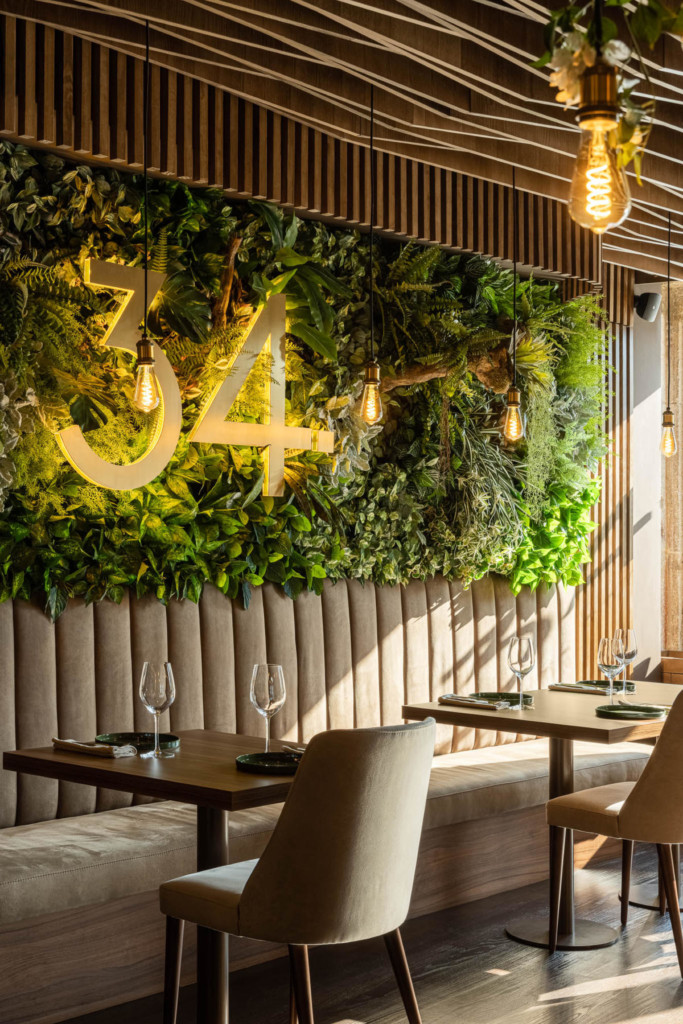
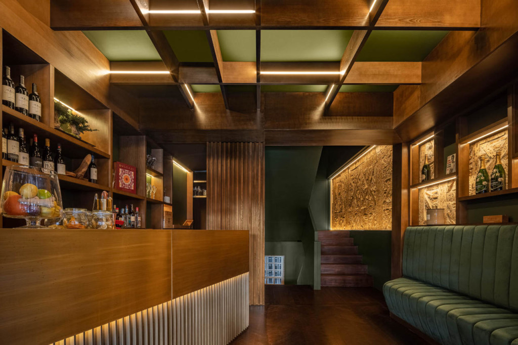
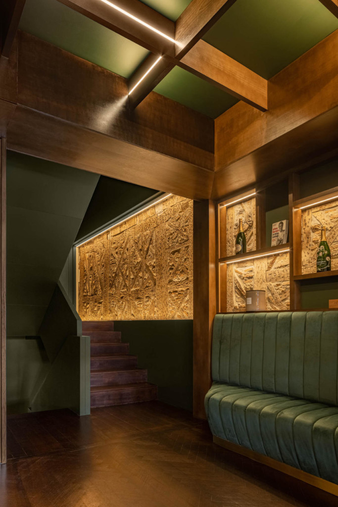
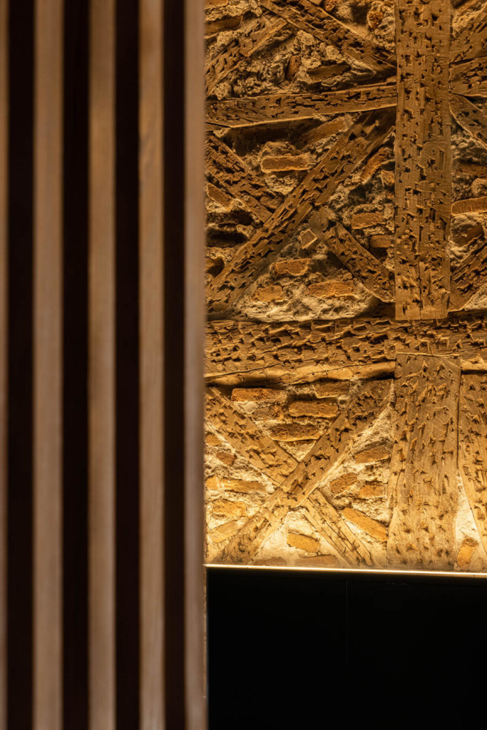
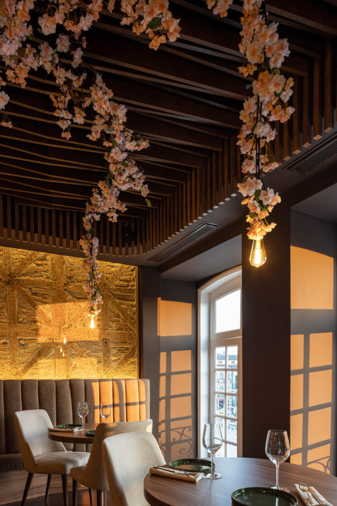
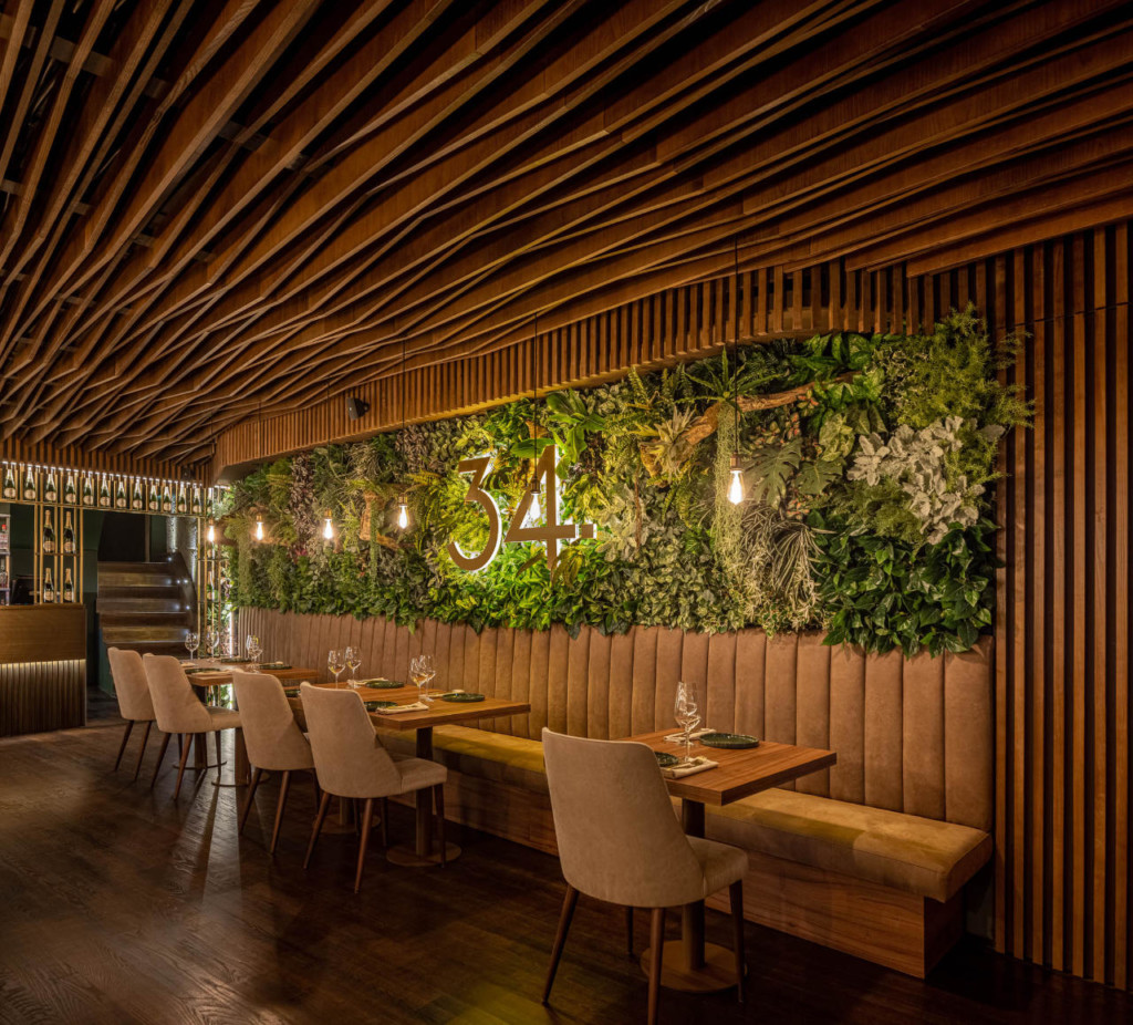
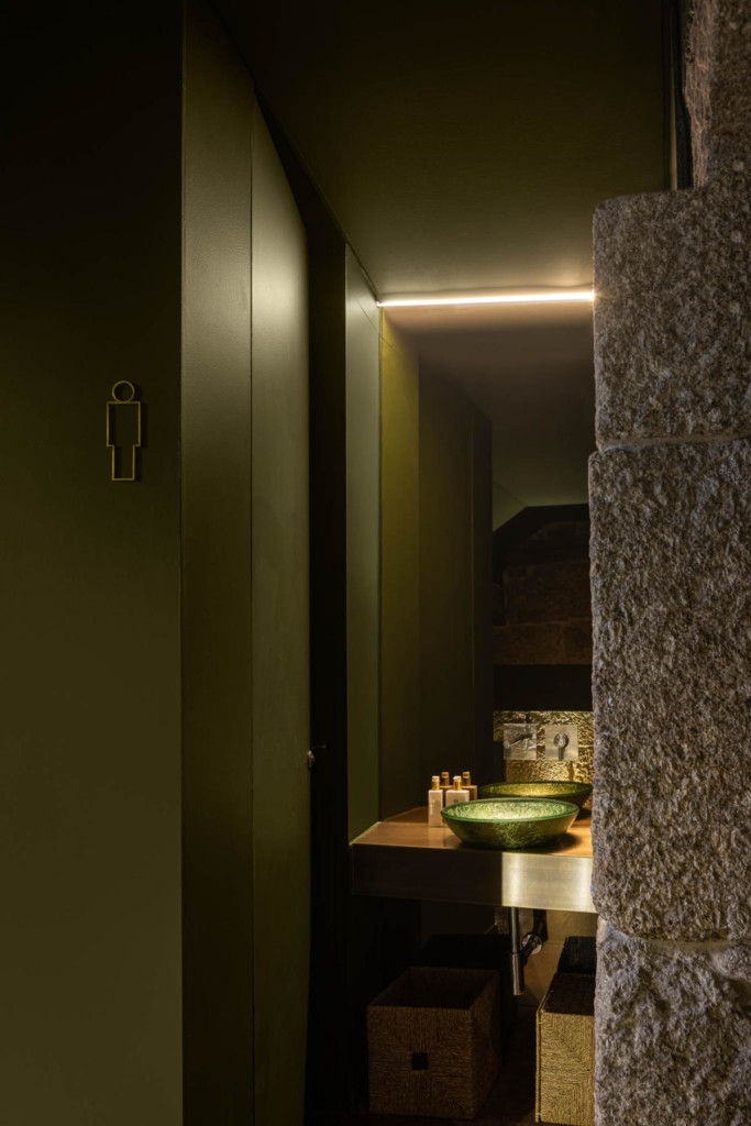
They chose this option to allow the space to flow and to dilute the feeling of spatial irregularity. Within these elements, they explored a duality between brand identity and construction identity: on one side, the building's original masonry (in some cases, after removal of coatings added over the years), which reminds them of its original construction, and on the opposite wall, the green elements, the brand identity.
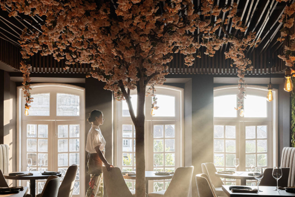
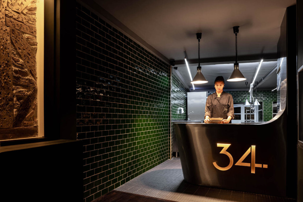
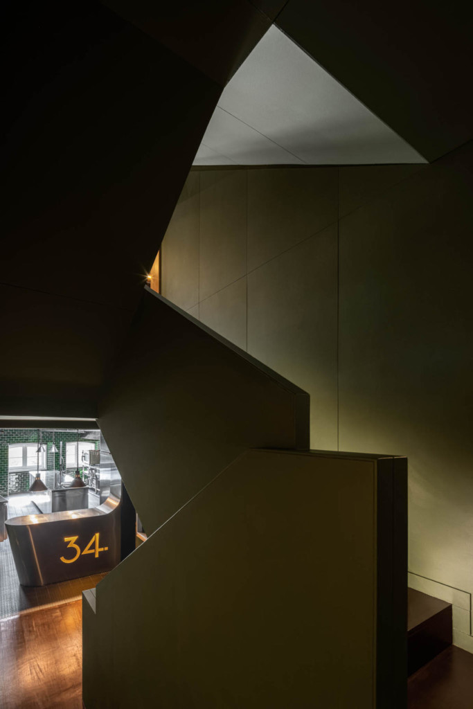
The wooden ceilings, framed by the aforementioned perimeter mouldings, are intended to recreate the atmosphere of the old restaurant, taking advantage of the longitudinal direction of the rooms to give a sense of depth, as well as allowing the lighting hangers to move slightly, depending on the location of the tables. The project covers the first three floors of the building, the first room on the first floor, the kitchen on the second floor (between rooms) and the second room with a lounge area on the third floor with toilets located on the transition levels between floors.
The conceptual matrix is strongly implemented in the rooms, with the exception of the derivation made in the lounge area that serves as an antechamber for the 3rd floor room, the only orthogonal space that tends to cause surprise effect on the privileged view to the Praça do Toural, in the very heart of the city of Guimarães.









comments