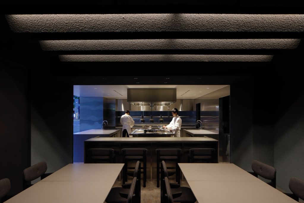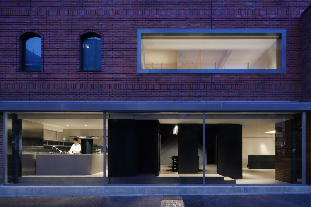
Located on the ground level, “nôl” is a restaurant atelier with a distinct concept. Functioning as an experimental kitchen, nôl can also be considered as a flexible space freed from the physical restraints of a classical restaurant. A place where talented chefs can use for catering preparation or for irregular dinner events. Thus compared to the spacious kitchen, this restaurant has only eight table seats.

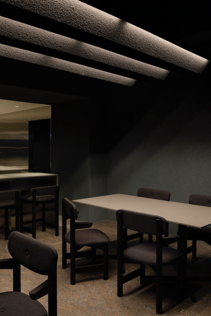
Though it is compact, the goal was to create an atmosphere that suits the extraordinary dishes that will be prepared. Since the name of this facility comes from the French term “non-usuel (non-usual)” and “noir (black)” the space was designed with black as its key-color, and the idea was to create a restaurant with a special feeling which is not fully open to the public considering the stance and characteristics of the space.

The dining area was finished with a matte, dark-toned lysine from floor to ceiling. To create depth, the space was painted in a gradation from grey to dark grey. Pendant lights above the tables were newly designed to fit the space, and the shade of the lightings were finished with the same lysine material to maintain a common tone and to exaggerate the contrast between the light and the ceiling. The kitchen was mainly finished with stainless-steel, in order to create a brighter image and a space which functions like a stage in contrast to the black dining area.
Project Credits:
Client: MARUTAYA Co., Ltd.
Direction: Aid Inc
Design: Koichi Futatusmata, Koichi Shimohira(CASE-REAL), Yasushi Arikawa(Partner)
Cooperation: TANK, Tanabe Kensetsu
Lighting Plan: BRANCH lighting design (Tatsuki Nakamura)
Manufacture of Furniture: E&Y
Sign Design: Aid Inc
Paint: Nakamura paint
[…] project of their flagship store located at Shibuya Crossing, one of the busiest places in Tokyo. For their first-ever collaboration with Pierre Hermé in Japan, the store was transformed into a […]