Text Description provided by the architects
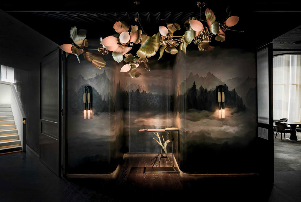
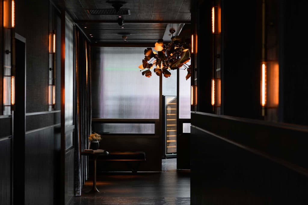
Entrance: As you enter Ensue, guests are immediately introduced to the natural landscape of Napa, along with Cantonese influences that honor the heritage of Shenzhen.
Simple and natural elements engage the guest with a new experience of fine dining, by way of redefining a luxurious and opulent experience with a more naturalistic aesthetic that still embodies refined detail. A moody landscape mural that has been hand-painted by a local artist is the main feature of this dramatic entrance. It depicts a foggy scene, adorned with horsehair sconces by Apparatus, that immediately sets the tone of the restaurant - a dark, cozy and intimate setting, that allows you to only view nature as nothing but luxury.
Equally as dramatic, the chandelier by Rosie Li Studio that greets guests as soon as they enter the front doors, presents another naturalist element, this time using modern elements and techniques. Floral sculptures soften the mood of the space, but are strongly defined by the use of polished brass metal.
Transitioning through the entrance, a pitched shingled ceiling is reminiscent of traditional Cantonese architecture. Velvet textiles have been used in cool tones to balance the striking nature of the chandelier and stone shingles, and brings a needed softness to the space.

Finally, a custom reception desk has been created to mimic deer horns, which are also featured at the front entrance as you enter from the elevator lobby. Inspired from pages in Chef Kostow’s book, these elements bring a sense of playfulness and imagery that are strongly tied with nature and the Napa countryside.
Ensue: The soft glowing light from the sky when the sun is below the horizon, caused by the refraction and scattering of the sun’s rays from the atmosphere. IT IS THE STATE OF AMBIGUITY. IT IS THE TWILIGHT IN NAPA VALLEY.
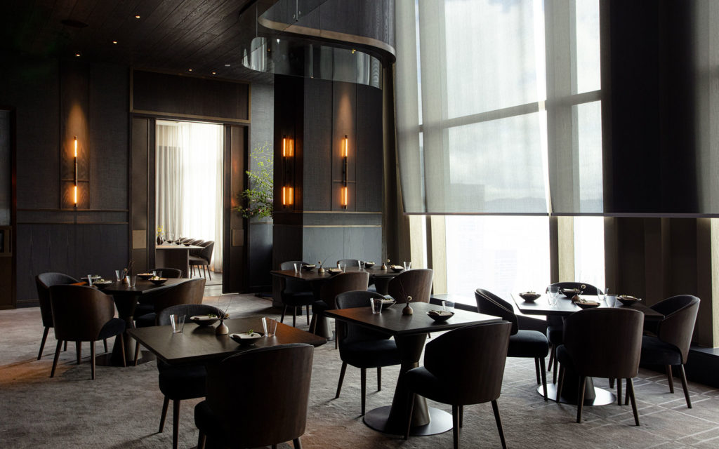
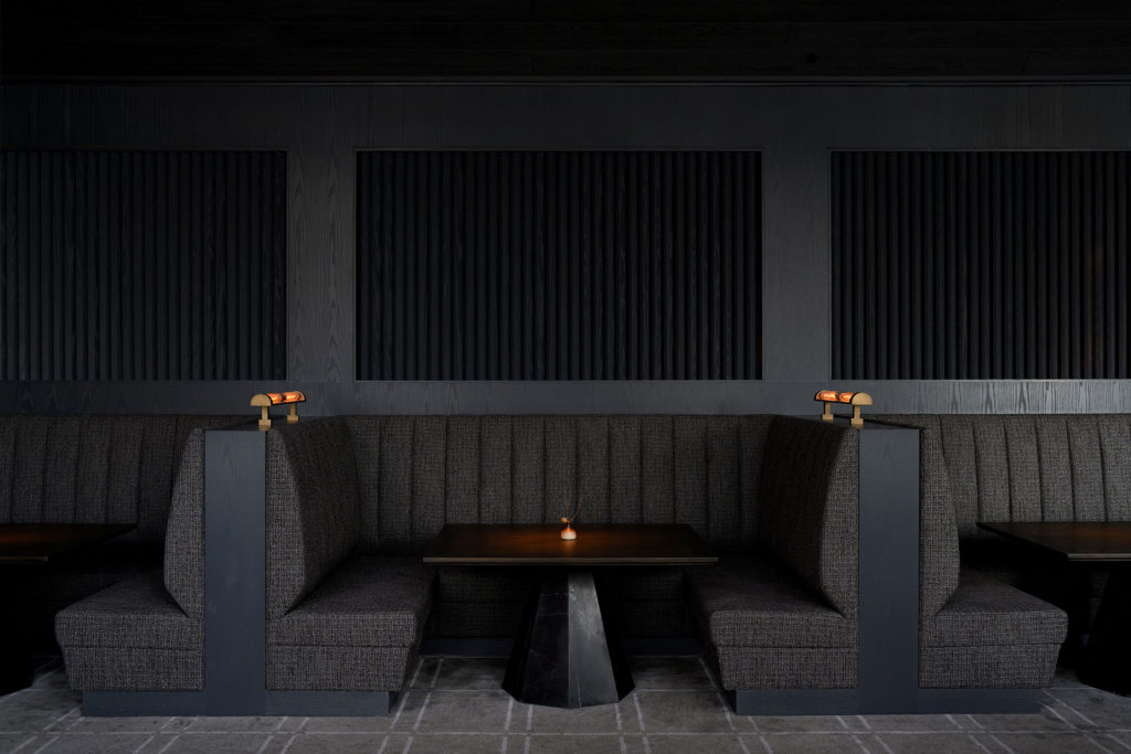
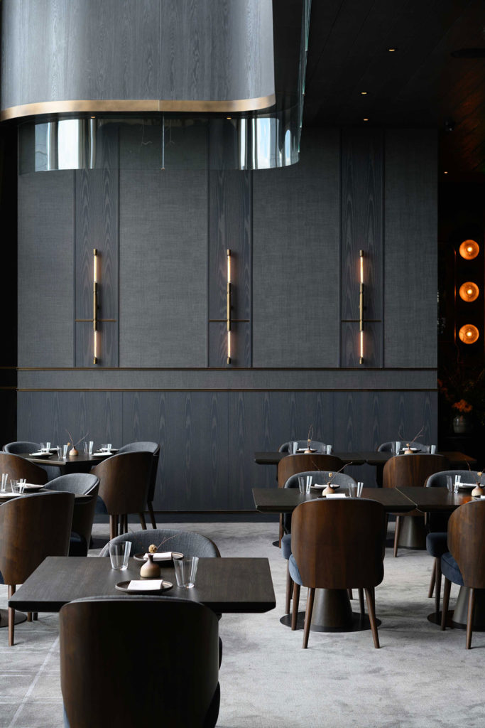
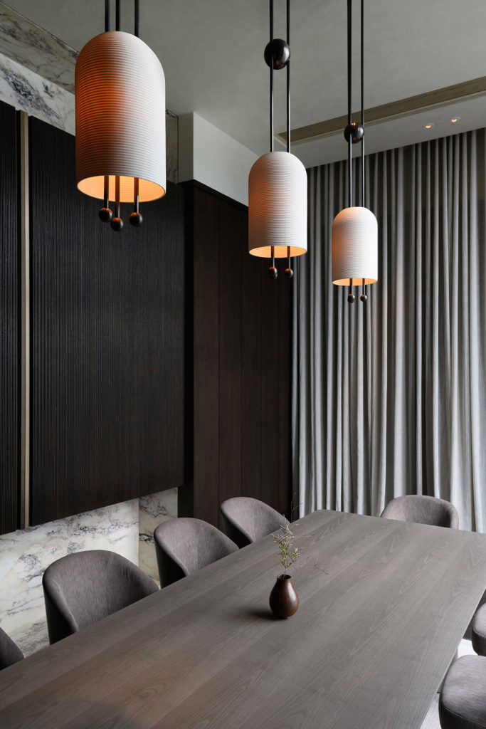
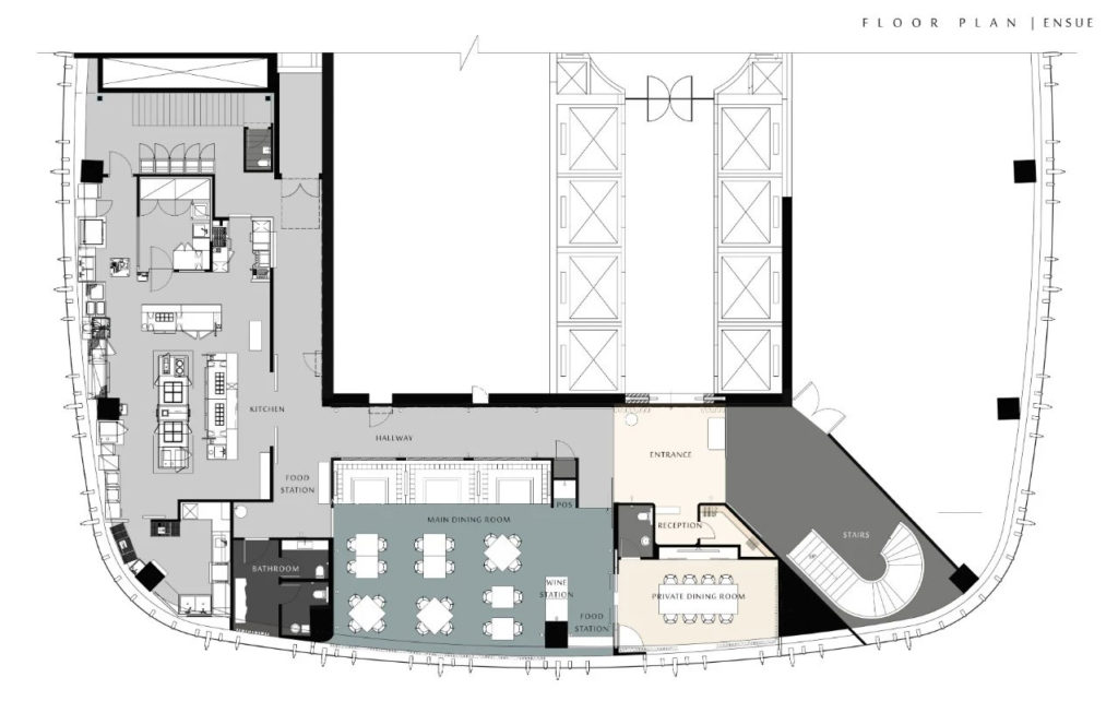
In the Main Dining Room, Ensue, a grey and neutral color palette allows the food and flavor to shine. Where color is lacking, effortless detail has been incorporated through millwork, wall paneling, and structure to create a refined and sophisticated room that is the heart and soul of the project.

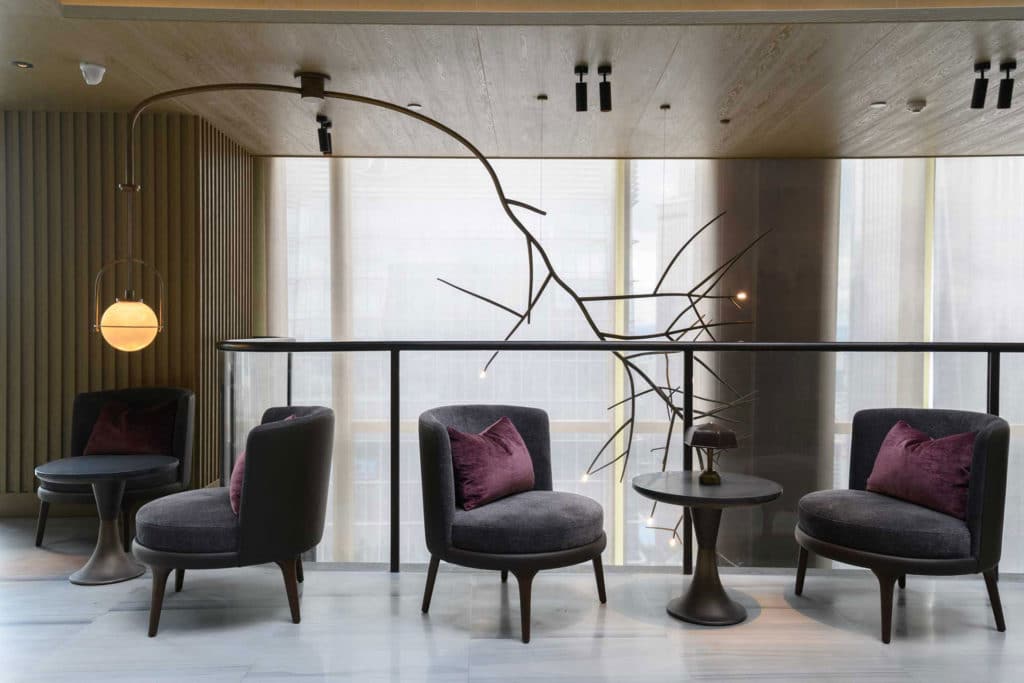
The fertile nature of Shenzhen and the canton region is referenced in the space through warm lighting accents and luxurious textiles. Natural elements are also introduced into a modern design, through materials and furnishings, as well as a custom branch lighting fixture that connects the double height space with the bar above, and gives the feeling of the local landscape being elevated 40-floors above the bustling city below.
To combat the rigidity of the existing architecture, curves have been introduced into the structural design of the Dining Room’s ceiling. This curved design element to define the double height space emulates the idea of a flowing stream in Napa, or the coastline of Shenzhen Bay. Where the ceiling meets the diving wall between Dining Room and Hallway that leads to the kitchen, the ceiling curves like a wave towards the back of the banquettes and defines this area as a cozy and intimate space, without the use of any vertical separation.

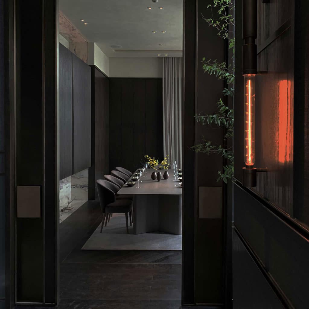
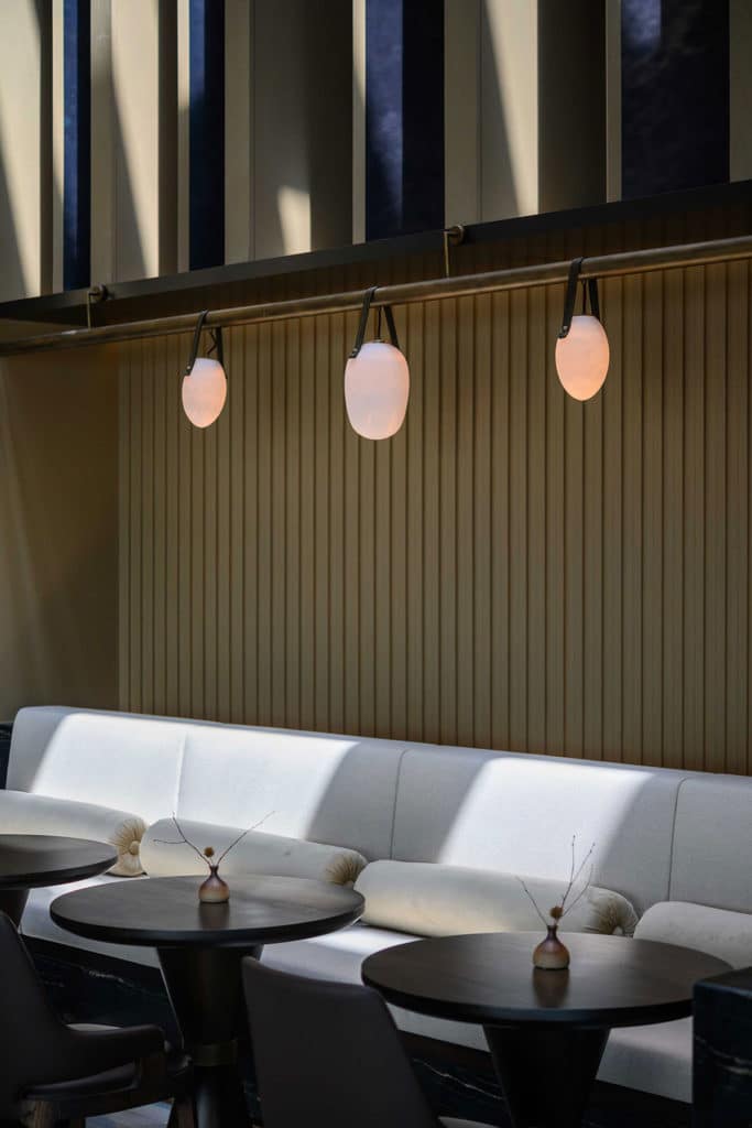
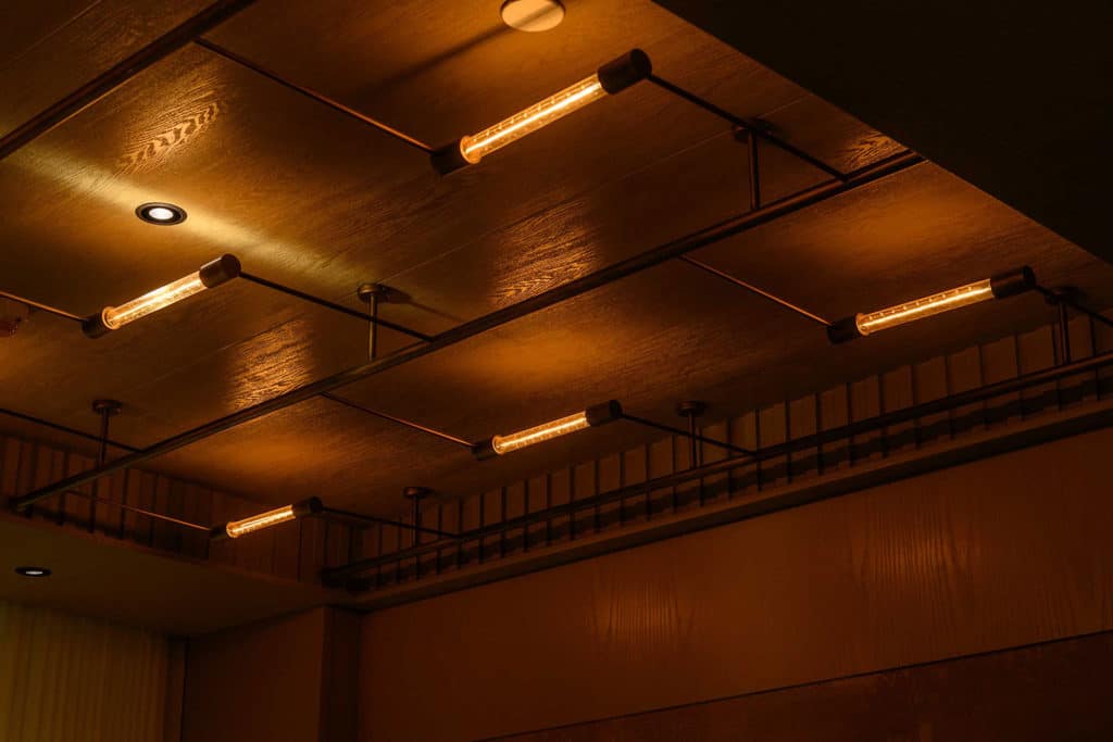
The atmosphere of this restaurant is heavily influenced by the idea of Twilight in Napa. Not only is the ambiance of the space enhanced during this hour, but the colors, lighting and intimacy of the Dining Room evokes that time of day just after the sun has set. The hue of the mountains translates through the color palette of the finishes and furnishings, and the custom wall sconces and banquette lightings utilize an exposed filament lamp to imitate the glow of the setting sun. Separating the banquettes from the hallway is a vertical louvered wall partition that creates an obstructed view of this passage, similar to the way that trees.
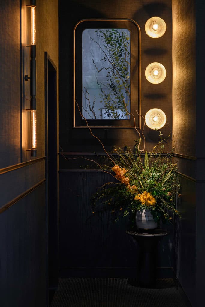
Alcove at Ensue: It is the first appearance of light in the sky before sunrise. A typical Northern California morning IS FILTERED BY layers of fog, BLURRING THE DISTANCE BETWEEN LANDSCAPE AND CREATURES. YOU ARE LOST IN THIS SCENERY BECAUSE YOU COULDN’T BELIEVE WHAT YOU HAVE SEEN IS TRUE.
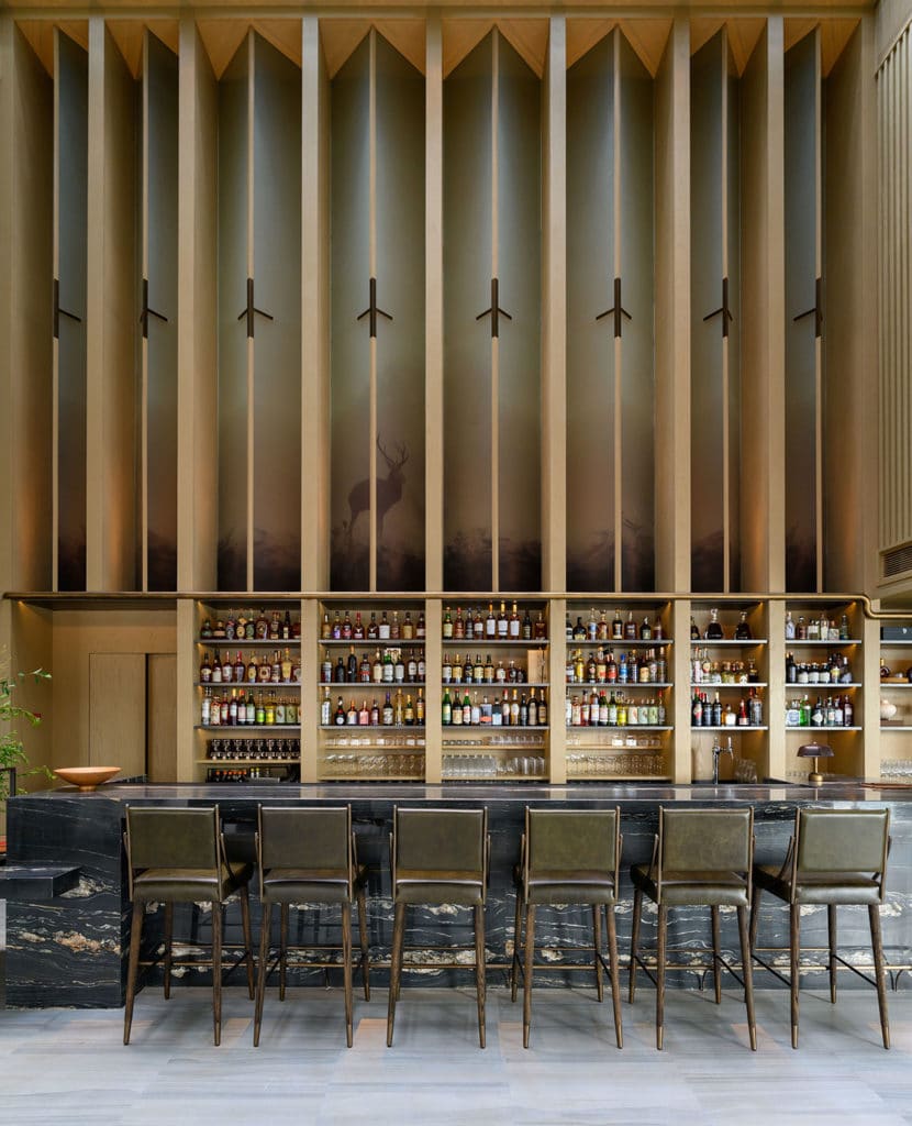
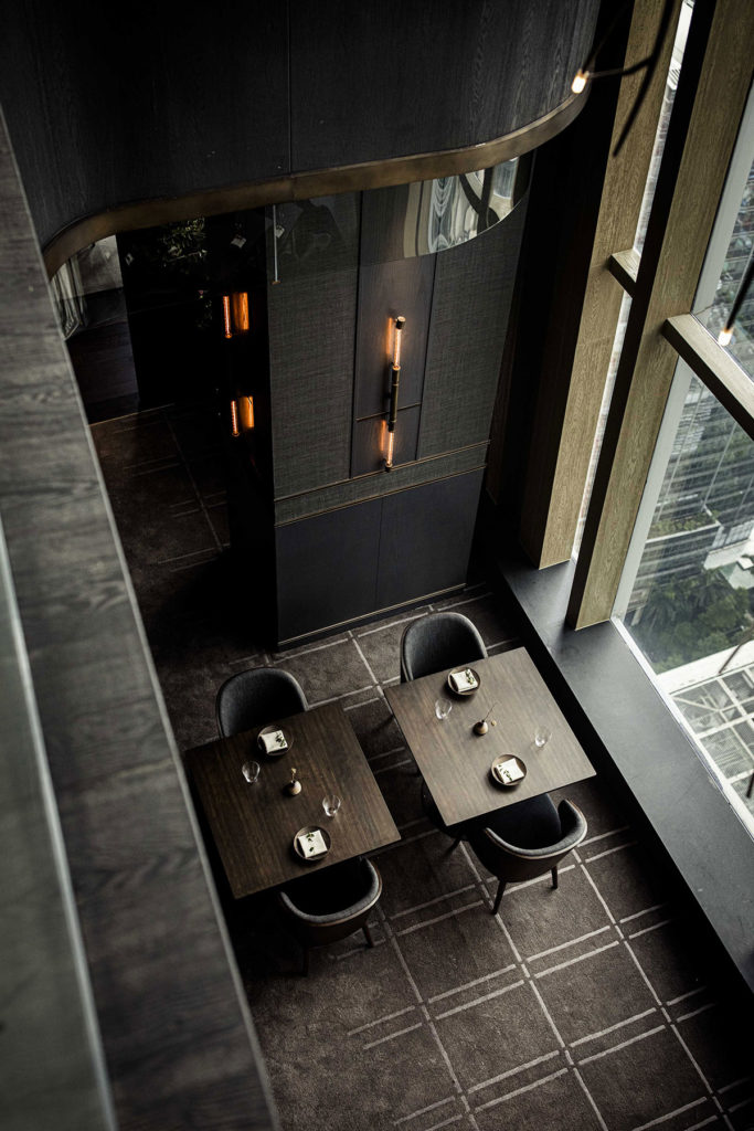
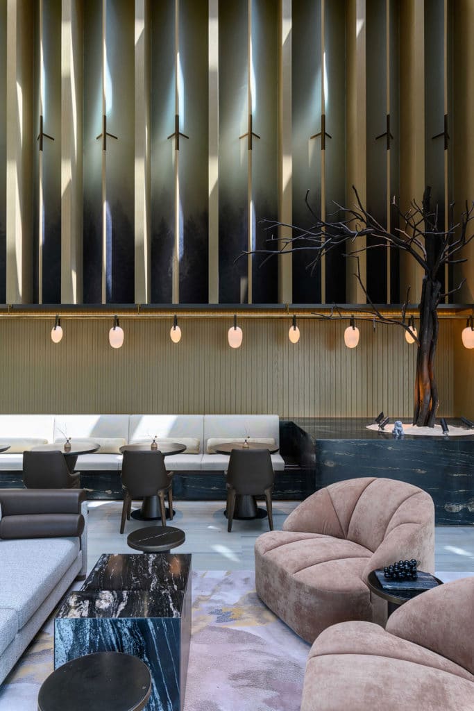
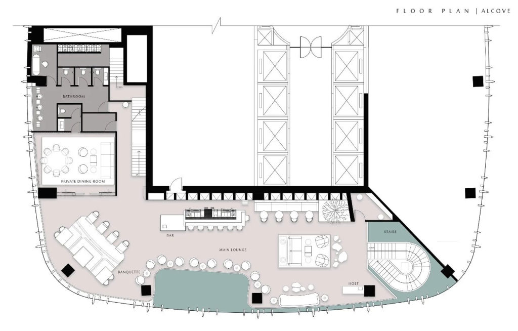
A big part of designing this restaurant in the space that used to be an empty, open roof of atop the Futian Shangri-La Hotel, was making the most of this incredibly tall ceiling height that was offered at the top of the building, and maximizing the existing window exposure and phenomenal views. With a total height of 13-meters (43-feet) the program was able to include an entirely new structure to accommodate a bar and lounge, now known as Alcove.
So that the Main Dining Room of Ensue could maintain the full extent of the window height, the mezzanine floor was set back to allow for the light and views to filter in. As a result, the upstairs bar and lounge is provided with a balcony to observe out and down, and the two spaces become interconnected even though their aesthetic and feel are vastly different. A custom branch light fixture hangs into the upper portion of Ensue’s double height space, and is masterfully countered over the railing above, providing a singular round lamp to illuminate the first of the lounge tables that line the railing.

Even with the mezzanine floor, an enormous 7-meter (22 feet) glass ceiling sits above the bar, whose height is enhanced by vertical glass panels with elongated linear design detail. Because of the abundance of natural light, a light wood has been used throughout to capture the essence of dawn; the first light of the day. At nighttime, during Alcove’s peak operating hours, the lightness of materials allows for exaggerated low-level lighting to create a moody and intimate setting in such an expansive space.
Private Lounge of Alcove: tiny drops of water that form on cool surfaces at night, when atmospheric vapor condenses. IT IS FRESH. IT IS PREVIOUS.
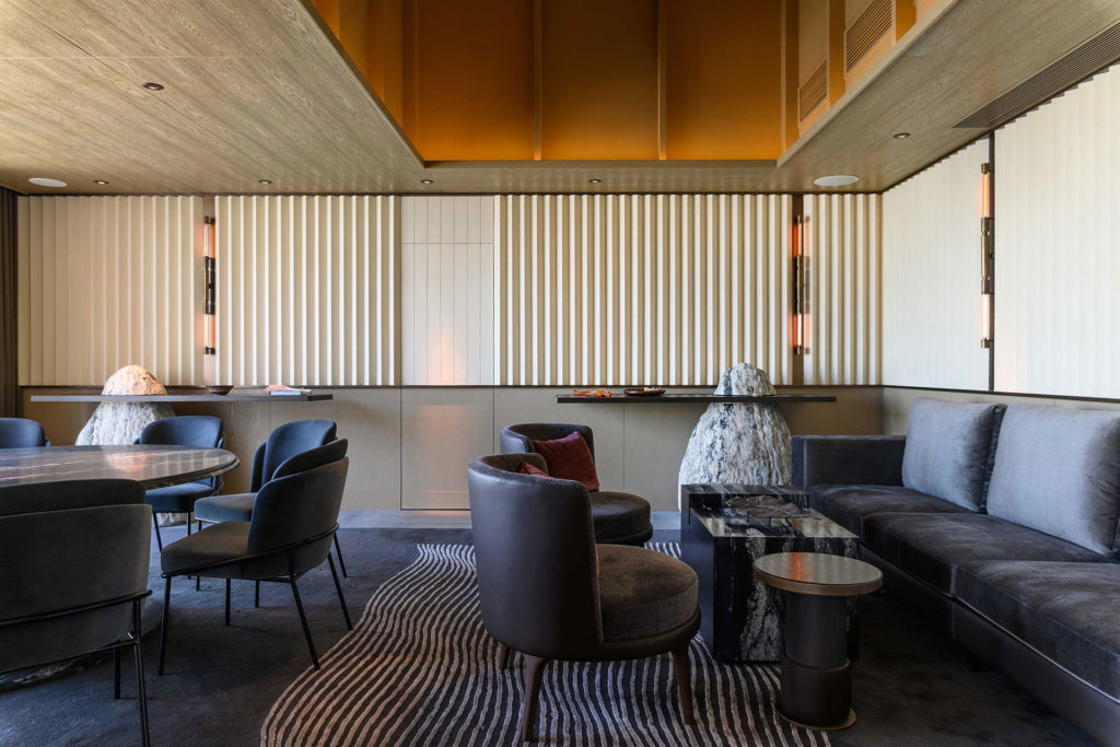
A new design language is introduced in the second Private Dining Room, through more rigid and linear forms, and a departure from a saturation of rich tones throughout the room. Overall, the style is more relaxed featuring a lounge seating arrangement and family-style 8-seat round table, yet still maintains a level of refinement through the grand double height structure and glass surround.
In this room exists the idea of Mountain Dew, named as such after the essence of Dawn. Traditional Chinese cooks would collect dew in the morning from water lilies, and make tea for their guests during the day. It is regarded as the most luxurious natural ingredient for beverages, because of its pure nature.
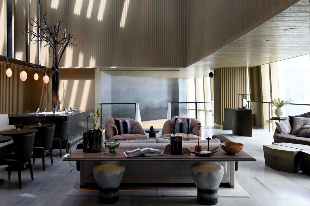
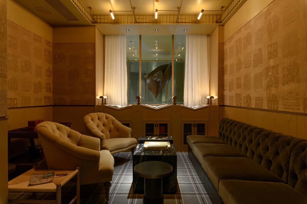
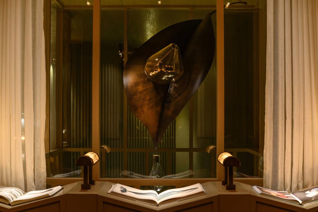
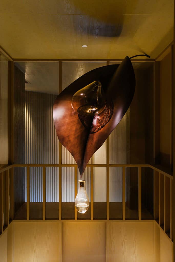
The feature of this space is a dried leaf hanging from above. On the counter side of Mountain Dew came the inspiration of dried flora and fauna; elemental design ideas that were introduced by Chef Kostow’s direction of creating a Wabi-Sabi environment.
The selection of blue as an accent grounds the space, and is representational of dew that has trickled down from the dried leaves. This juxtaposition of dried and hydrated elements.
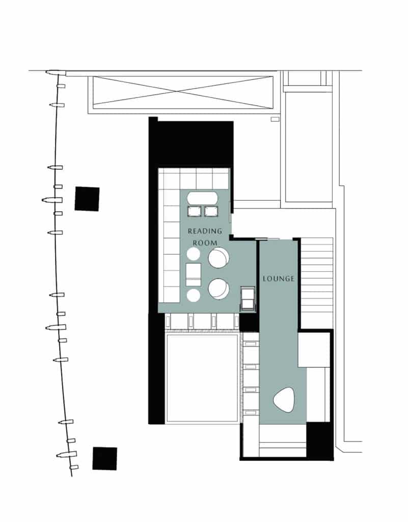
A ‘secret’ area exists on the 3rd Floor, where clients can access two private rooms from the mezzanine. Interaction with tangible design stories is important for guests, as it creates a more personal and unique experience, beyond the service of food and cocktails. It is at the highest point of the Restaurant that this notion is ultimately realized.
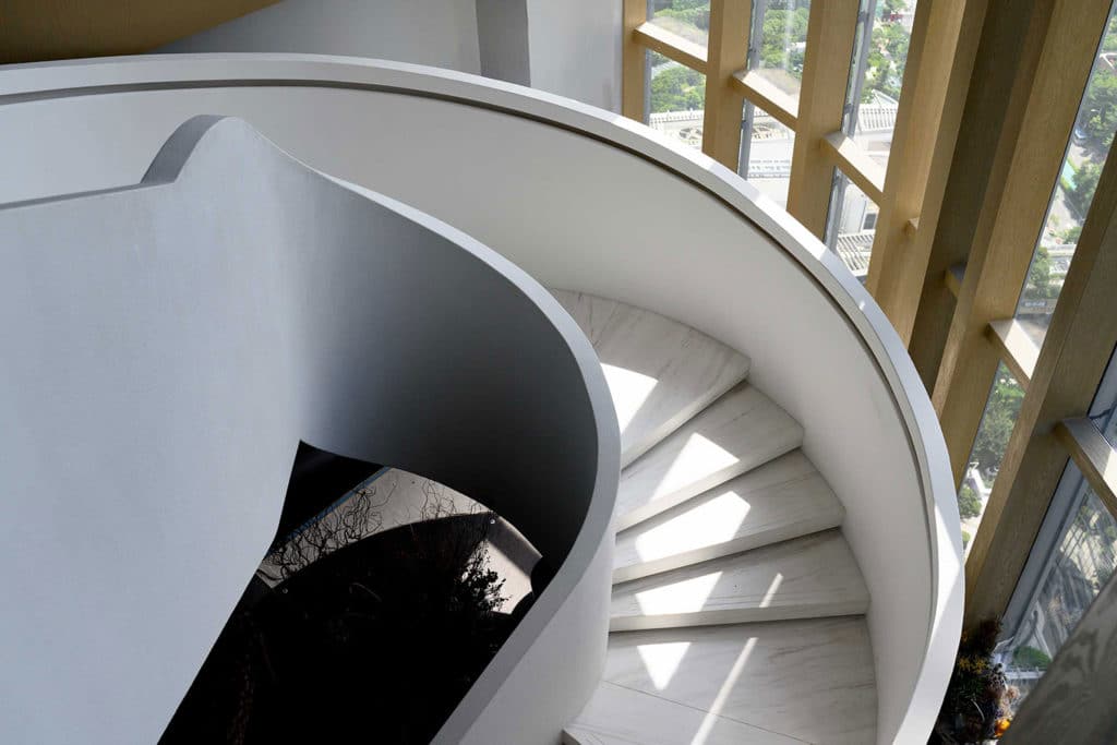
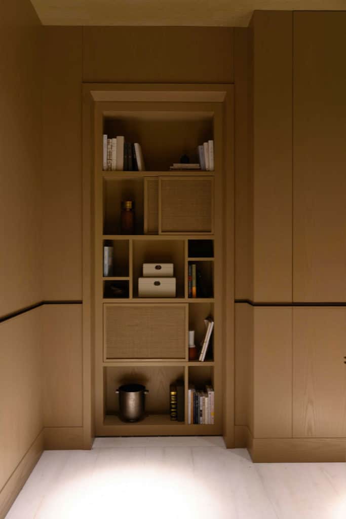
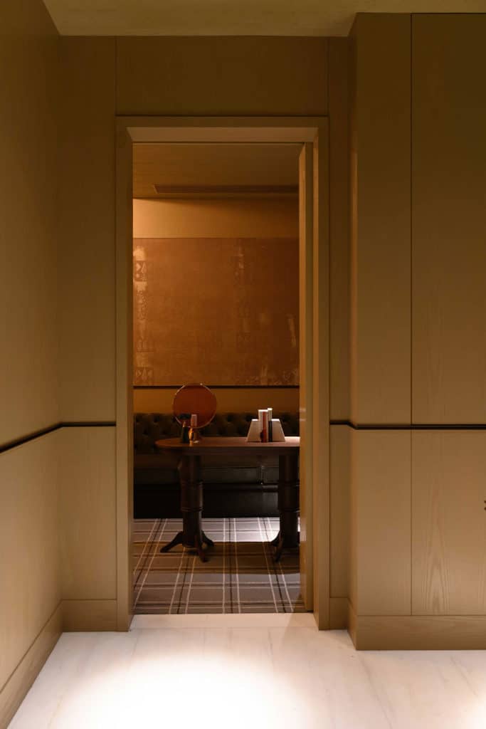
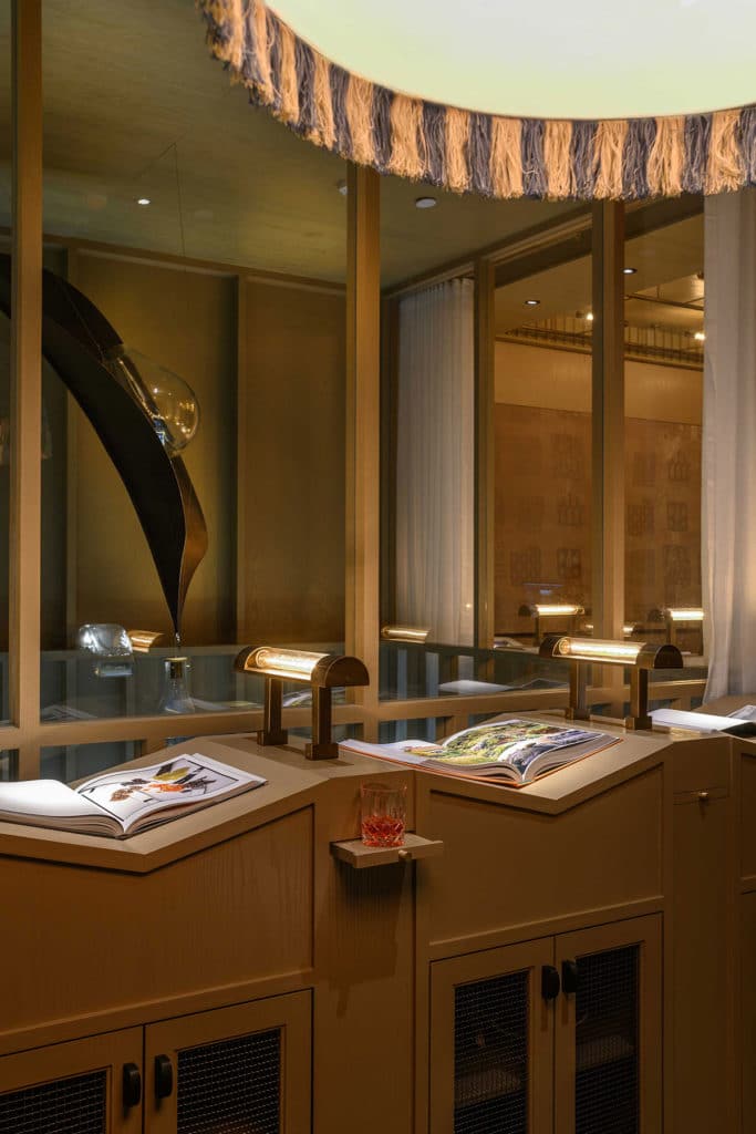
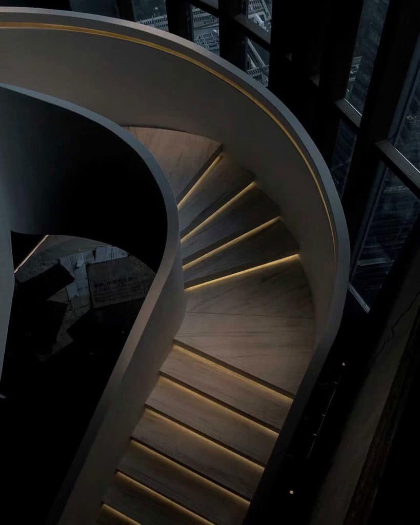
Guests walk up a white marble stairs with custom designed railing, where each iron post forms a flower bud. Ascending the stairs with this railing in hand, is reminiscent of farmers and cooks collecting dew from their land. Upon arrival, the first and only feature of the landing is a bookcase, in disguise. Various objects and compartments comprise this Speakeasy Door, that operates by pressing a lone book on the far left. This leads to what is best described as a Reading Room, showcasing books on a custom display stand that allows for large books to lay open and encourage reading. The wall at which this display is located adjoins the double height space from where the dried leaf and dew fixture now hangs at eye level, and showcases a view of the Private Dining Room and falling dew, below.
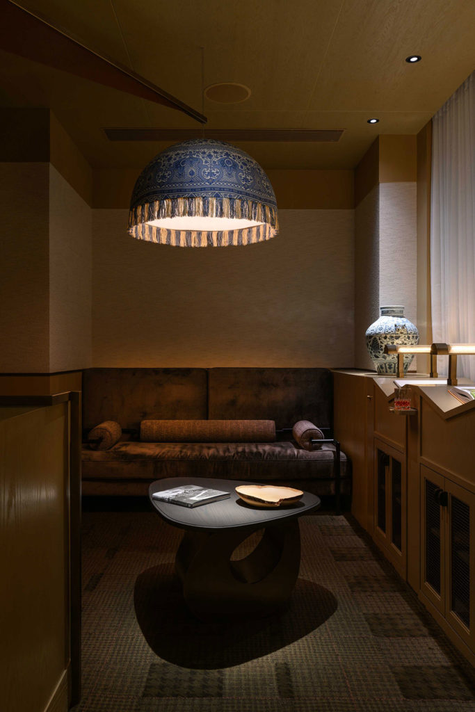
The second private room on this level similarly features a custom book display and lounge seating, in more traditional Chinese blue and white palette.



comments