
A new age Indian sweet and confectionery shop, where a French bistro meets an English patisserie
In India, traditionally consumption and gifting of sweets or "mithais" are symbolic of celebration. It has a deep-rooted association with auspicious events and is an indispensable part of our socio-cultural heritage. Even today when you want to share a piece of good news with friends and family, it is expected that you would treat them to a box of delectable sweets. Over the past few years, the ambience of Indian sweet shops has become quite routine. Display shelves fashioned in similar patterns, unexceptional dining sit-outs and the usual flooring, nothing very exciting.
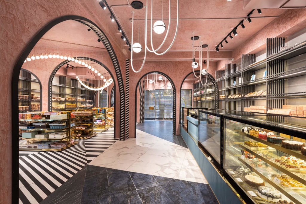
The design then became a voyage attempting to answer this question. How can a trip to the sweet & confectionery shop challenge assumptions of visual perceptions? Drawing inspiration from the versatile range of food products and contrasting flavours, concept evolution and development for Baker's Lounge became an enquiry: what would be the impression of a space that is somewhere between a French bistro and an English Patisserie? The objective then became a concoction for an unparalleled retail experience that would transcend all sensory barriers as visitors walked through the store.
In the current bustling scene of the food & beverage industry, emerges a new age sweet & confectionery shop that caters to a wide range of tastes; from a "Gulab Jamun" to a "Lemon tart"! Located in Panchkula, occupying 2500 square feet area on the ground floor of the tri-storeyed building is Baker's Lounge with a dining area that comfortably seats up to 25 people.
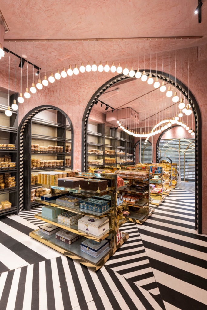
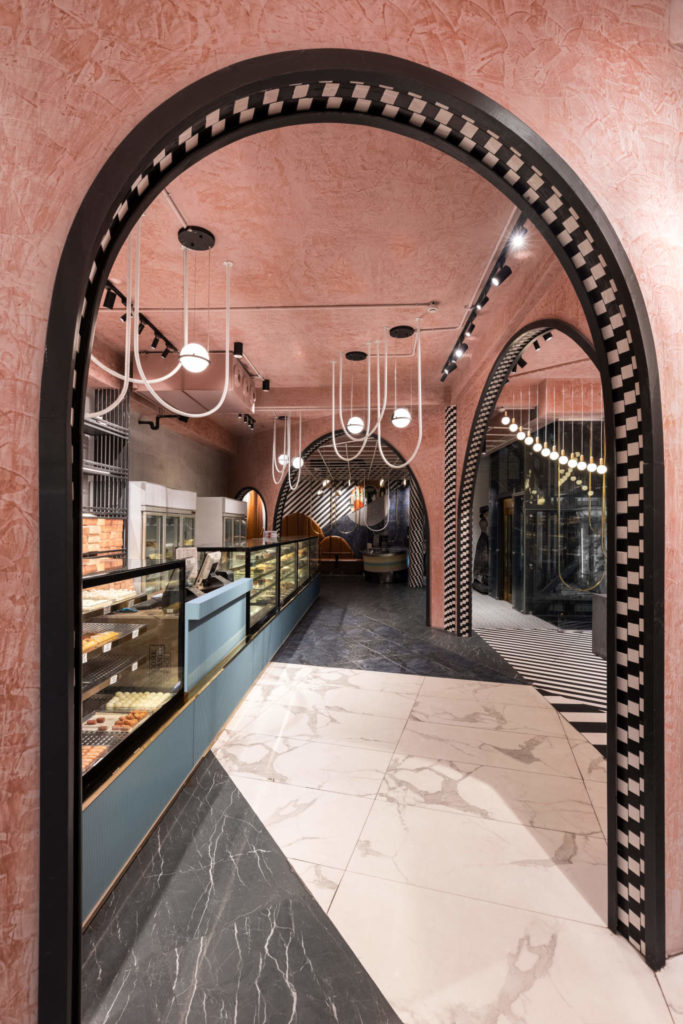
The client envisioned creating minimalist yet impactful aesthetics. Thus it became essential to develop a visually de-cluttered retail experience for the customers while being considerate to the high footfall, especially during the festival season. Discernible zones had to be schematically planned catering to myriad offerings like packaged food products, baked items, 'to be ordered' food preparations and sweets. More importantly, it was essential to converge the zones to a common visual theme in an unassuming fashion.
An effort was made to recreate the bygone British colonial era vibe. A distinct visual tone was set with art deco reminiscent arches in chequered soffits, a kaleidoscope of monochromatic flooring and pastel blush ceilings. Suspended bulb light fixtures orchestrated a vintage symphony in the form of inverted arches while metallic gold accents seal the retro vibe of the store bringing in just the right amount of bling.
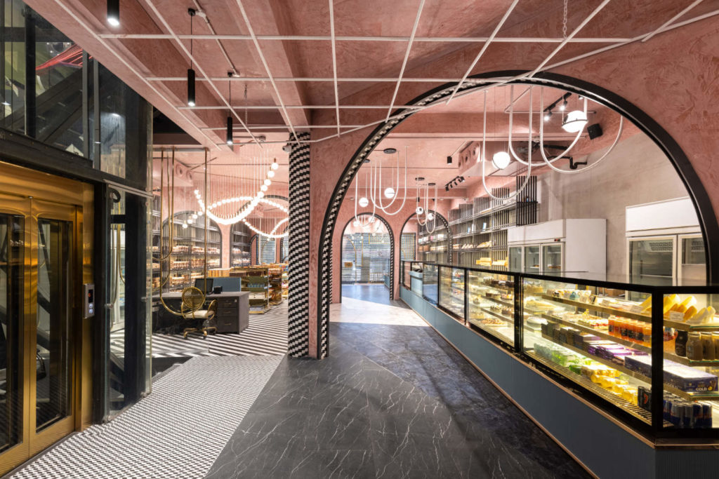
The aesthetics progressed towards a symbiotic composition of layers of elements. Arches were specially crafted to depart from the dreary and usual, unidimensional display arrangement. They demarcated multiple axes that behaved as portals, highlighting multi-dimensional intuitiveness. Subconsciously distinct experiences were created at different hours of the day, evoking an element of surprise and wonder in the buyer. To accentuate the inflexion in the ceiling, soffits of the arches were clad in chequered tiles and highlighted with black profiles complementing the monochromatic flooring. Arches are employed as a recurring element in the visual scheme in the form of compositions of gilded membranes in the front display area, along the staircase and as a backdrop in the quick dining zone.
Capturing the quintessential spirit of the 1920s, the pastel stucco marble textured ceiling is juxtaposed with monochromatic tiles. While the display racks along the light grey washed walls are kept muted, the free-standing shelves are finished in "aureate" edges for the classic "Midas touch". To facilitate the recall value of the visit, spherical and bulbous luminaries are suspended in a dramatic fashion, synchronising with the avant-garde spatial vocabulary dictated by the arches and their monochromatic character.
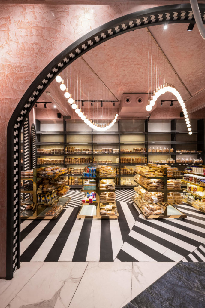
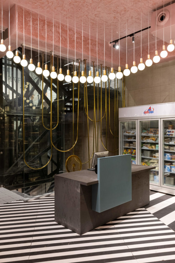
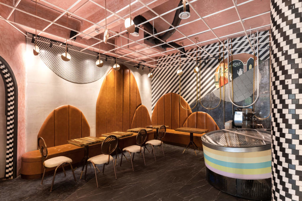
Embracing the vintage colonial times, fluted glass panels on the base of the display counters play a modest role while the combination of black, gold and white contributes significantly to enrich the visitor with a much deeper and larger experience. In the dining area, tufted tan leatherite seating, vault shaped backrests, inverted gilded membranes along with the monochromatic artwork on the walls weave a dynamic and vibrant ambience. Each element, distinct in nature and unique in function, unite to present themselves as a homogenous composition.
Counterstereotype visuals in Baker's Lounge are an attempt to transform the mundane and dreary shopping experience for a box of sweets. The motive was to weave a culinary experience that constantly renewed its escapade for the visitors with its divergence from the aesthetics of a regular "mithaiwala" shop. Interestingly, the pursuit towards reimagining a habitually frequented location became an inward journey, with a quest to conceive an atmosphere that is unhackneyed. The enquiry and the process for the design of Baker's lounge, transformed into a deviation from the prejudiced assumption of a retail outlet character. The outlet continues to be the busiest sweet shop in the city, thronged by visitors at all times of the year.


Credits:
Principal Architects: Badrinath Kaleru, Prerna Kaleru
Design team: Anusha Sharma, Pragya Singh, Karuna, Satish Kumar
Lighting and Electrical: The Luminars
comments