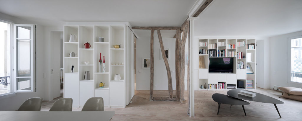
The White Apartment - A combined refurbishment of two Parisian apartments to create a unique family dwelling.
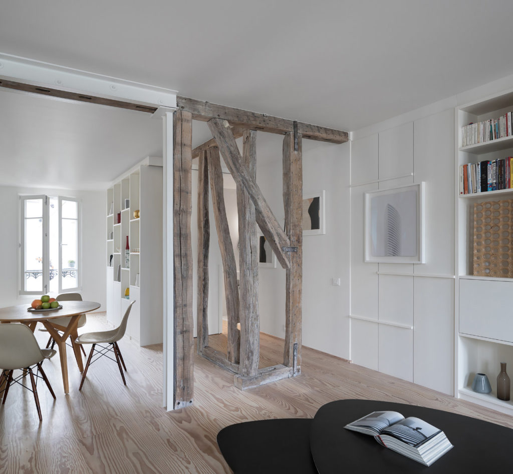
Two adjoining apartments have been combined to create a single family sized flat along with a well-designed studio for rental. Layouts have been reconfigured to harness the light available from two elevations and some Parisian cachet has been lent to a fairly standard space by exposing the original wooden structure.
The brief was to create a new home for a family with two young children, who wanted to stay in central Paris but who also wanted the kind of fluid, open, light-filled spaces not often possible in apartment living.

Rethinking the overall layout of two adjoining apartments, both in a very dilapidated state to maximise the light of its southern exposure in creating a single apartment.
Working with the original wooden structure of the 19th century building, while minimizing structural interventions.
Providing the apartment with an authentic identity that recalls its historical setting, despite the fact that not many of the original features were left.
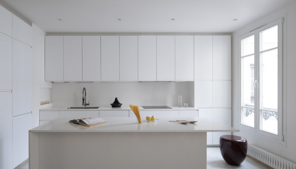
The two adjoining apartments have been combined to create a single family sized flat along with a well-designed independent studio for possible rental. Layouts have been reconfigured to harness the light available from two elevations, with the living room located along the southern façade to maximise sunlight, and a kitchen/dining space located along the northern façade.
The apartment creates the ultimate in family friendly living, with communal space to cater for a variety of activities - playing, cooking, dining, relaxing and socializing.

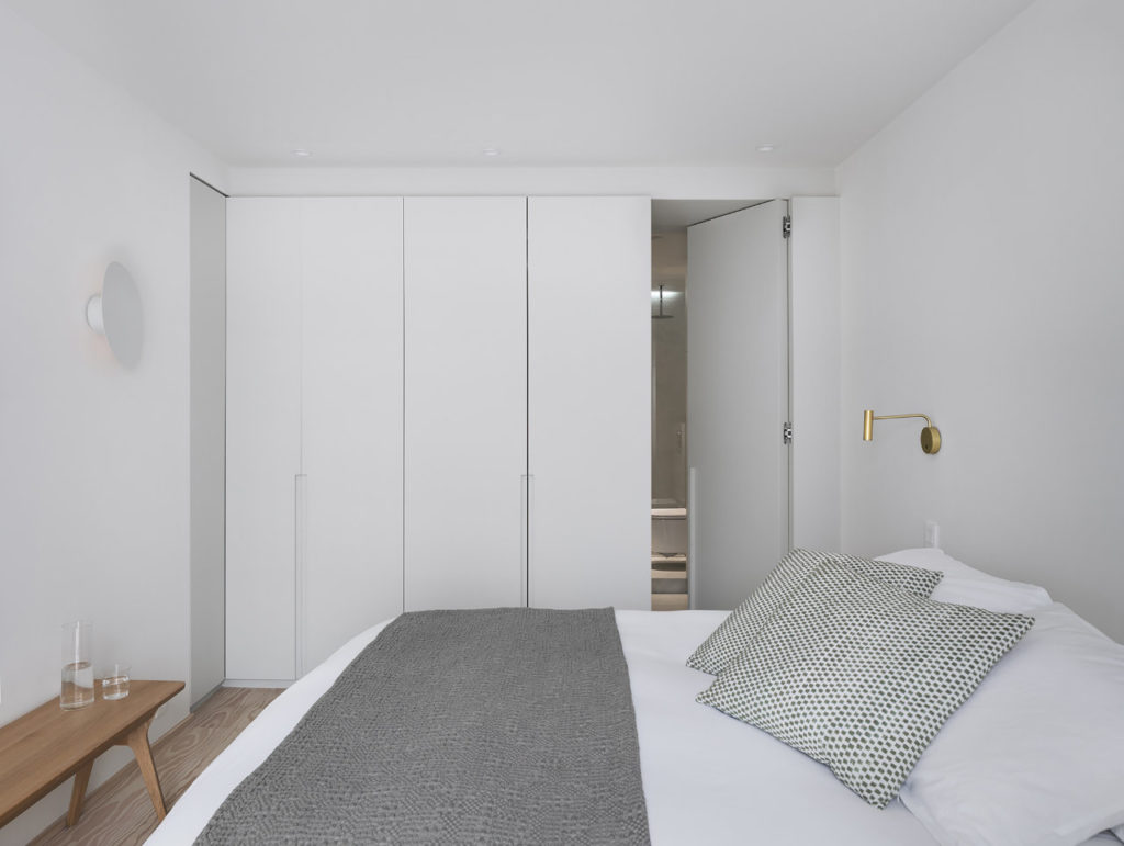
Bedrooms and office space are located towards the periphery with bespoke joinery used to create division/privacy and yet blurring the distinction between walls and storage. Corridors have been designed out to utilise every square meter of available space and ensure that it is in use, rather than being lost to circulation. The two doored bathroom can be accessed from both the children’s and guest bedrooms, creating a loop and providing an enhanced feeling of spatial circulation.
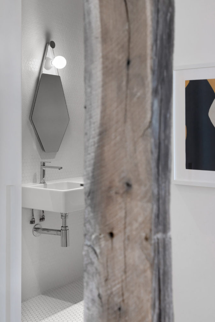
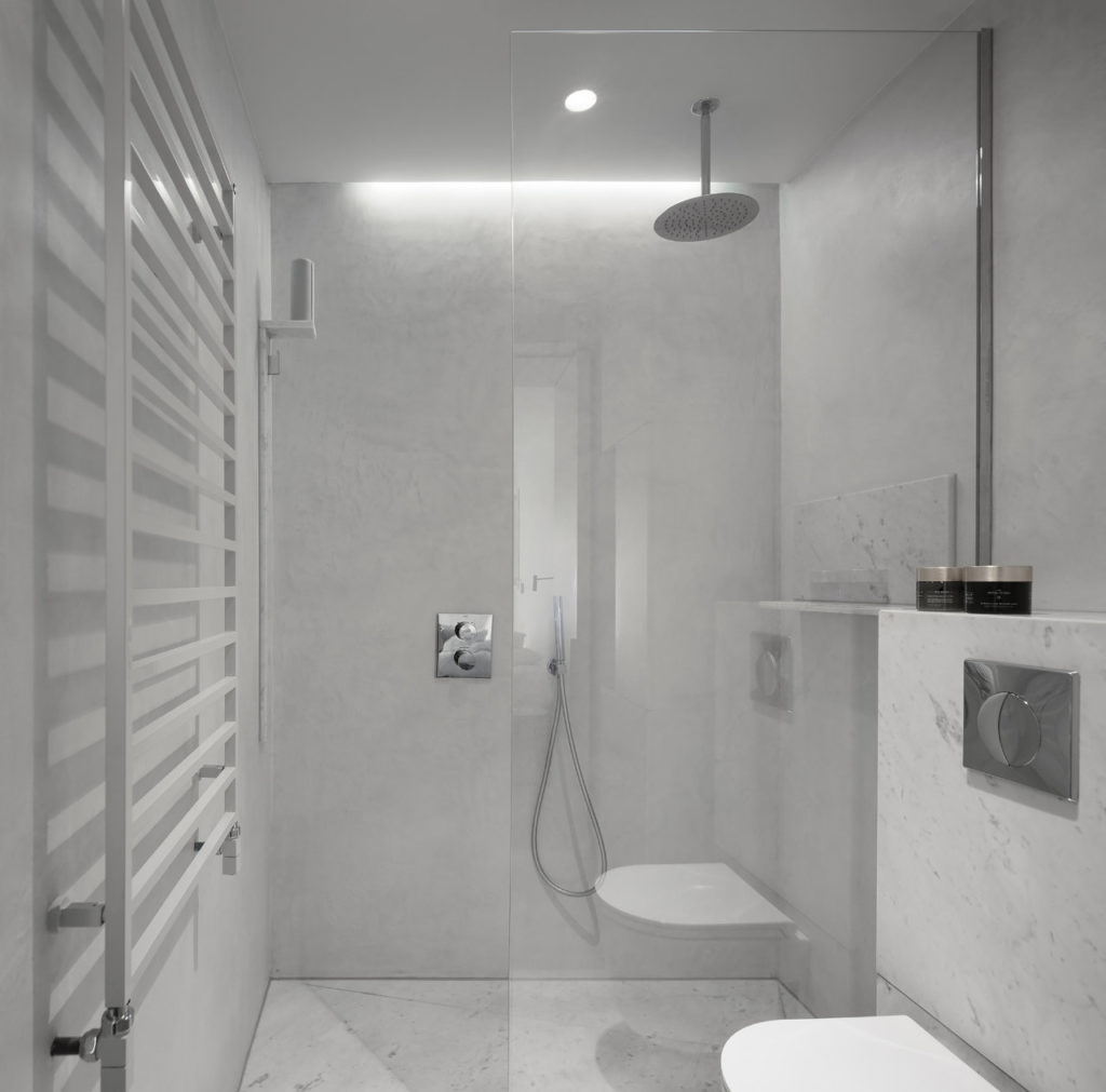
Some Parisian cachet has been lent to a fairly standard space by exposing the original wooden structure. Finishes are minimal, with Dinesen pine flooring and a palette of whites - walls, painted wood, quartz countertop & white-washed wooden floors – creating a neutral yet stylish backdrop to family life. The bathroom combines Carrara marble and functional concrete for a contemporary feel.





comments