
Text description provided by the architects
We always find joy when we get to work with clients that are members of their community who prioritise creating spaces that bring people together. Whether it's a playground, a childcare centre or residential project, the architecture can support activities that allow for and inspire connection. Seeing value in community connectivity allows a project to move beyond ‘hero architecture.’ The architectural gesture comes later as a result of an intellectual process fuelled by the incentive of why we are doing it in the first place.
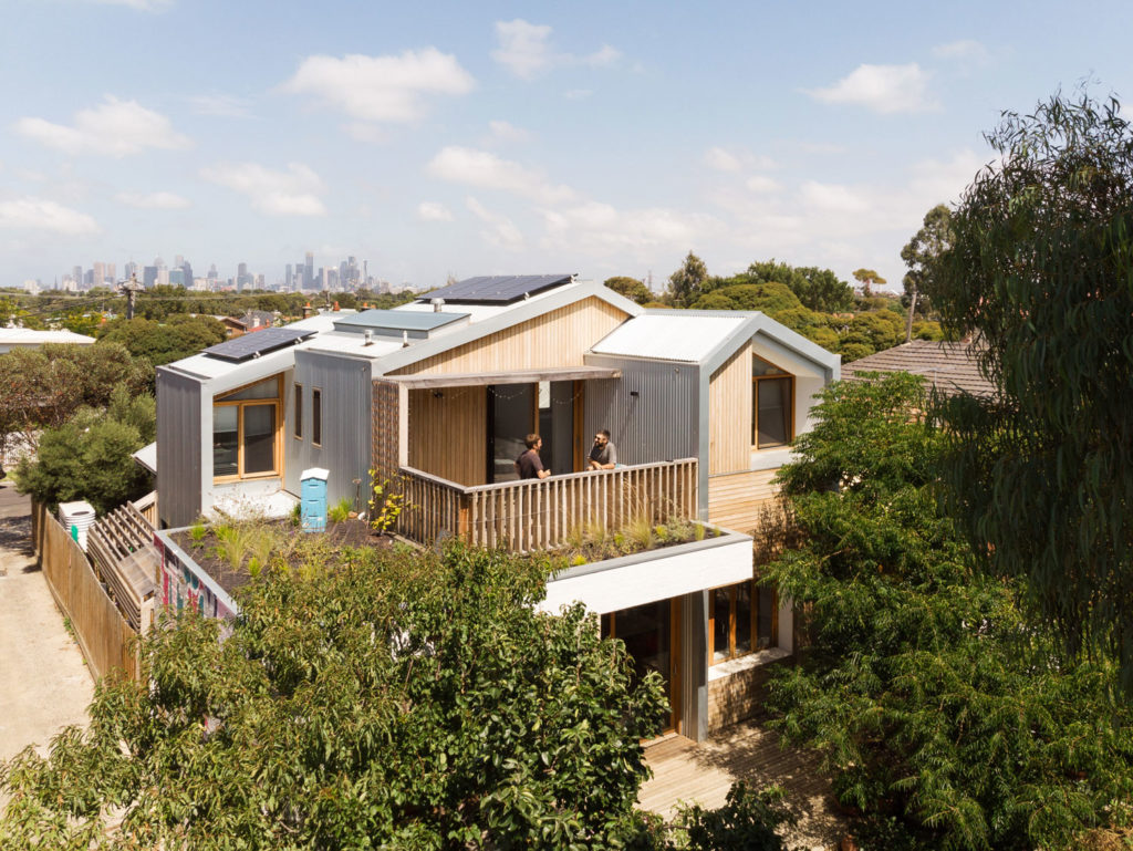
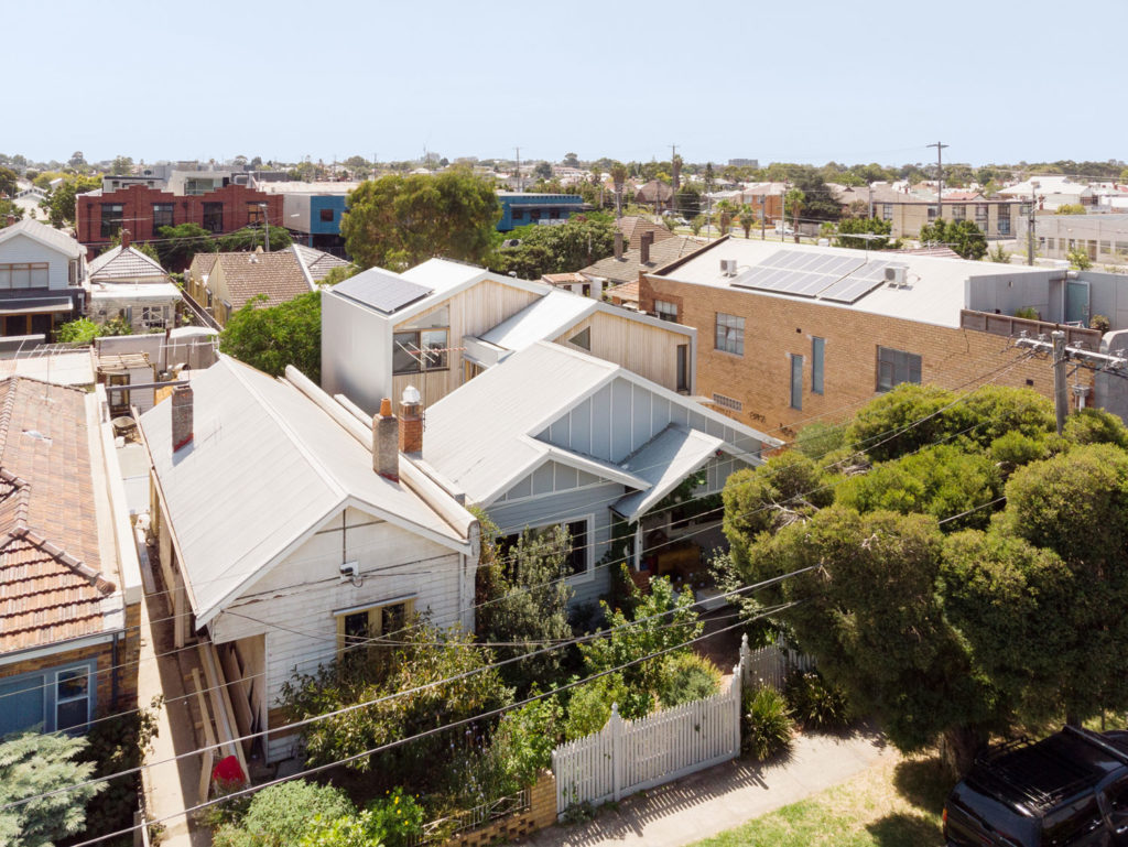
When a family comes to us with an old house or terrace like the one in this project, they’ve accepted that the small, pokey and often dark spaces don’t provide reasonable opportunity for their young family to evolve, flourish and enjoy the lifestyle they’d inevitably like to lead. Our intention with the Elm Street project was to open the house up through the connection of spaces internally while at the same time, letting the outside in. The project also sees a balance between retaining old building stock and a reconfiguration for better family life. It also involved a restructuring of the segregation between formal and informal space.
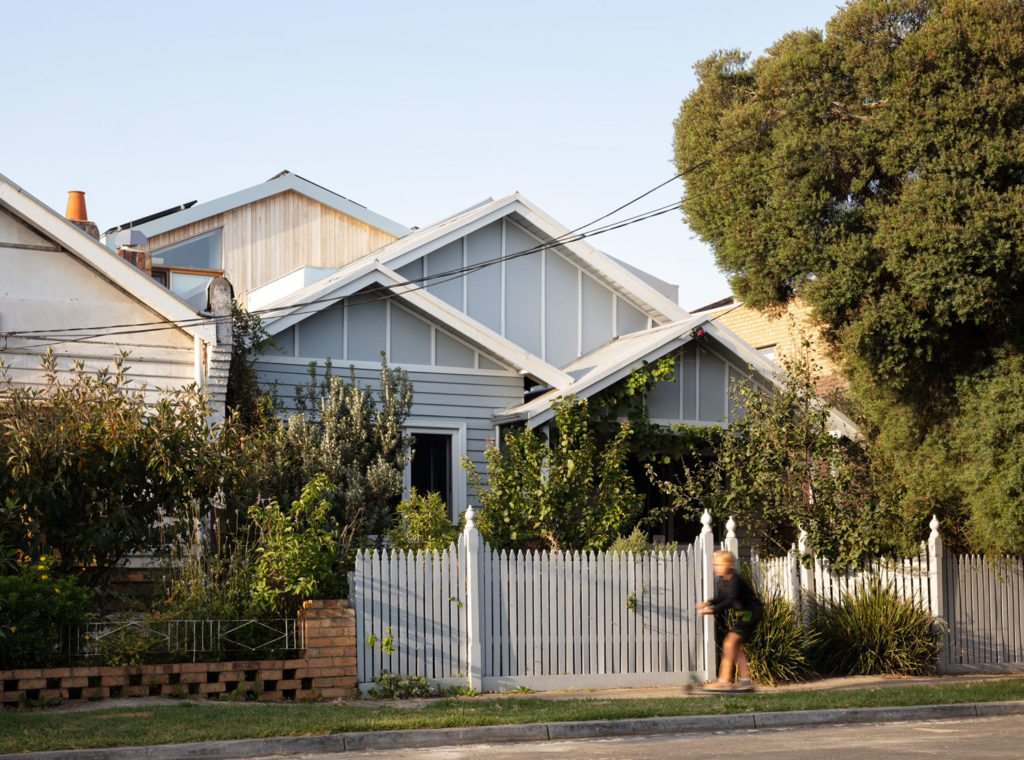
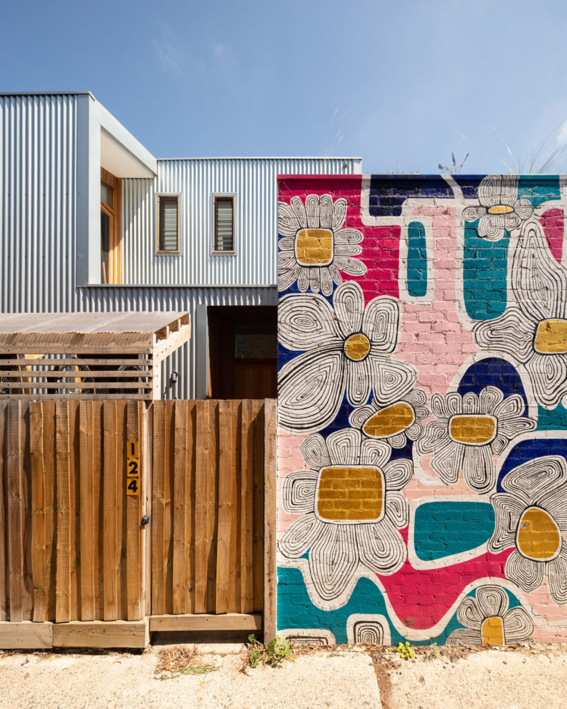
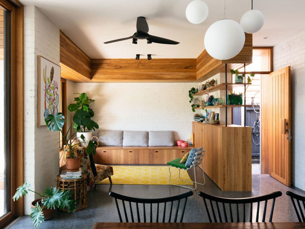
The family at Elm Street are really connected to their local community. They’re friends with all their neighbours and we designed to encourage that, to sustain and grow that connectivity. The clearest gesture that allows this was reconsidering how you enter the home. The entry to a Californian Bungalow is typically through the formal front door. Moving away from this, we supplemented an additional entry off the side lane. The old idea of coming in the front door, where you find the ‘nice room’ that the children aren’t allowed in, that has the crystal cabinet and granny drinking sherry is broken down. The side entry is defined by a mural that is strongly identifiable. All the neighbours know that when you visit, you go down the lane. This informal entry is straight into the living space, so the private family area can easily adapt and become community space.

In a majority of our jobs we tend to reverse the traditional ideas inherent in the layout of older houses. The rooms provided are more defined by the sorts of activity spaces the clients need. Additionally, in two storey family homes, we aspire to strike a balance between connectivity while also providing quiet nooks. In this way, an awareness of and an engagement with everyone's movements in the house can be fostered.
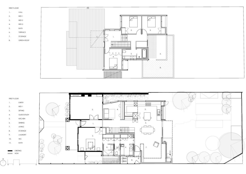
This house is zoned into three clear areas. The children's bedrooms upstairs, the adult bedroom downstairs towards the front of the house and the living spaces and noisy spaces towards the rear. There is a main informal living space as well as secondary spaces provided for other family activities. On the ground level, the spaces provided have the flexibility to be used in a number of ways. For instance, the study may at times have adults doing the household bills late at night. At other times, you’ll find children doing homework or practicing the piano. It’s where long-term craft projects can take shape or where Lego and jigsaw puzzles can intermittently take over. In this way, we’re able to provide a lot more amenity in a smaller footprint.
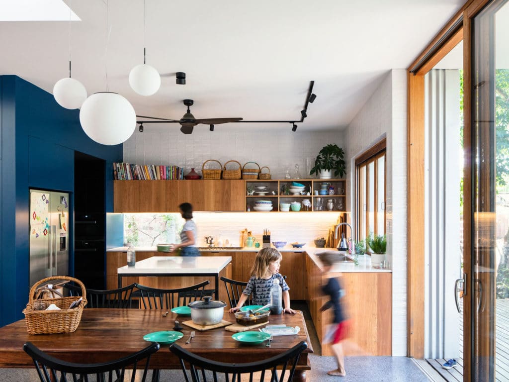
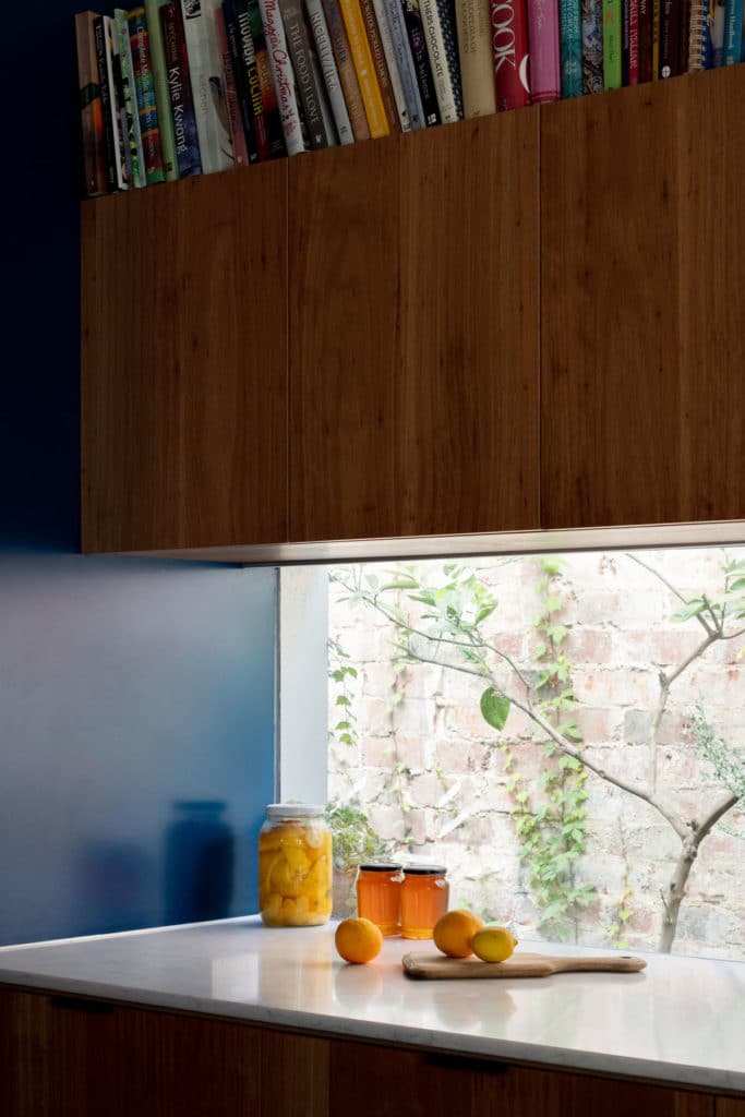
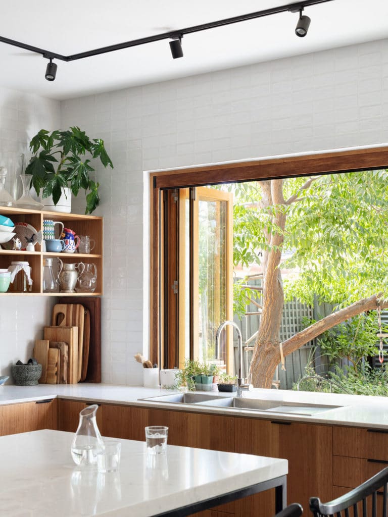
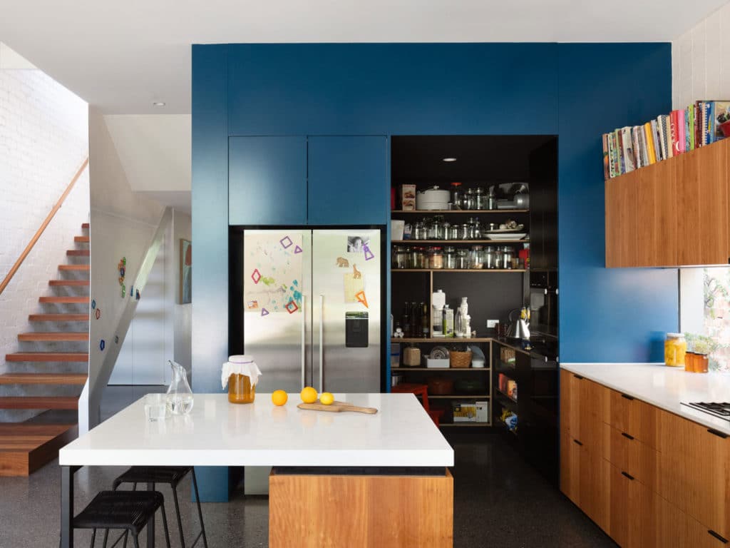
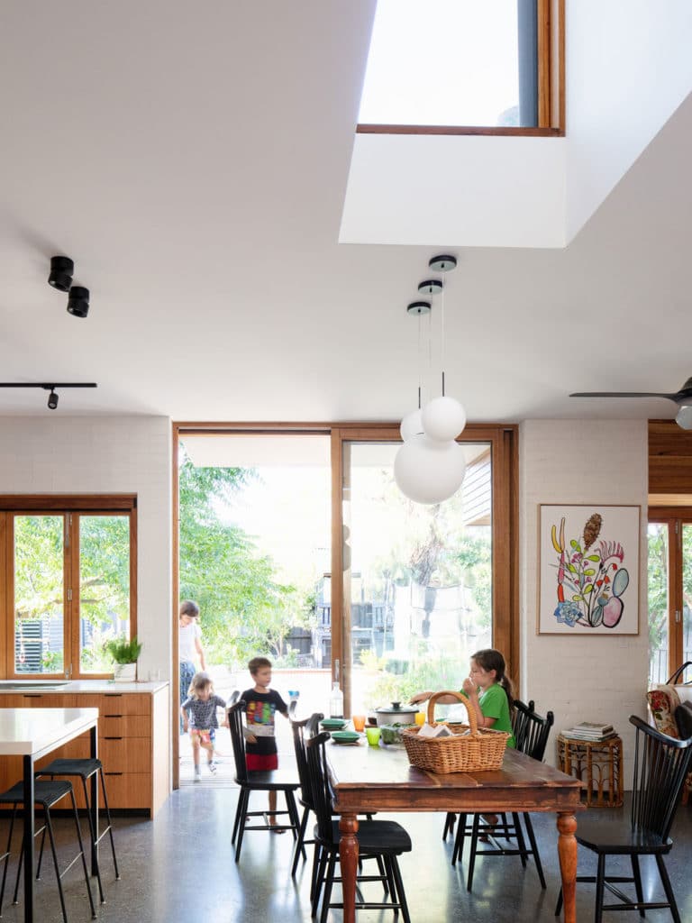
The clients have three young children and their family life like most, centres around the kitchen. We designed a large, open kitchen area that connects to the dining and living spaces as well as the backyard. They’re also very keen cooks. They preserve fruit, make Kombucha, keep bees and grow a lot of herbs and vegetables. The open walk in pantry, plenty of bench space and storage are all approaches that allow for lots of food to be produced.
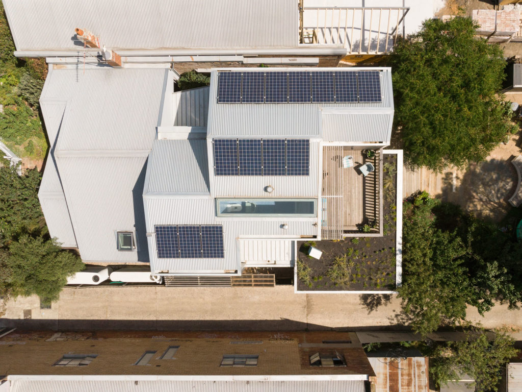
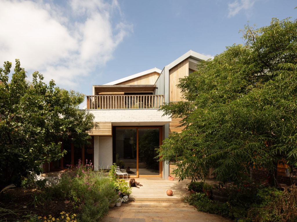
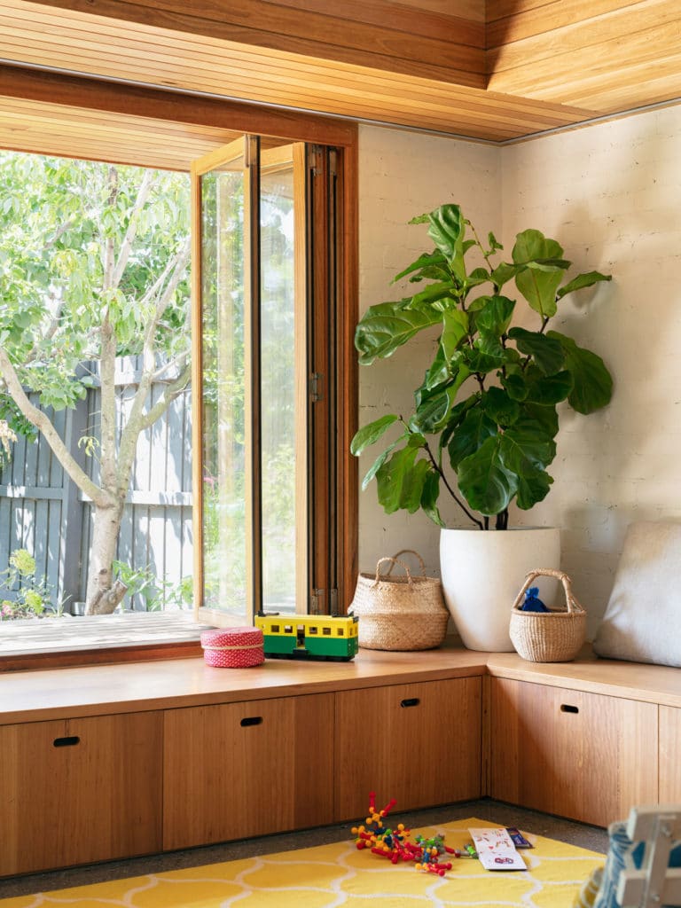
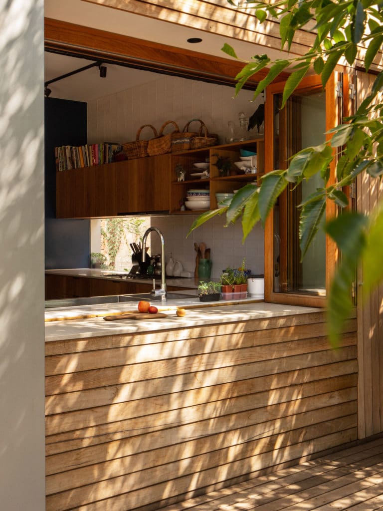
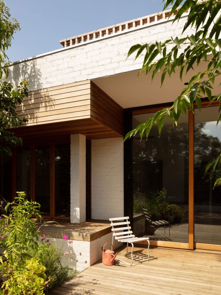
For the family at Elm St, the outside is just as important as the inside. Their backyard works hard to provide space for playing with a cubby house and trampoline while half of the area is an overflowing edible garden and chook pen. They also identified that they enjoy eating outside so the relationship to the garden was really important. To enhance this, we incorporated a kitchen window that opens to become a servery and large glazed doors that allows the dining to flow out onto the deck. The fold back windows in the living room lets the inside activities spill out with a generous space for different play activities or a number of friends and neighbours to gather and sit in an informal setting connected to both the action inside and the garden. The deck on the upper level, looks down on the main garden. Rather than leaving an accessible area of roof bare, a green roof was incorporated. The green roof becomes an extension of usable garden space with the area for bee keeping.
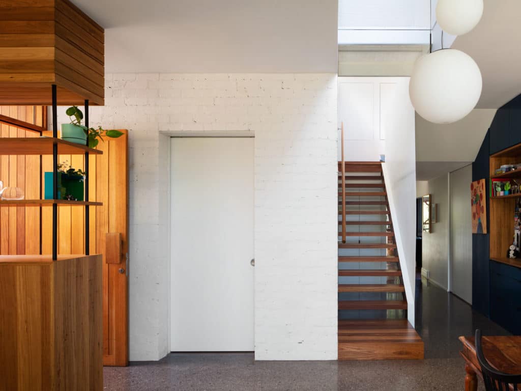
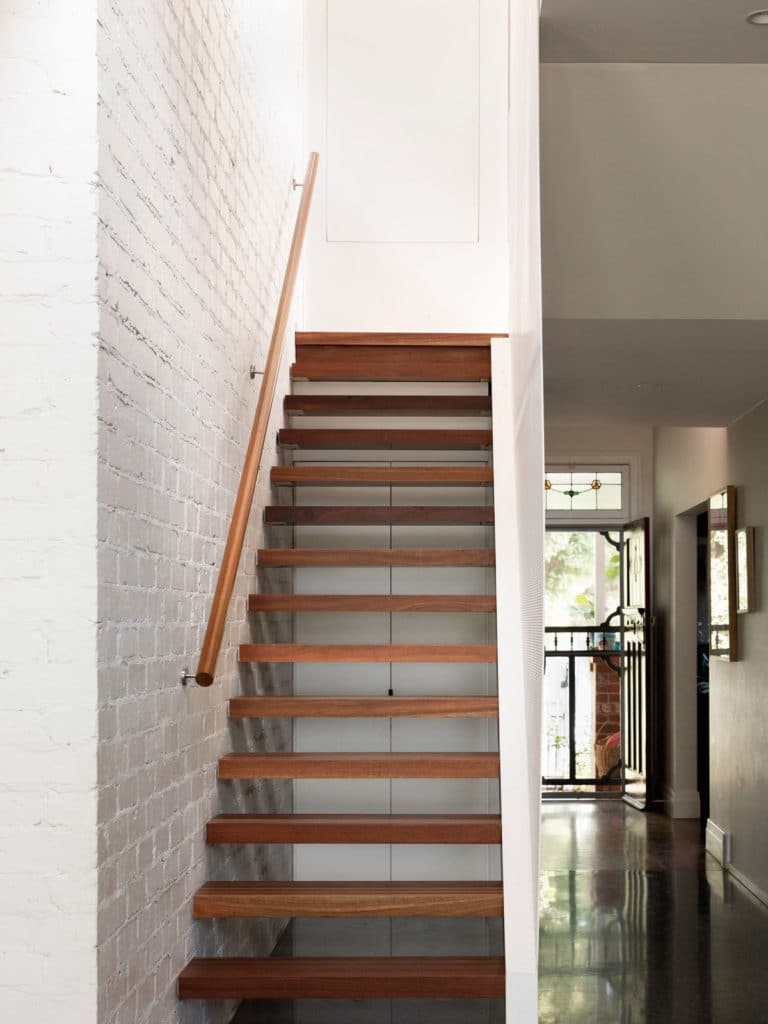
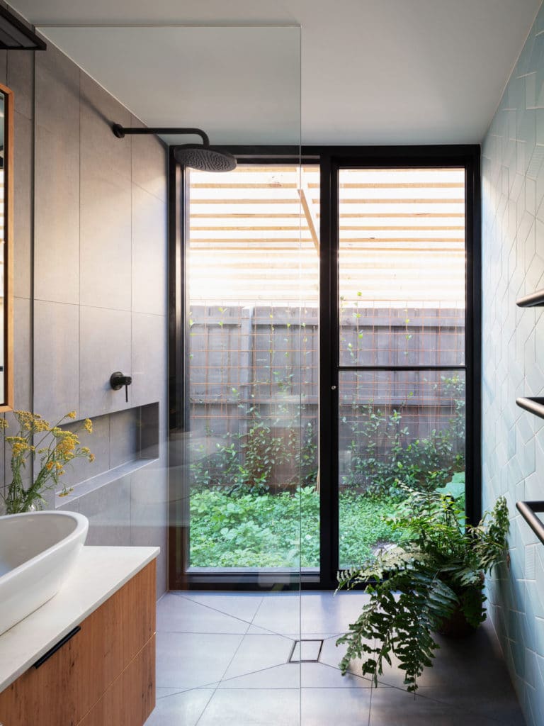
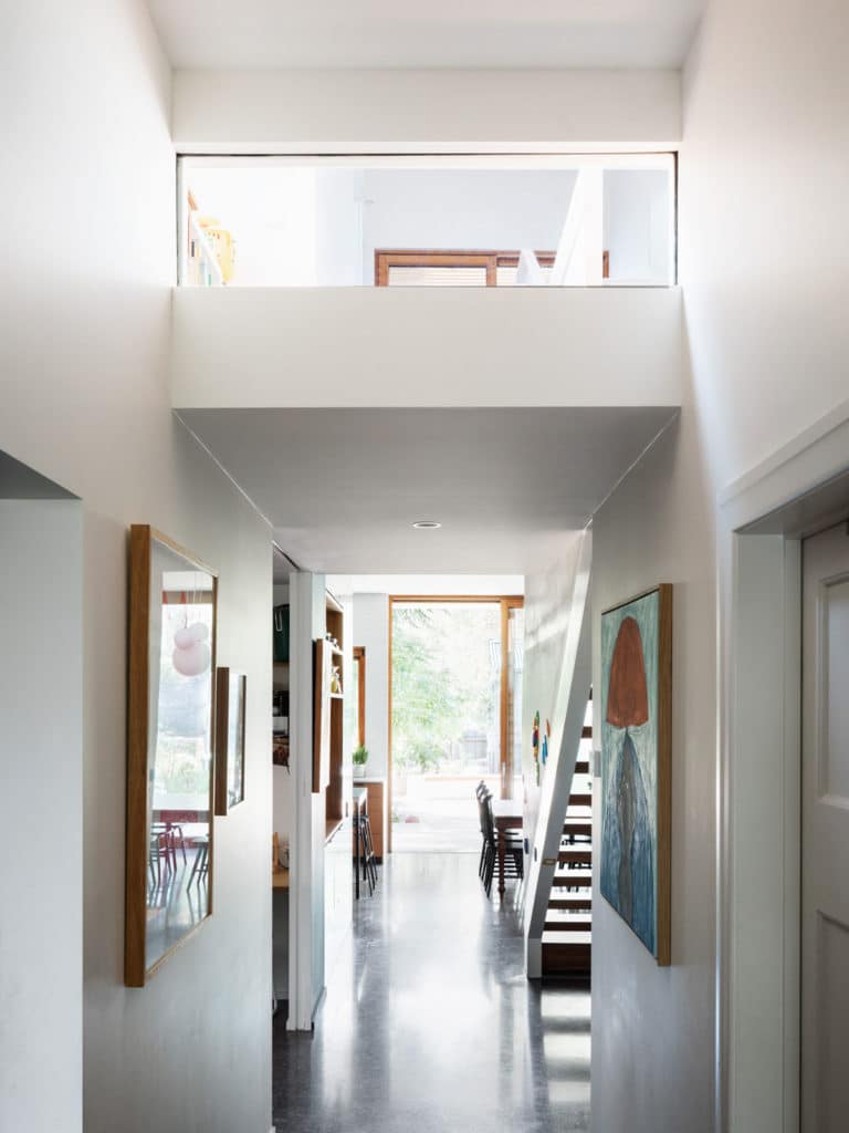
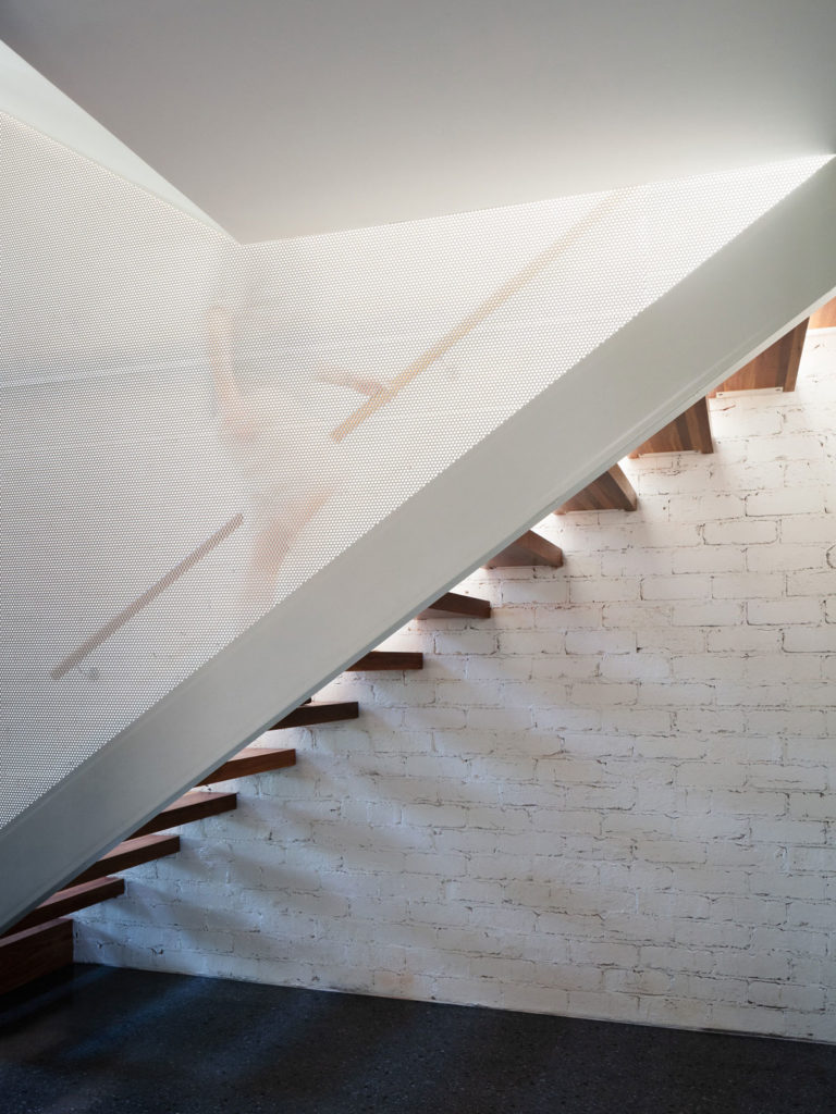
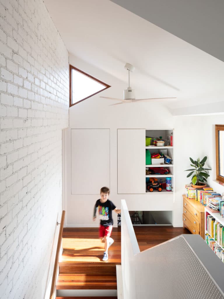
The relationship to the outside guided a plethora of other design decisions. A range of openings assist the connection to the outside and help define the spaces. For instance, hidden courtyard gardens were provided outside the downstairs study and ensuite. Expanses of glass allow these small rooms to connect out and feel more open. Longer views of trees in the distance are captured from the upstairs bedrooms. A snippet of the outside is seen through a small triangular window at the top of the stairs, providing a view that’d be missed otherwise. The central stairwell also allows a strong visual connection between the two levels providing an important sense of spaciousness.
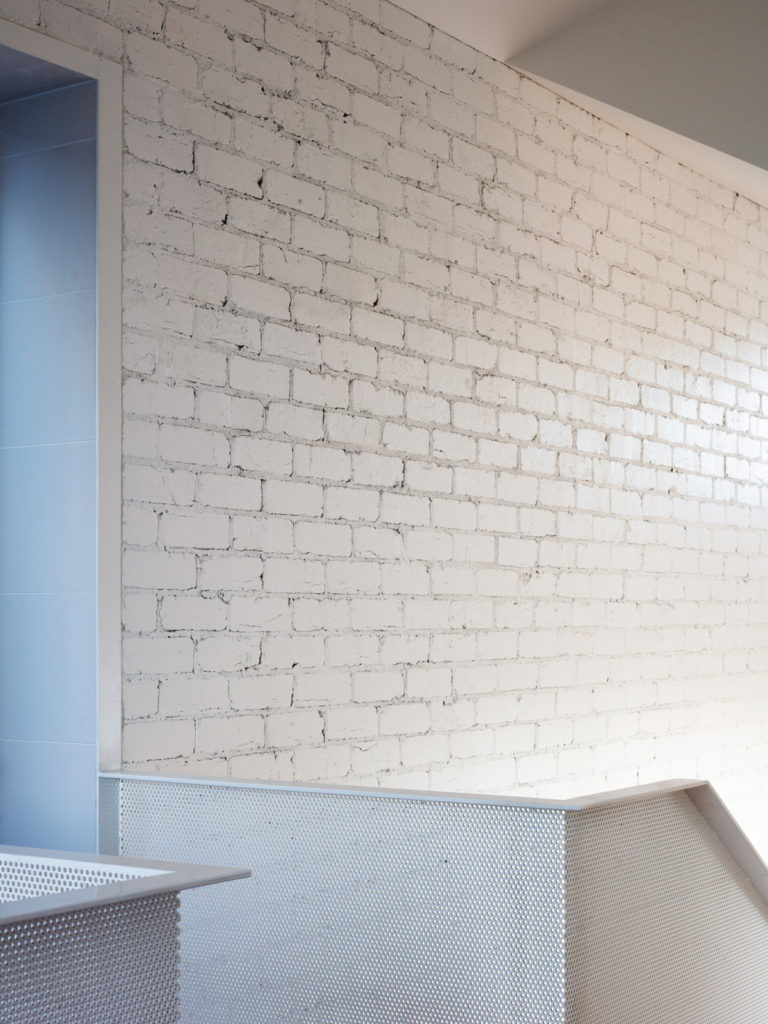
By having the two stories spaced around the stairwell, a thermal chimney effect is created where cool air is drawn from below and exhausted at the top. This house has ceiling fans but no air conditioning and is really comfortable. The thermal mass of the brick wall and concrete floor also assists thermal regulation. The brick wall that runs down the middle of the house provides a visual texture that identifies the spine of the house. It works thermally as a heat sink as well as a cool sink, assisting the moderation of the indoor environment. The building fabric itself is highly insulated and considered north sun shading has been provided. The project also incorporates water tanks and PV cells.
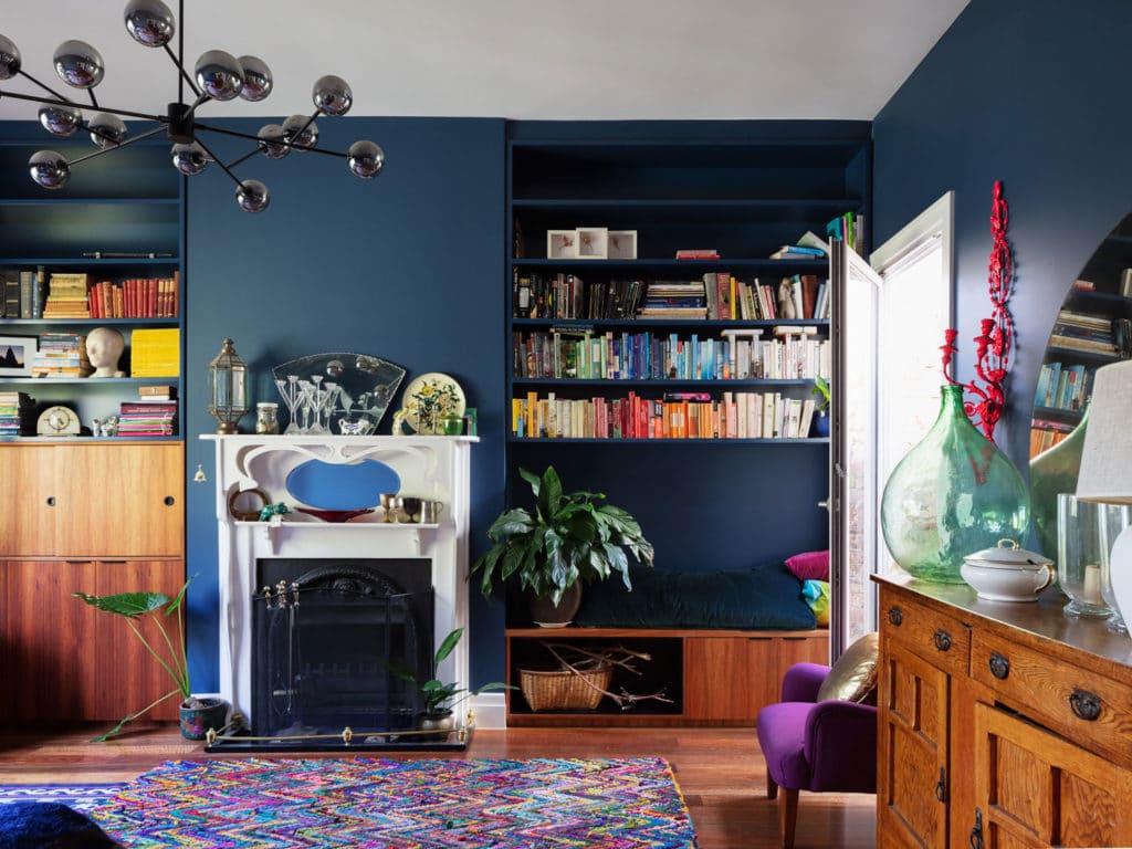
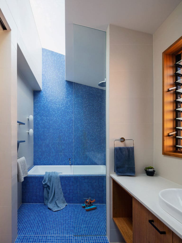
Choices around aesthetics in our projects are heavily influenced by visiting clients and seeing how they live. The reality is, no matter how minimal or restrained you may create a home, clients are likely to live in a very similar way as they always have. We also avoid being too definitive. We want the house to match people's personalities and allow them to adapt the spaces over time. For this family, we saw that they are great collectors, they have heart. There's always food production happening, craft projects, children’s art and toys around, as well as a dog and the chooks. We prioritised making small gestures, avoiding the house feeling contrived where every beautiful thing has its place. Instead, a backdrop is laid that allows the house to evolve and change alongside the family. Gestures such as the deep blue walls of the pantry help emphasize a space. The use of a strong colour contrasts to the glass and timber that opens to the outside but it's recessive rather than trying to stand out by itself. By being recessive, the belongings and features become the hero in the space.
The external form of the Californian Bungalow had the defining feature of the typical gabled roof. The roof of the new section takes the vernacular form of the gables offset from the retained roof. We liked this sensitive approach that saw the new extension not dominating the existing. In a sense, it could've always been there. It looks new in materiality and execution rather than form. Internally, the roof shape allows interesting and dynamic ceilings in the upstairs children’s bedrooms and bathroom.
The form of single residential homes is evolving. Today we see suburbs full of bigger, grander houses with high fences and tiny backyards. In our opinion, these houses that foster a family life conducted primarily inside, miss the mark. In terms of this single residential project, a focus on community set foundations for a house to avoid being a primarily internalised experience. An internally and externally connected home is created fostering the family life the clients identified in our first meeting with them and creating a home that is comfortable, spacious, practical and flexible.


comments