Text provided by the architects
This innovative two-story dwelling prioritizes ground-floor accessibility and enhances the living area within the constraints of a narrow lot size. The design optimizes space to conform to site restrictions and regulations while enhancing the overall comfort of the residence.
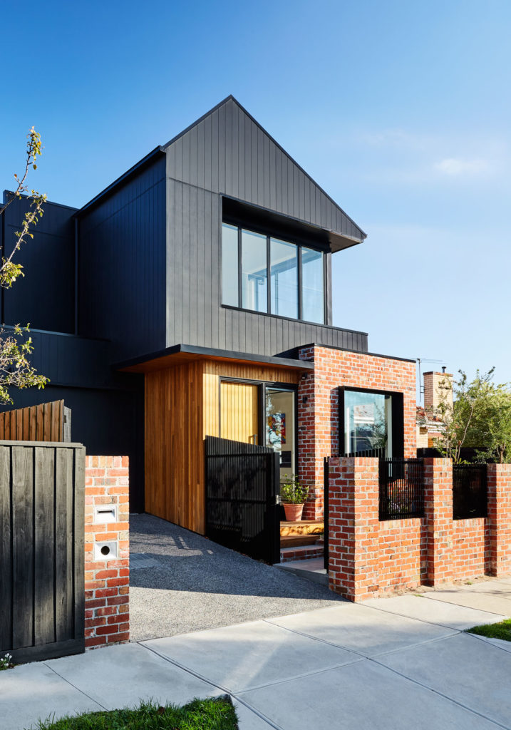
Architecturally, the pitched structure is complemented by expansive openings, resulting in generous eaves and window sills. This architectural approach aims to connect with the street and acknowledge the corner location of the house. These openings serve to blur the boundaries between indoor and outdoor spaces, accommodating a variety of spatial functions.

The key challenges are neighbourhood context, planning regulations and constraint, budget, building area to accommodate the client’s brief whilst fitting on a small site.
The client lives in Bentleigh for 45 years. Her previous home was a 5 bedroom double storey house. Being a large home, it was becoming too hard to maintain by herself. She wanted to downsize to a 3 bedroom home however she did not want to move far away from her friends and family. She loves the Bentleigh area and she could not find anything nearby that she liked, or that suited her needs. She decided to engage Atlas Architects to investigate the potential of building a new townhouse at the rear of her existing house. As her existing property is a corner lot, a new townhouse would have its own street address. She did not want to demolish the existing house as she built this 30 years ago and believes it is still in good condition and that a new family could move in and enjoy the space. She felt that it would be wasteful to demolish a perfectly good home.

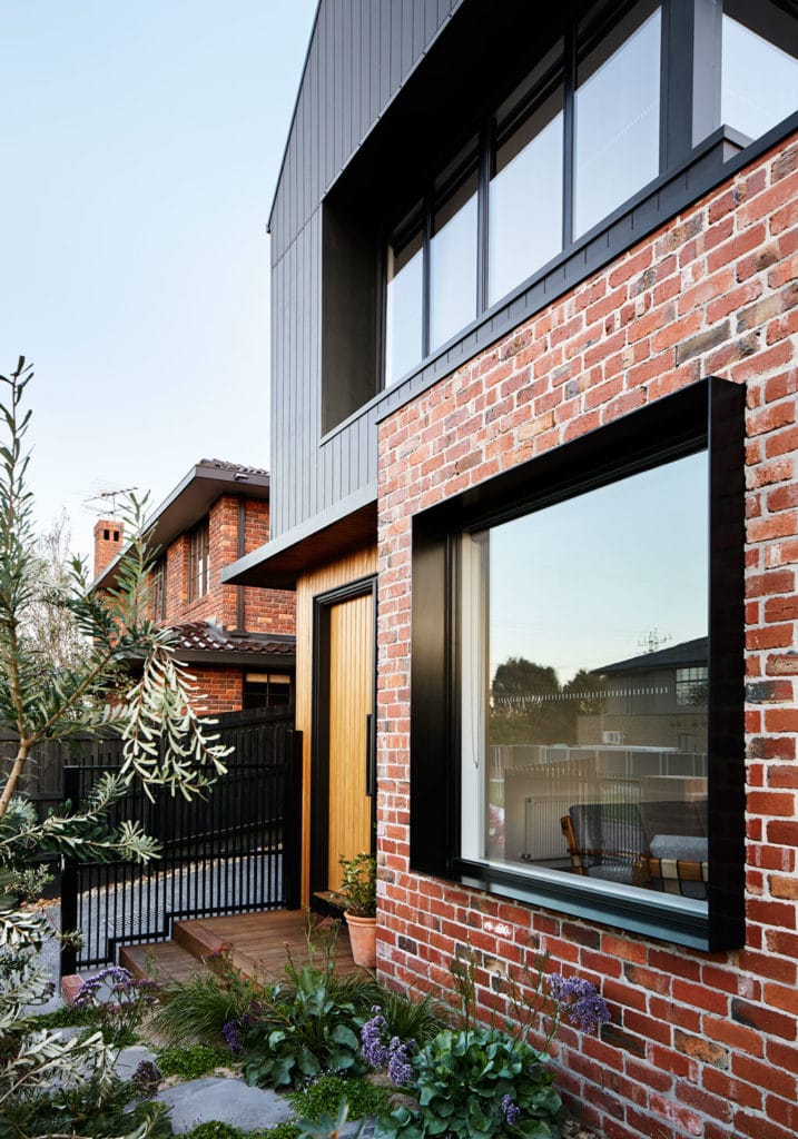
The effect of a silhouette is achieved by the colour of burnt wood and effectively conveys the outline of the new volume. Material textures such as bricks, shiplapped timber, and vertical grooved linings were introduced to visually relate the new building to its surrounding context and to our own experience of Australian houses. Together they generate a sense of human scale. The rich texture of recycled red bricks and natural finish vertical shiplapped timber cladding speaks to the adjacent building materials, whilst painted vertical Scyon Axon smooth cladding mitigates between the familiar brick pattern and shiplapped timber cladding.
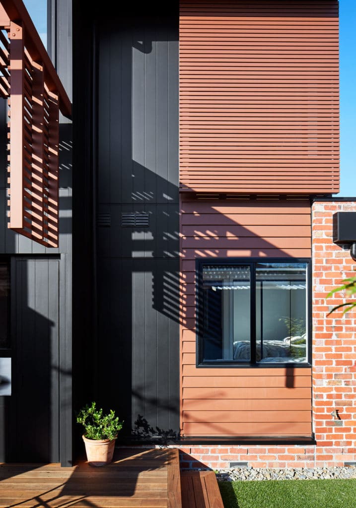
Other finer elements of the building such as screens, cantilevered pergola and horizontal cladding were used to break up the silhouette massing in the outdoor living space. These elements were timber battens and Primeline Weatherboard, painted with a colour similar to brick in order to transition from bricks to ‘the silhouette’, encapsulating the outdoor room. The paint colour has a similar tone to red bricks, warm and familiar.

The facade has large open windows to capture the city view and the street. It creates a sense of openness from the internal spaces as well as from the street. The deep steel window box detail on the ground floor and deep window reveal on the first floor add depth and shadow to the façade.
The contrast between natural timber cladding and black Scyon Axon highlights the porch/entry area creating a focal point.
The pergola cantilevers over the deck area. It defines the outdoor room without impeding on the circulation and function of the space.
Neighbourhood context and planning regulations: Council initial response was not supportive of the development, so we had to make additional effort to articulate the building façade and volume. The design outcome and expression were to minimise any impact on the neighbour’s amenities, whilst still achieve the architectural vision. We worked closely with a town planning consultant to address every aspects of the Rescode and local Council concerns.

Budget: Budget was always at the back of our mind when designing and documenting the project. We were aware that the new house must be within the client’s financial capacity and property market valuation. Various cost plans were acquired at different stages of the project to keep our feet on the ground. Additional cost cutting exercises were done after tender with careful considerations in order to keep our vision while reducing cost where possible.
Building area and spatial efficiency: As the site is small (approx. 11x19m), the brief was to make the whole ground floor accessible for the owner. The first floor is mainly for visiting family and guests.
The build location and design was tight as it was situated on a small block. James Hardie Axon cladding enabled us to store and install the sheets off the scaffolding we had erected instead of having a work station on the ground and trying to pass up each sheet individually. It only took 2 men to install where as other system such as foam and render consists of other trades and more materials. Also being a sheet product installation time was quick.
comments