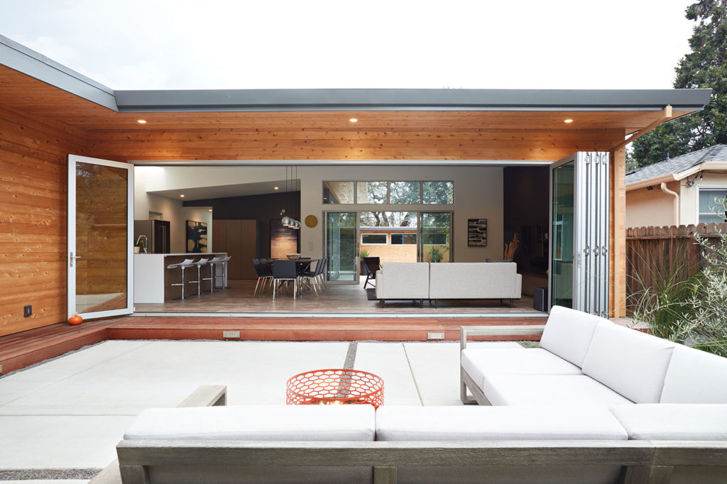
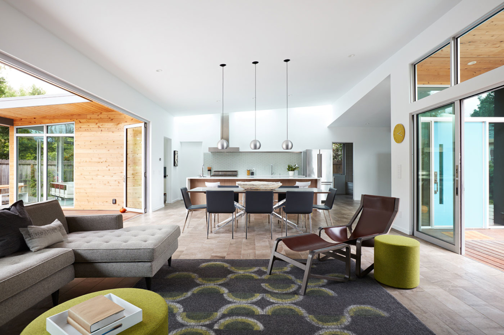
The previous owner of this 1960s modern home covered over the walls of glass with plywood and installed a massive awning at the rear of the house, blocking out most light and connection with the outdoors. The original interior had a maze-like layout starting with a small entry area and moving into too many hallways. In short, the house felt dark and closed-in. Nevertheless the new owners saw the potential in the home, purchased it, and hired Klopf Architecture to help them realize the potential. Today it is an open, light and bright, indoor-outdoor, clean and simple, modernist home for two professionals and their young son.

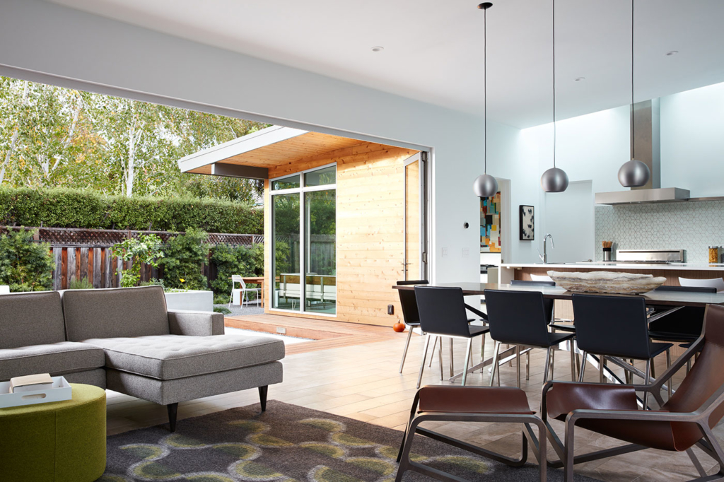
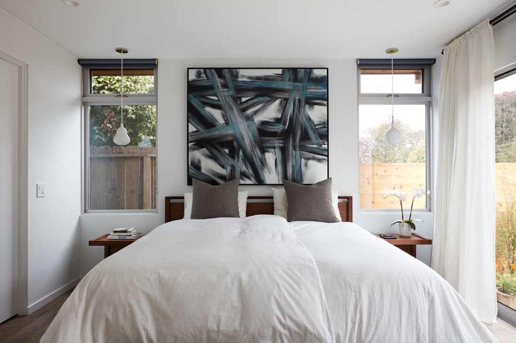
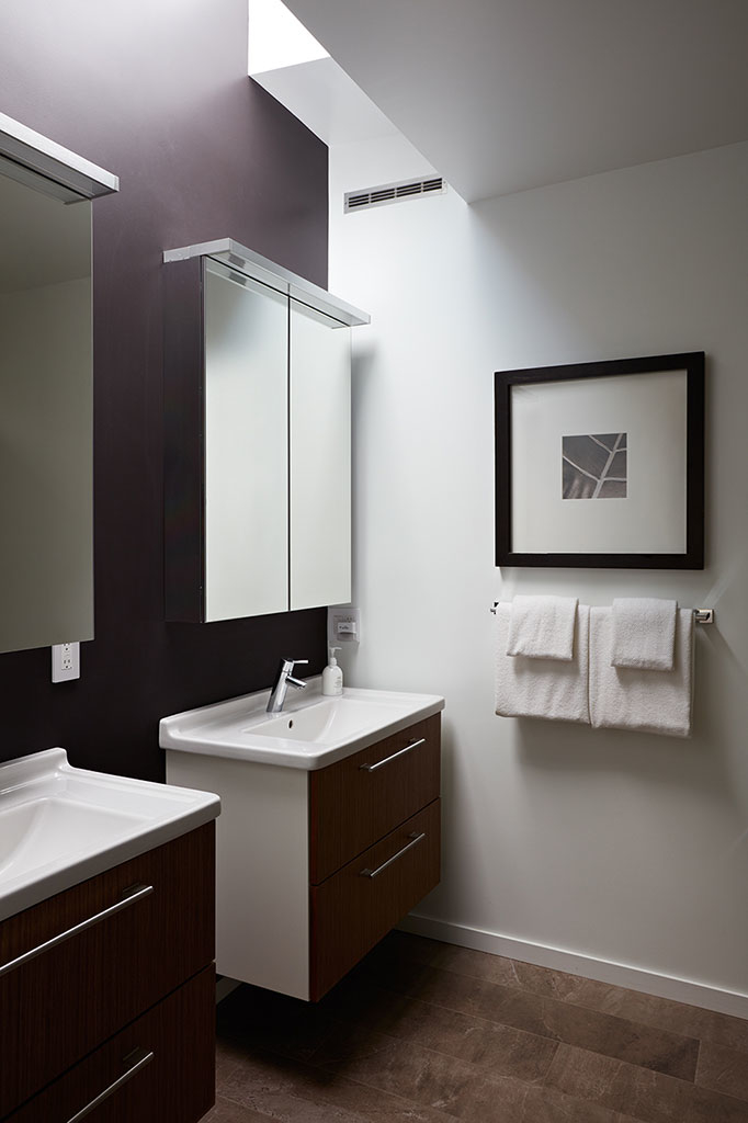
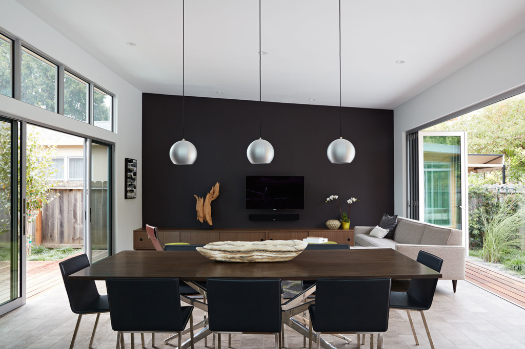
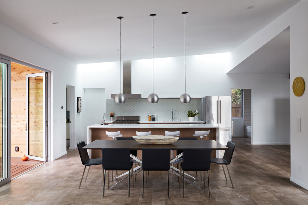
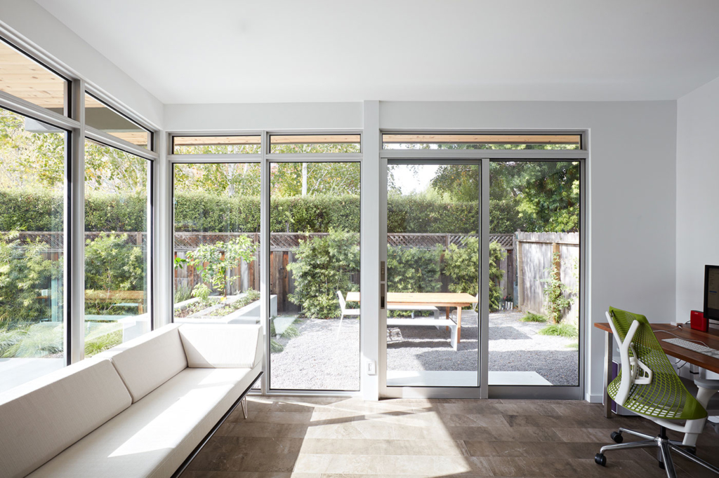
When touring the home with the new owners, Klopf saw immediate possibilities to reconfigure the house into a main living space including kitchen and dining, combining what used to be the old kitchen area and the under-utilized living room. The old kitchen was combined with a family room to the rear that became an office. The kitchen itself moved as Klopf designed in a utility “core” with pantry, laundry, and mechanical systems where the kitchen used to be. In the bedroom wing, the master suite was improved with a walk-through closet that leads to a bathroom with skylights above the sinks.

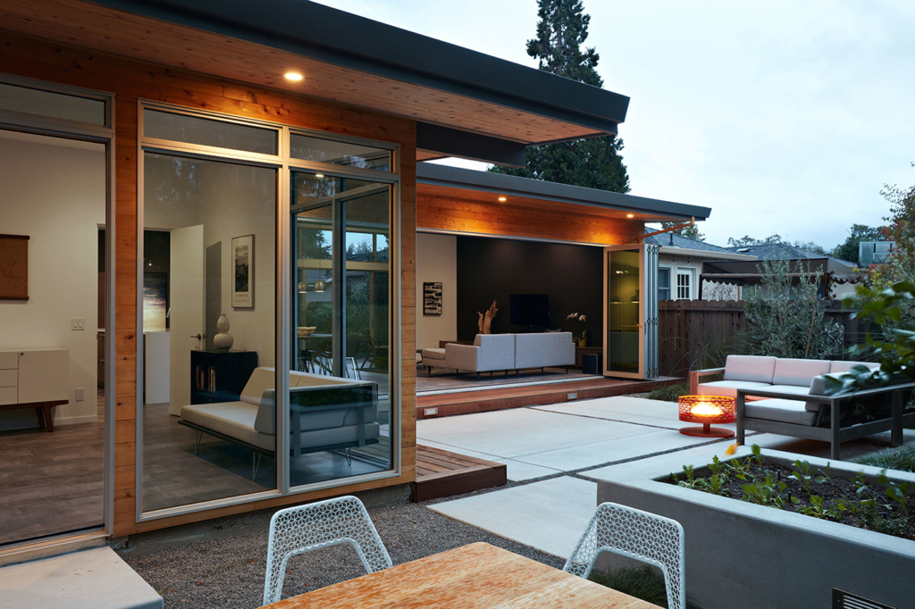
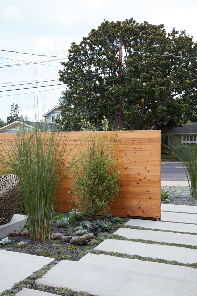
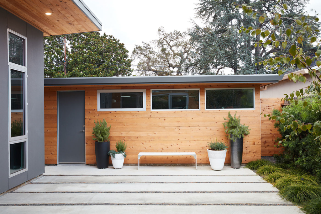
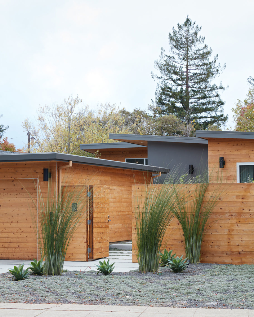
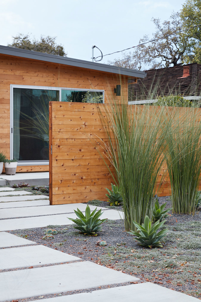
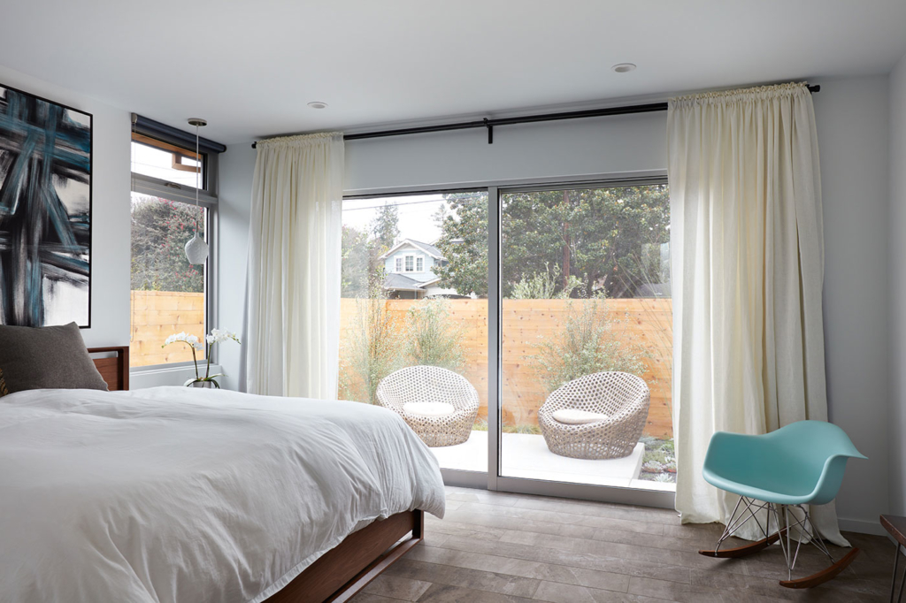
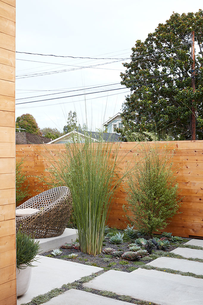
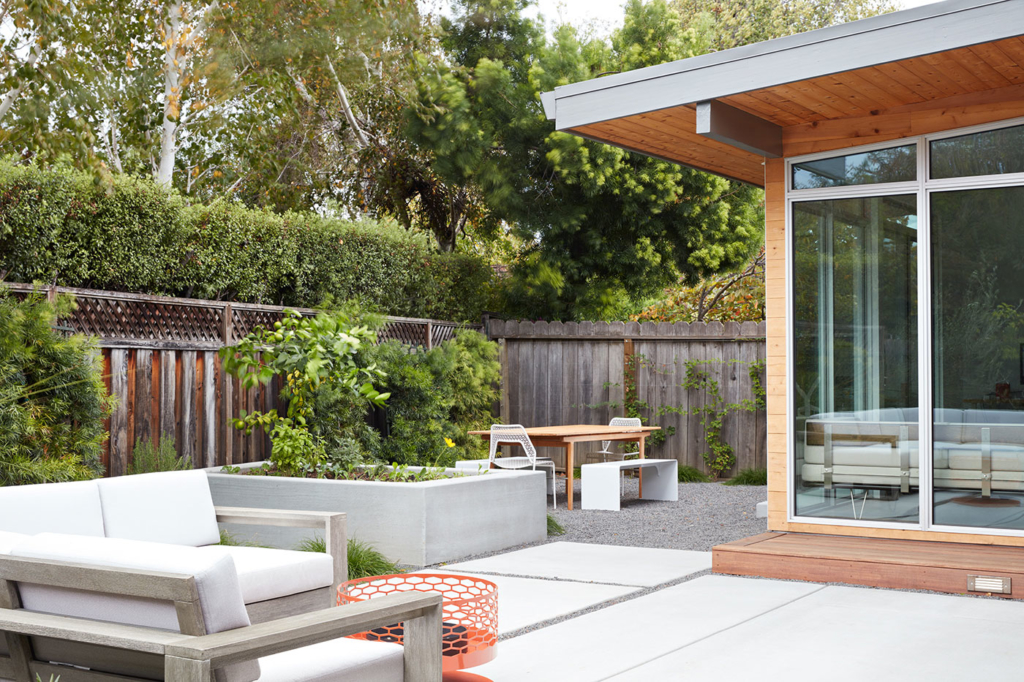
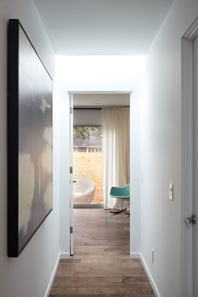
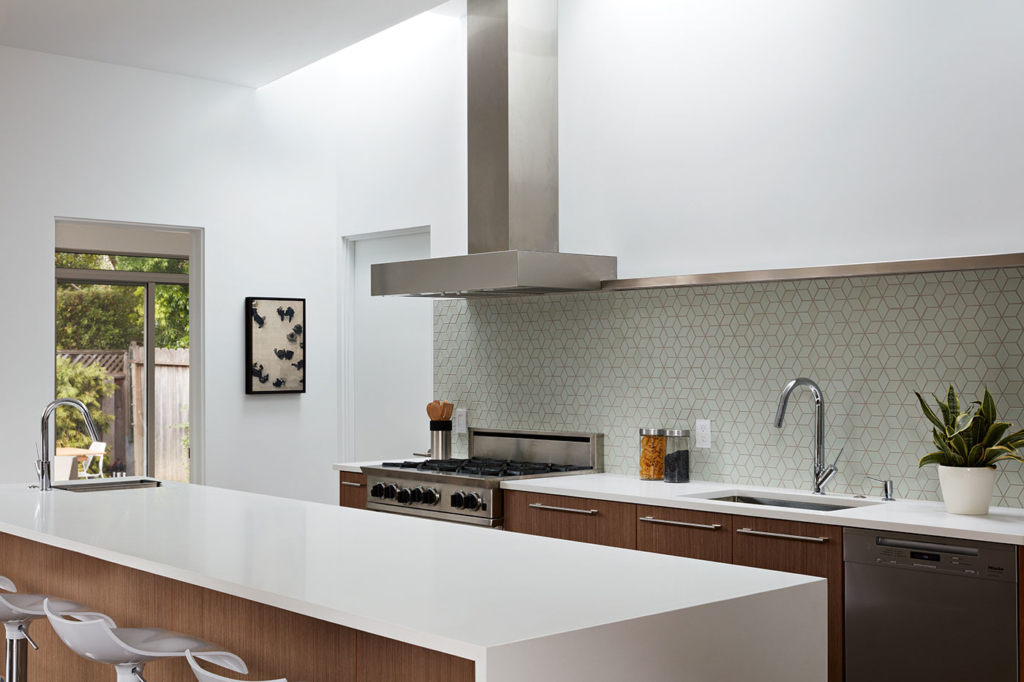
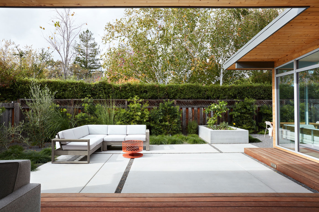
The layout emphasizes openness and flow, connection between indoors and outdoors, and privacy from the street with courtyards and fences creating outdoor spaces that act as buffer zones. Even though the master bedroom is on the street, the landscaped courtyard by Growsgreen between the master bedroom and the front fence makes it feel resort-like. Skylights bring light into the deeper areas of the house to even out the natural lighting so the inhabitants don’t need electric lights most of the time. It’s dramatic to track the sun coming in through the skylights and lighting up the kitchen on a sunny day.
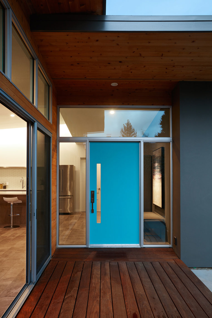
Klopf updated the entry sequence to flow more smoothly by removing a gate and opening up the front door and entry area with sidelites and clerestory windows.

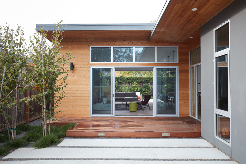
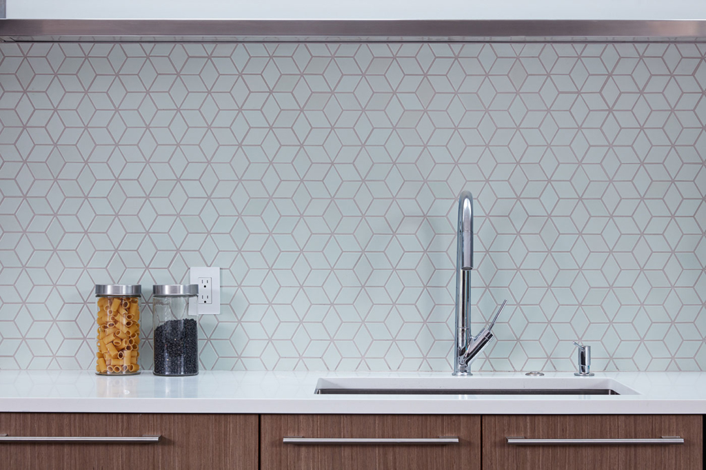
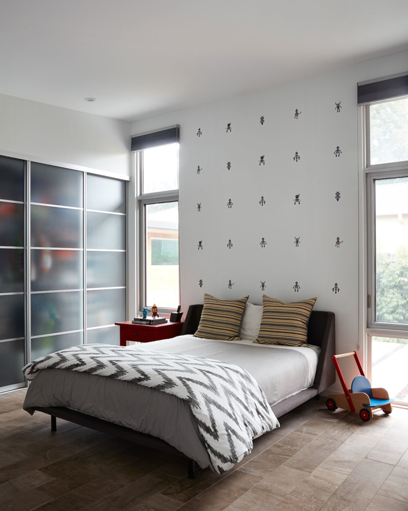
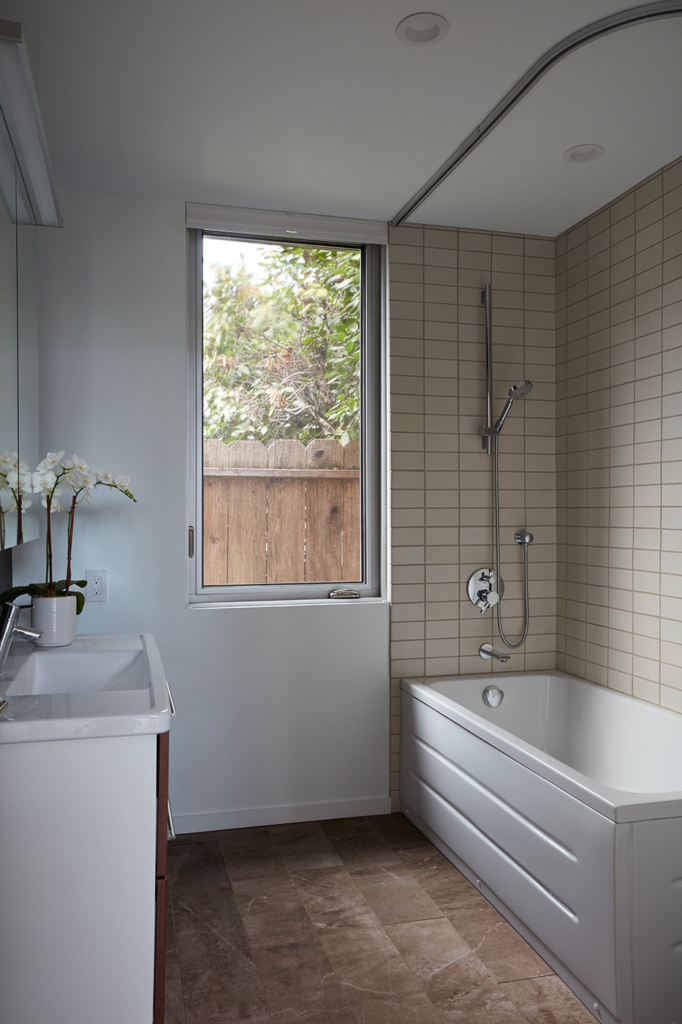
The builders opened up the house to the studs throughout and provided it with all new plumbing, electrical, radiant heat, roof, wall board, windows, insulation – the whole house is nearly new, but on the same footprint as the old one. Heath tile in the bathrooms, IKEA cabinets with custom faces in the kitchen and pantry, Daltile flooring tile, and painted drywall throughout the house create a sense of consistency and flow from space to space. Klopf and Growsgreen specified “timeless” exterior materials: plain smooth stucco, concrete, clear sealed western red cedar siding, and dark bronze anodized Western windows and doors.
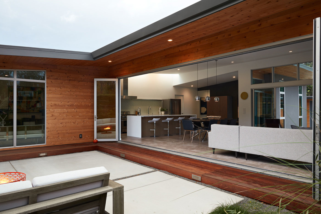
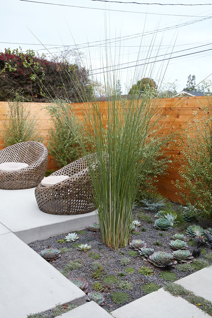
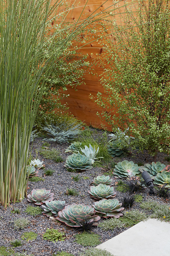
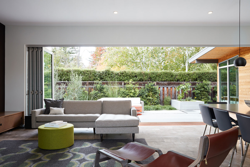
By removing the old owner’s plywood, and increasing the openness with large windows, long folding wall systems, and wide sliding glass doors, the Klopf Architecture team connected the landscaped patios and courtyards by Growsgreen Landscape Design to the interior living areas of the house. One feels a sense of calm and relaxation spending time either in the interior spaces or the adjoining exterior rooms with lush plantings.
Project Details:
Design Team: John Klopf, Chuang-Ming Liu and Ethan Taylor
Landscape Design: Growsgreen
Structural Engineer: Sezen and Moon
Contractor: Starburst Construction
Landscape Contractor: Inside Out SF

comments