
As soon as they arrived, the architects were extremely interested in the proposal: a different bulk products store, based on a more conscious consumption experience and lower environmental impact, all without compromising quality and variety.
Since it was the first store of a new brand, The New Pantry project went through several stages: brand development, service development - they recommended their friends from Touz.Co to help them in the process - sizing of the space necessary for the planned variety of products, choosing a property that had abundant natural light to enhance the products, reflections during the pandemic isolation period, development of the architecture project and, finally, the materialization of all these steps in the construction.
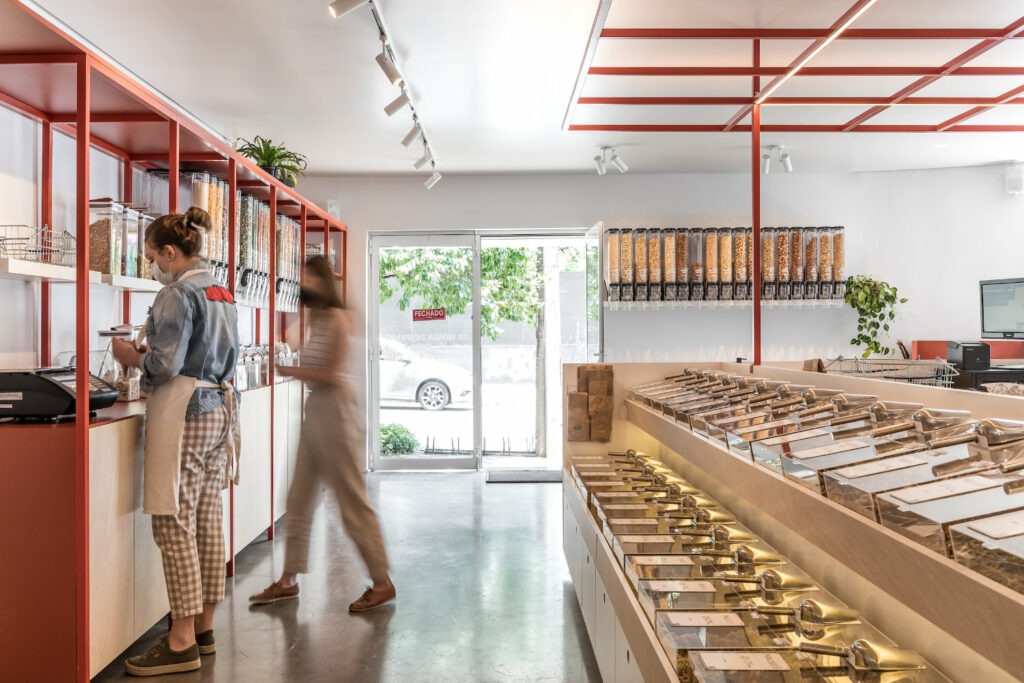
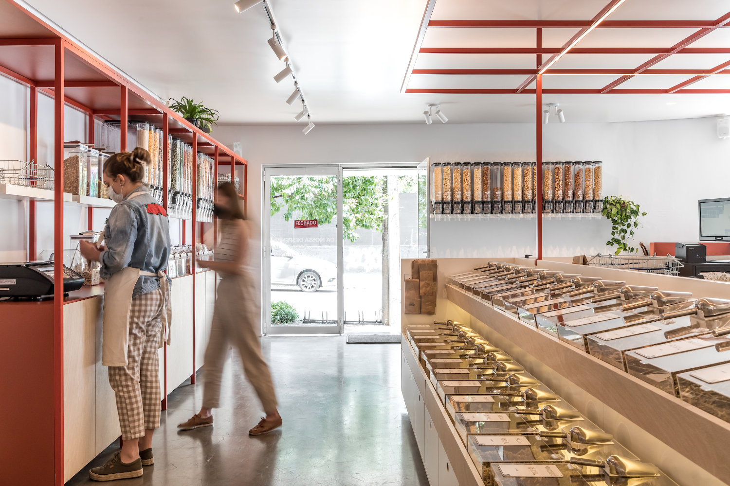
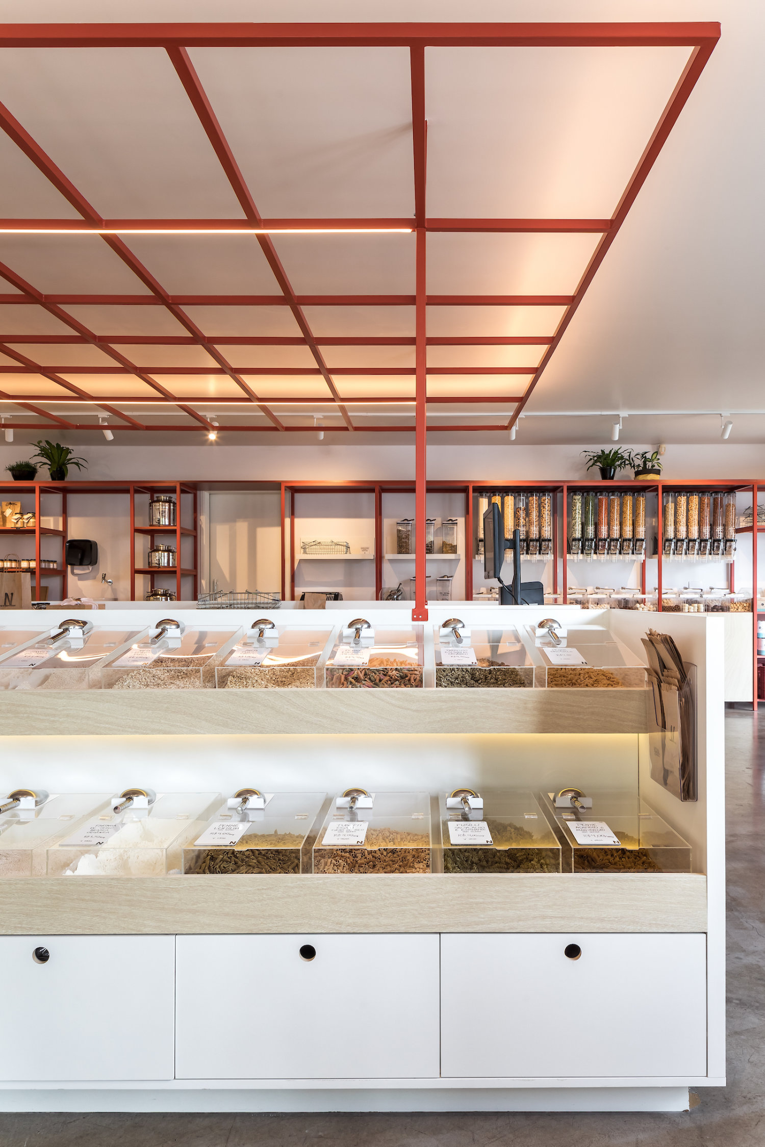
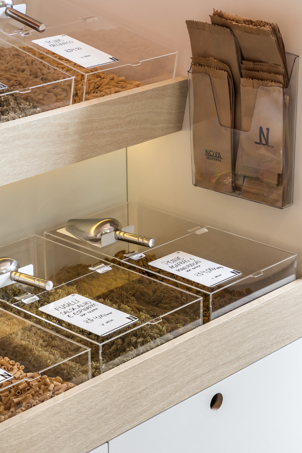
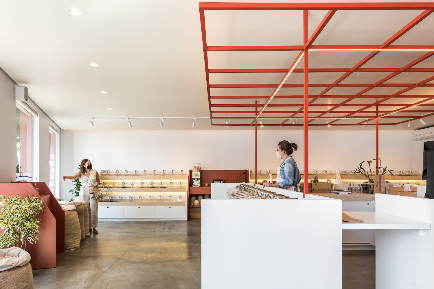
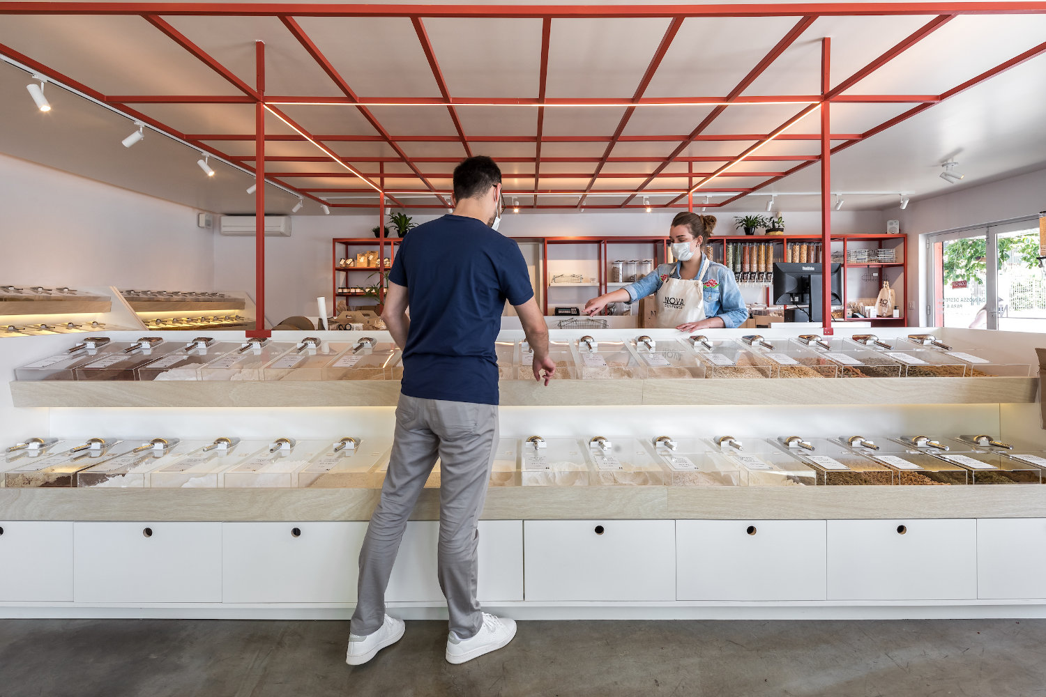
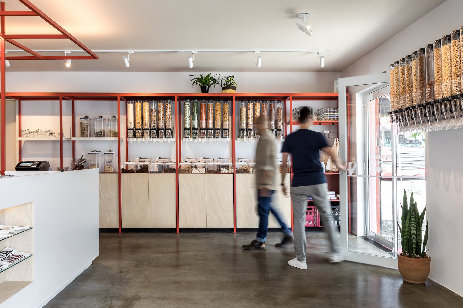
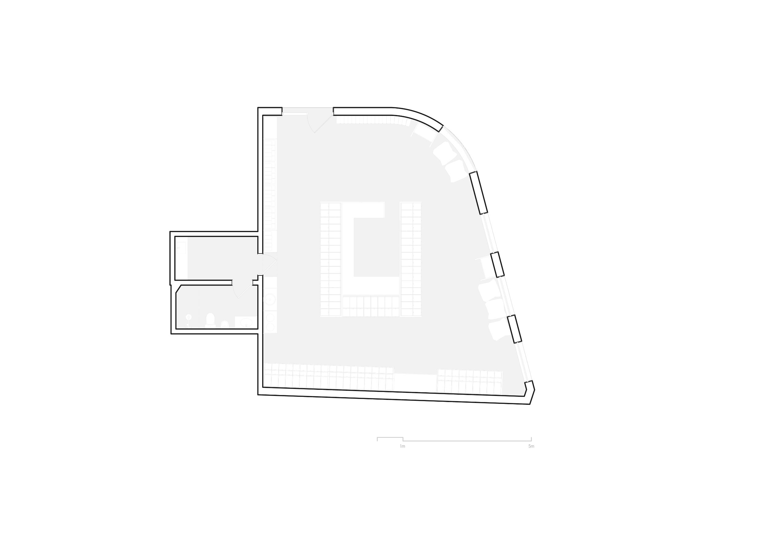
One of the main tasks of this project was precisely the sizing of the space necessary for the store - which, being a bulk products store, would have a basic standard measure: the dispensers. It was then that, noticing the limitation of the market in the offering of these pieces, they called another friend, product designer Max Kampa from VenturaLab, and they developed a custom design that values the products, but also the own scoop for retrieving the inputs. In repetition, these two elements create rhythm and a striking identity for the store.

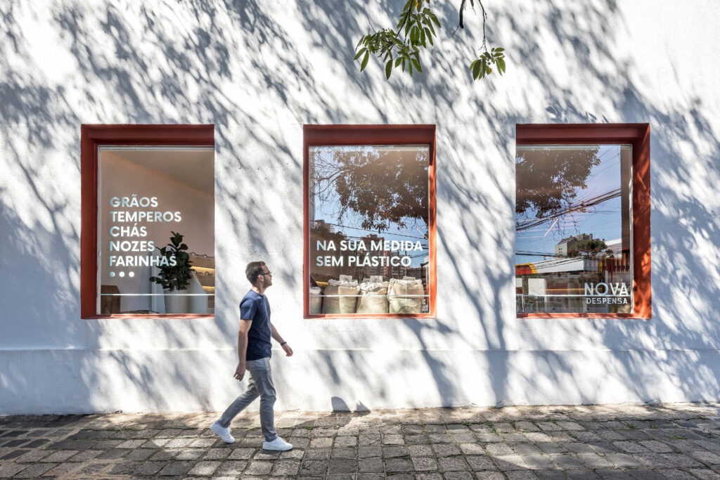
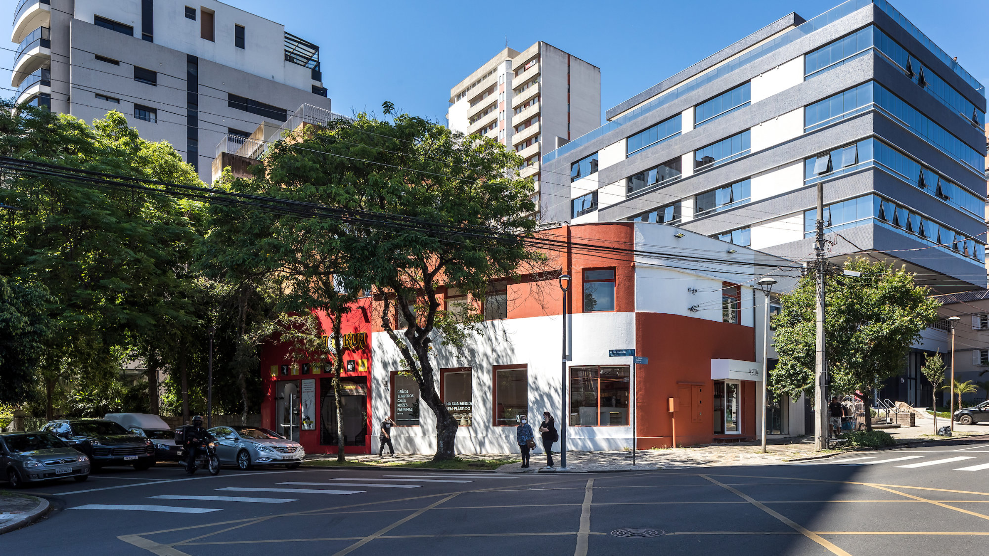
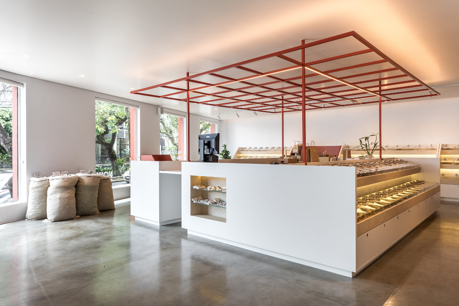
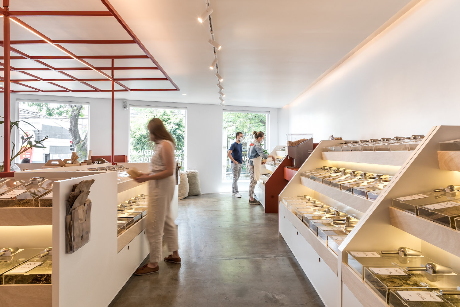
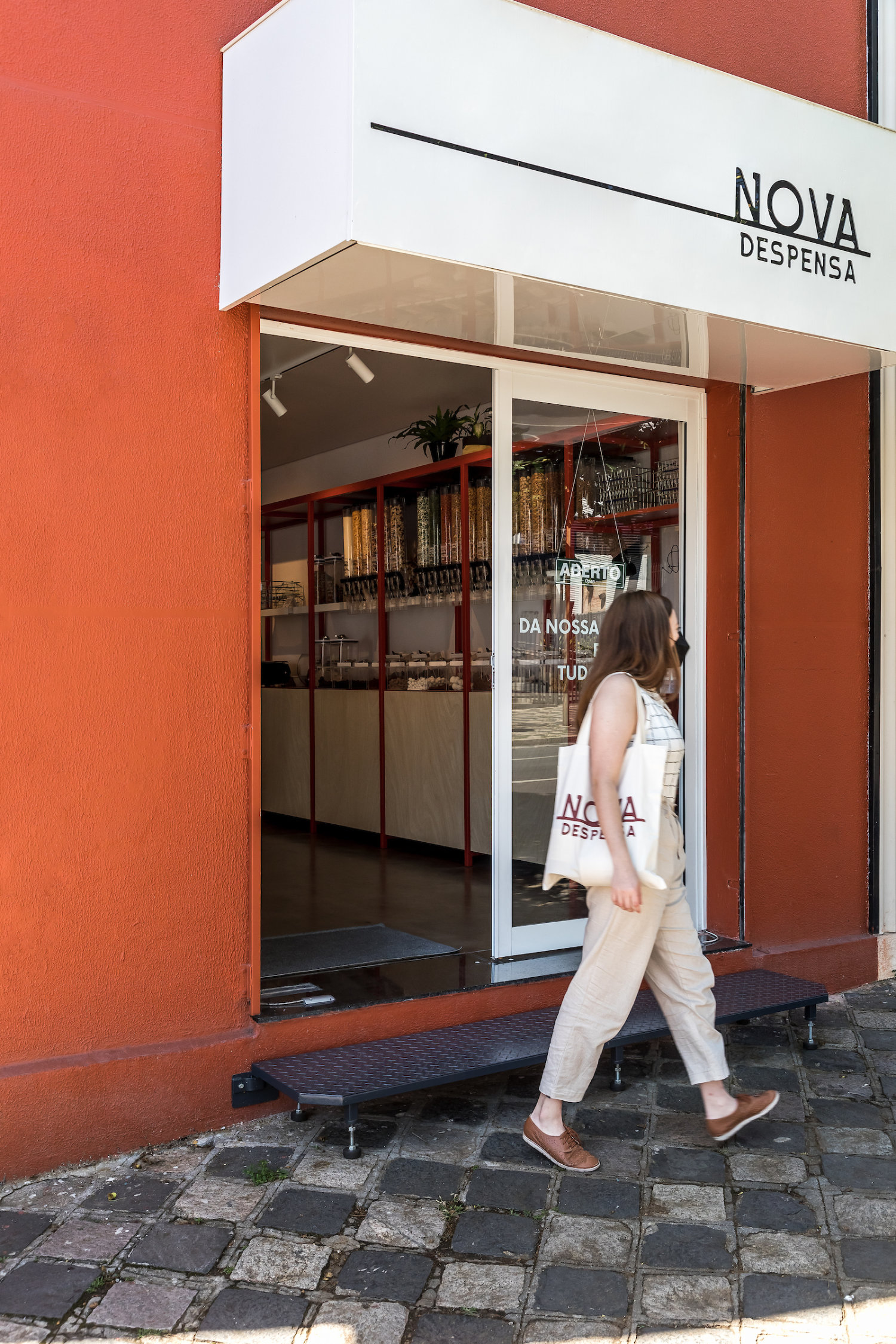
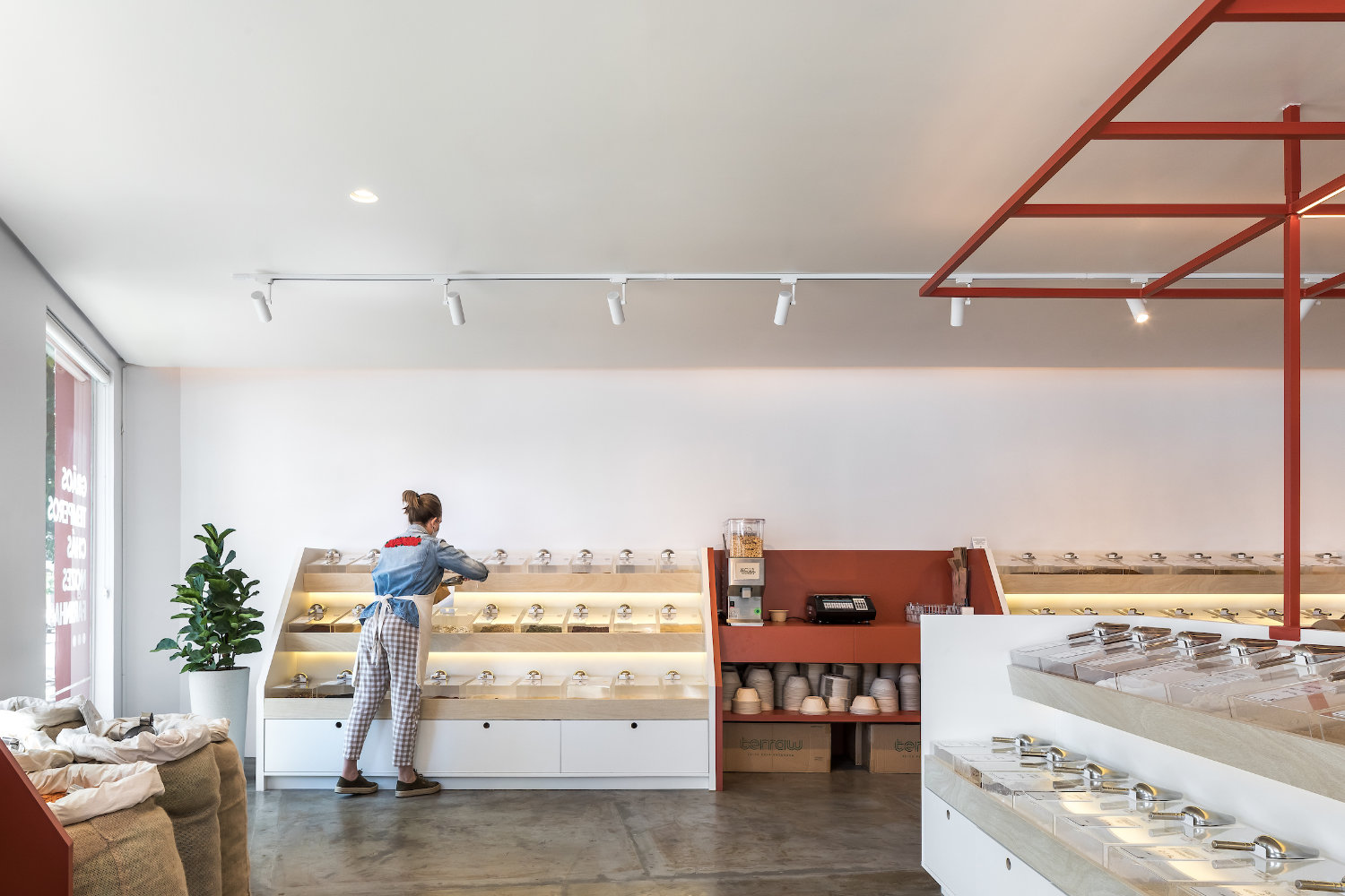
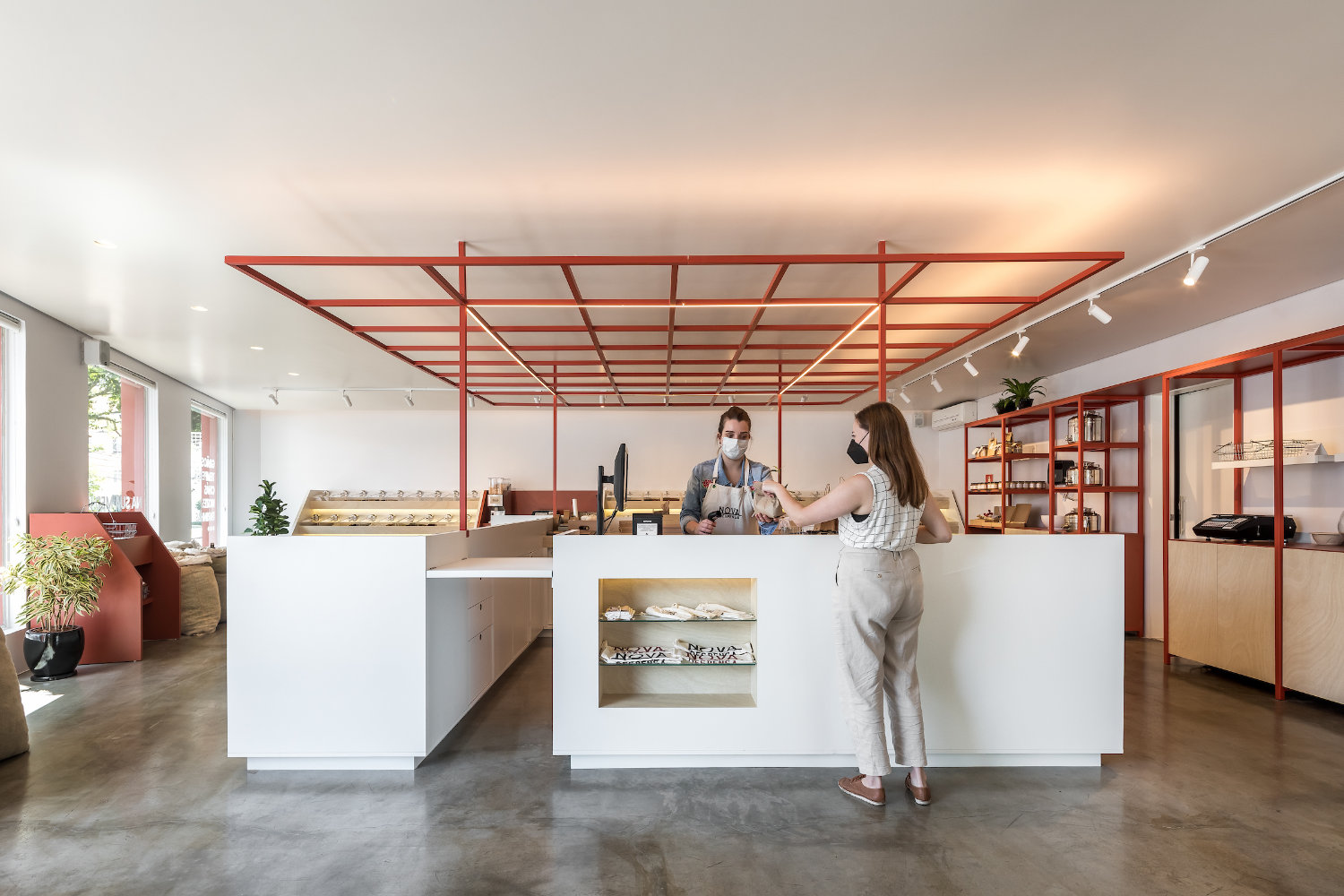
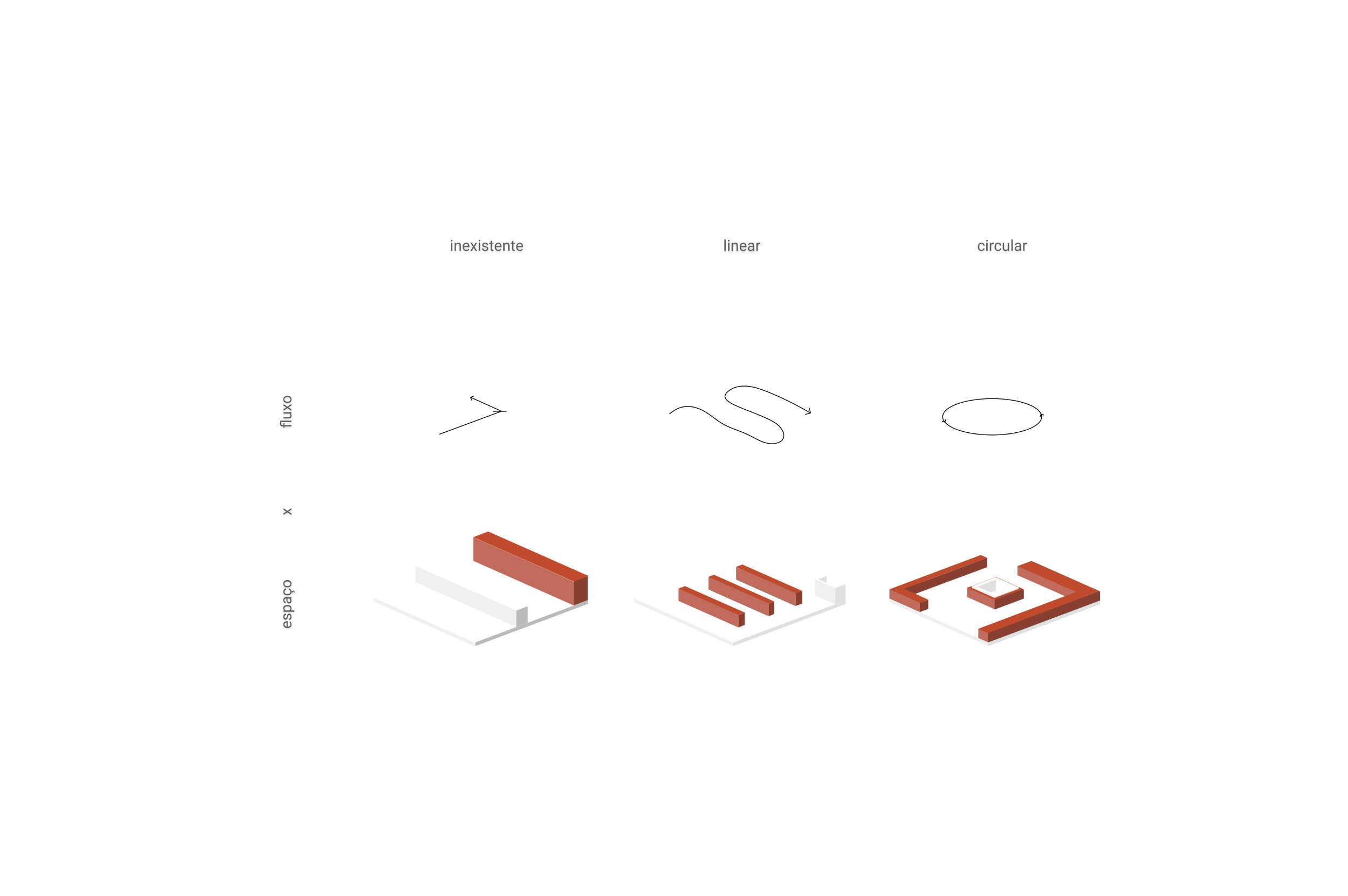
The next question was only to organize these dispensers in the chosen space, a corner property on Vicente Machado Avenue in Curitiba / PR. For this, the architects studied the product / consumer relationship over time. At the beginning, in the first groceries, the products were behind the counter and the customers depended on an intermediary to access the products. Later, in industrialization, the products went to the shelves, and the consumer was thrown into a series of aisles on a linear path to the cash register. The proposal was then to transform this relationship, creating a central island, of attendance and product display around which the customer circulates freely - an internal kiosk with products in the center and in the perimeter of the space.

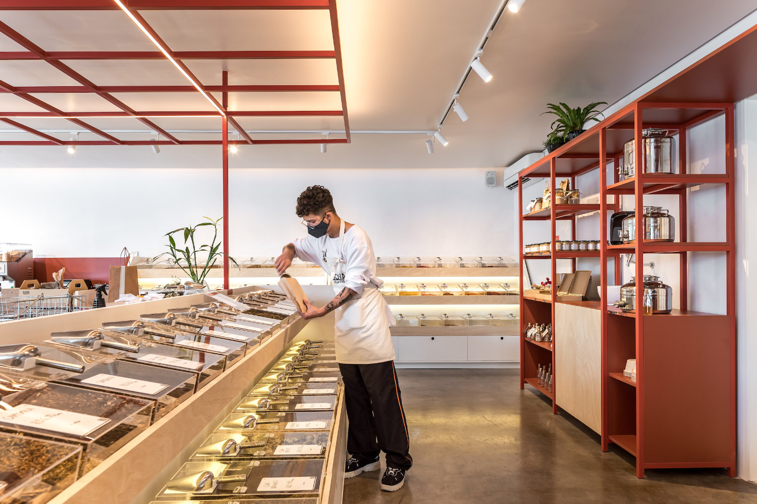
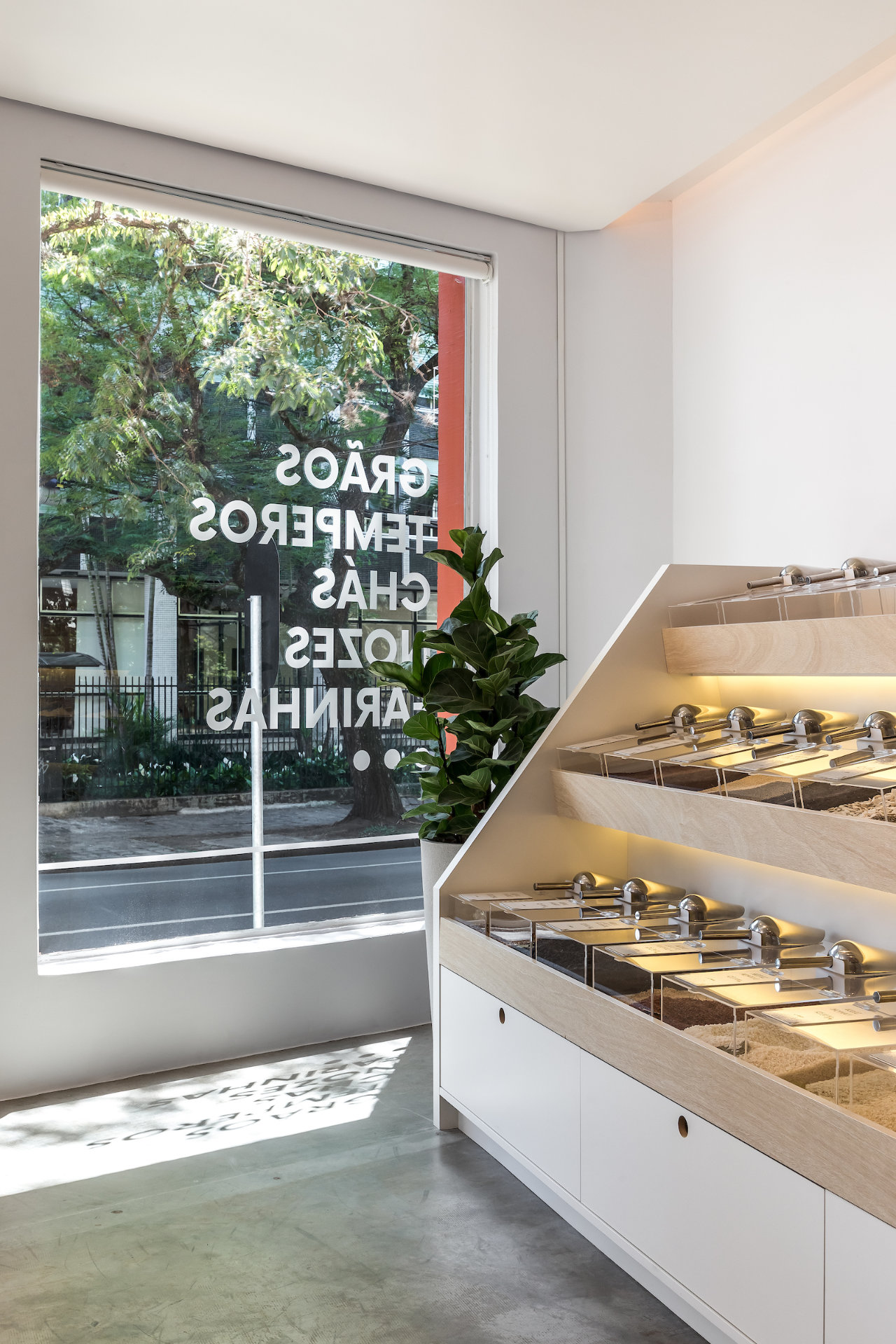
Furthermore, the height of the designed furniture was thought so that the customer had total comprehension of the space as soon as he entered the store - without overload of information - and so that it was possible for the store's team to support the customers at any time. The final result was achieved by combining all this with a simple and light materiality, based on white, in a light wood tone and the presence of the brand's color in the locksmiths. A friendly and inviting identity for a store that proposes itself as an extension of the customers' home.
Solo Arquitetos Project Team: Franco Luiz Faust; Gabriel Zem Schneider; Lucas Aguillera e Shinyashiki; Thiago Augustus Prenholato Alves.
Construction: Alphaenge Construções
Joinery: Oikos Móveis
Curtains: Adornié Home Decor
Lightning Features: Studio E.LED Light

comments