
A small brick house located on Louis-Hémon Street in Montreal recently underwent a major transformation. This residence had remained virtually unchanged since its construction in the 1950s. The program consisted of creating new living spaces that are bright, pleasant, and more adapted to a contemporary lifestyle, while respecting the original character of the residence.
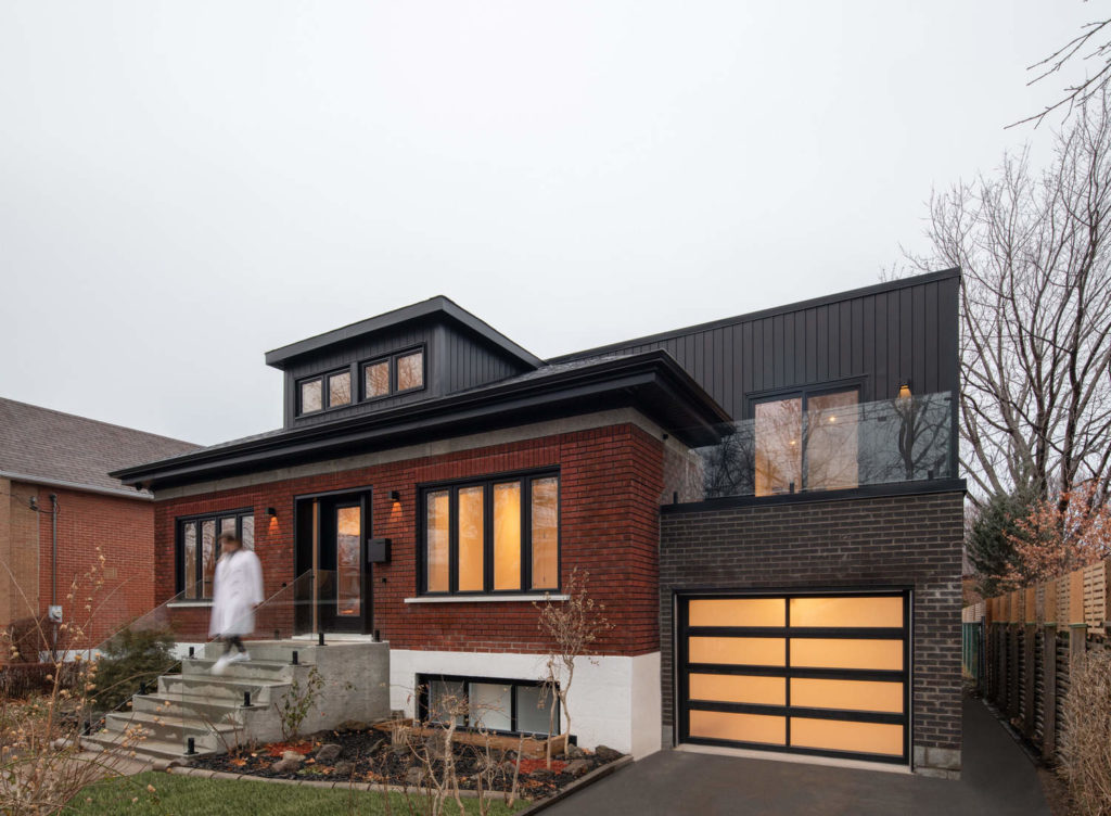
Taking place in the heart of Villeray, a lively, family-oriented neighborhood on a human scale, it was clear to the agency that it was necessary to find the volumetric balance between the existing part of the building and the architectural addition, while promoting harmony with the neighborhood. Furthermore, it was essential to preserve key elements of the existing architecture such as the roof slopes, the dormer, and the characterful volume of the dwelling. New finishing materials were proposed in order to infuse character and echo the new installation. In addition to these modifications, the attic, an unused and cramped space, has been removed. It is through this decompartmentalization that the architectural potential took on its full meaning.
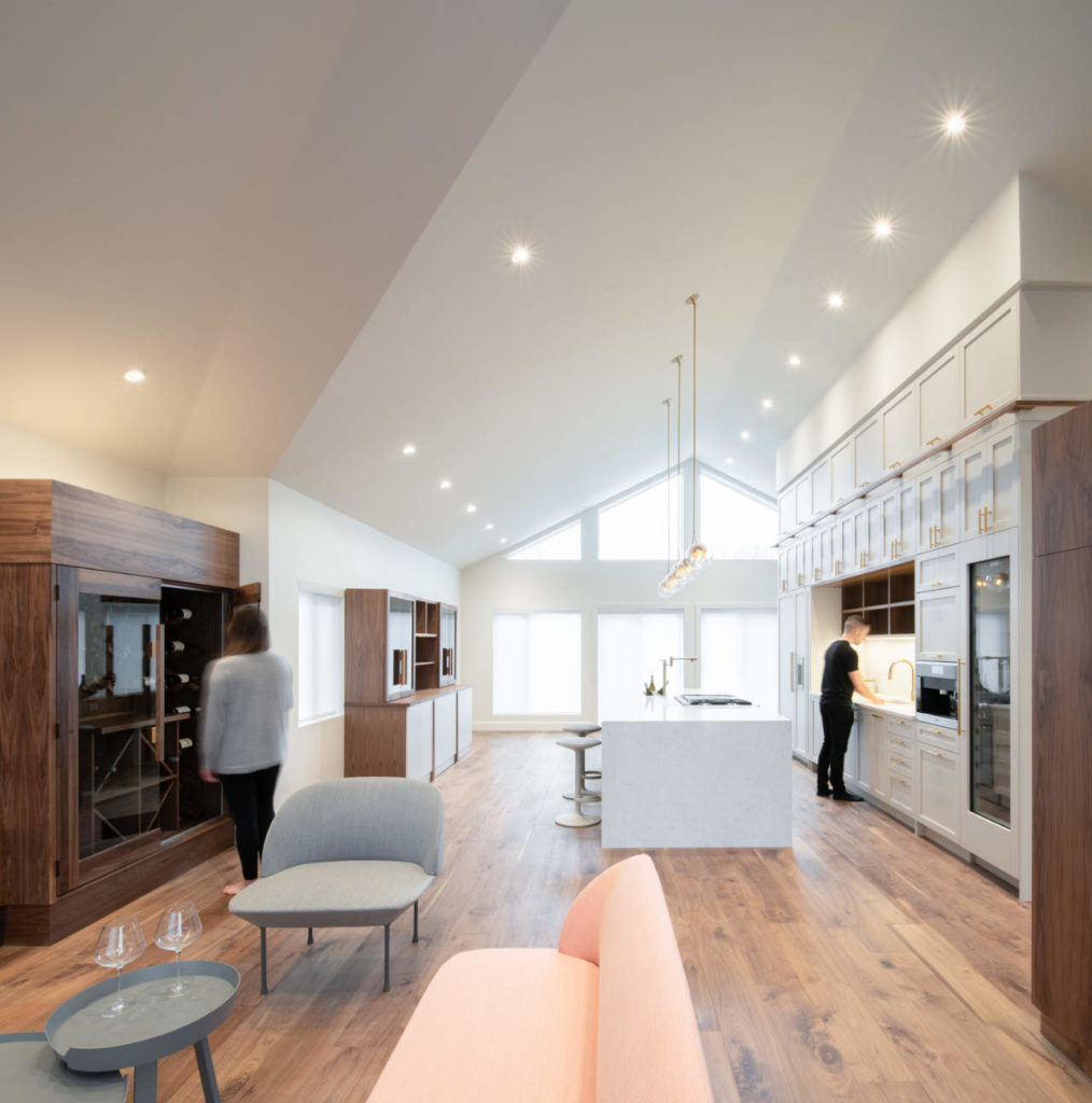
"This gesture was able to bring out the quality of natural light and maximize the contribution of the house, while enhancing its character," says Marie Eve Issa, founding designer of ISSADESIGN.
The main change made to the original rear façade was the integration of more generous openings. The vast windows and doors follow the rhythm of the building's typology. Moreover, it is through these modifications that the connection between the interior and exterior becomes an integral part of the concept and bathes the space in more light, thus providing the shared living areas with a pleasant place to live.
The addition is intended to be a contrasting architectural language between the two volumes. It was important for the agency to create an opposition so that the whole forms a whole uniting itself through the expression of contemporaneity.
"We propose a distinctive addition by creating a distance between the volumes in order to establish a dialogue of architectural respect, making the existing building breathe," explains the agency. "The objective is to enhance it."
Contrasting in its simplicity, the new wing plays on the idea of mystery, for it is within the latter that private spaces are hidden.
In the original layout, the rooms were divided into a private area around the bedrooms, and a public area around the living room. This configuration has been modernized and transposed into the new layout through the implementation of a volume housing the social areas of the house, and private areas, which take place within the adjacent volume, the addition.
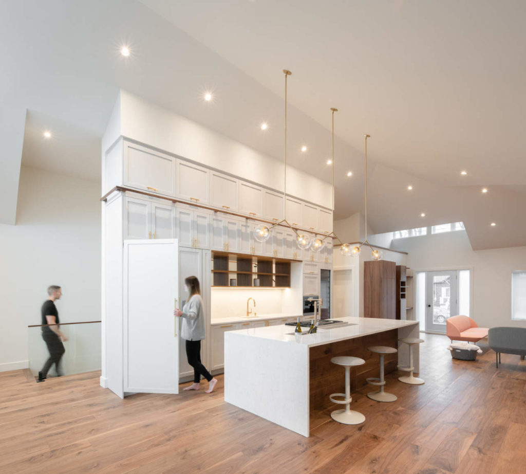
From the entrance, the family living areas are open. The living room, kitchen, and dining room have been grouped together to form a single large living room at the heart of the house and, by the same token, to benefit from the cathedral ceiling.
Being a chef, it was important for the owner to have a central kitchen that would allow him to entertain. Eager to share his culinary passion with his guests, the kitchen acts as a place for demonstration and socialization. The large cabinet wall creates a theatrical look, drawing the eye into the kitchen with its imposing height and unique details. The designers were inspired by the large storage walls of restaurant bars, which serve as central elements and are signatures of festive places. To this effect, an ice bin is placed on the island, allowing the owner to adapt the space to the receptions, while a wine cellar puts their private collection within reach.
Behind the kitchen, the staircase connects the two pavilions, playing on the levels. The children's rooms and a family room are located on the lower level. On the upper level, overlooking the central living space, is the master suite, consisting of a bedroom and a full bathroom. Located above the garage, the master suite comes with a front balcony, allowing its occupants to enjoy sunny mornings.
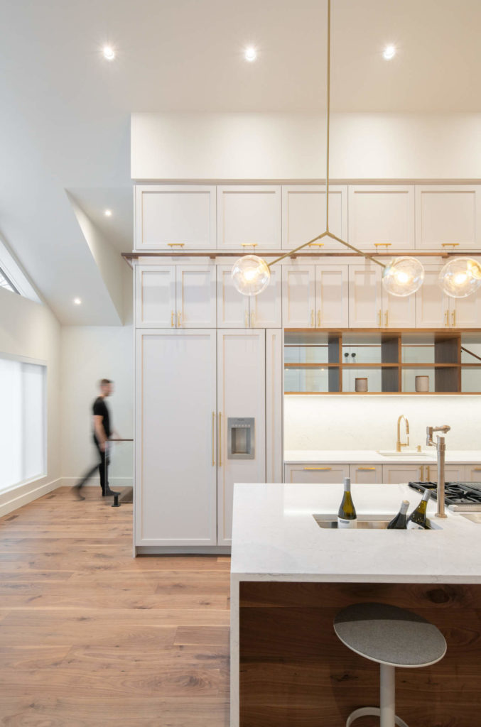
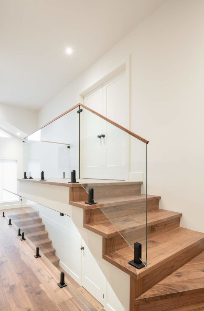
Classic materials such as black walnut, marble effect quartz, brass, and terrazzo were used in this project to create a discourse with the original architectural typology. Continuity of the material was achieved throughout the spaces to contribute to an impression of fluidity.
In a way, the essence of the project lies in the enhancement of an architecture that is in keeping with the times, while responding to the current needs of a contemporary family.


Credits:
Design: ISSADESIGN, design de l'environnement intégré
Lighting: EDP
Ceramic: Centura
Floor: Craft
Photographer: David Boyer
About ISSADESIGN
ISSADESIGN is an environmental design agency specializing in the fields of institutional, corporative, commercial, and residential design. Its areas of expertise include creative consultation, interior planning and design, and architecture.
ISSADESIGN takes its client’s expectations, needs, and desires to heart by creating timeless designs that respects the principals of sustainability. The designers believe they can contribute to a greener society, one step at a time. No matter the size or budget of a project, they integrate simple and inexpensive ecological solutions to their concepts. The team develops close relationships with its clients by being available and flexible to their needs. Respect for client needs and collaborator ideas contributes to the richness of ISSADESIGN's projects. The client is at the heart of the process in each project, and the design team submerges into their universe to create and develop the perfect sync between their philosophy and their personality.
At ISSADESIGN, the designers live for new challenges, creative solutions, and innovative technologies. Constant curiosity pushes the team to exceed client expectations by creating unique spaces where aesthetics and functionality meet.
comments