
The Taicang apartment by office ZHU, is a renovation project of an existing double storey residence in Taicang, Jiangsu. Office ZHU’s design intervention provides their clients with ample space to escape the city and reconnect, whether on a weekend retreat or holiday family visits.
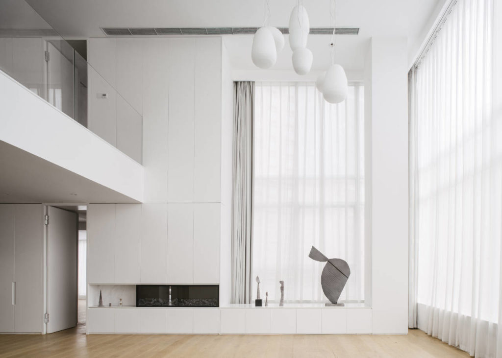
For the young Shanghai based clients, the leading design driver for the project was a desire to create a relaxed environment, away from the hustle and bustle of city life. Nestled in the wide and heavily landscaped streets of Taicang, the apartment’s surroundings offer a welcome break from the density of Shanghai. Additionally, the existing housing typology in the area offers luxuriously high ceilings. The Taicang apartment is no exception, boasting a double height, light-filled internal living space – a perfect base for a spacious and fluid atmosphere.
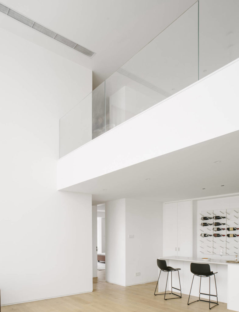
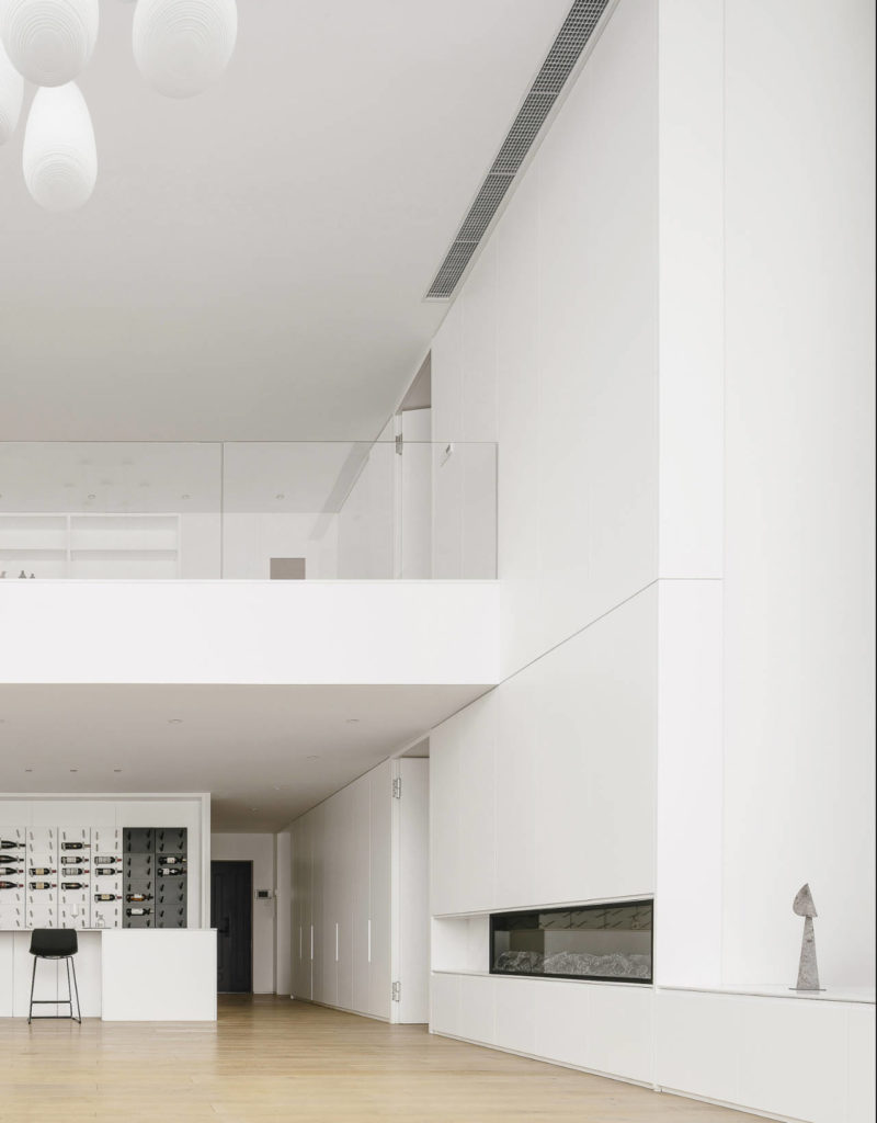
In order to fully express the apartments existing spatial character, Office Zhu took a paired back, minimalist approach. The architects’ began by compressing the existing stair to a single run. The gained space was then utilised for open library shelving on the upper level and a bar counter on the ground floor.
Joinery was correspondingly restricted to the perimeter, while walls and sliding doors were reduced to a bare minimum. Instead, the use of low level furnishings define functional areas, further exaggerating the internal volume. The design also flaunts generous openings, with floor to ceiling doors that celebrate the verticality of the space while also providing effortless cross circulation throughout.
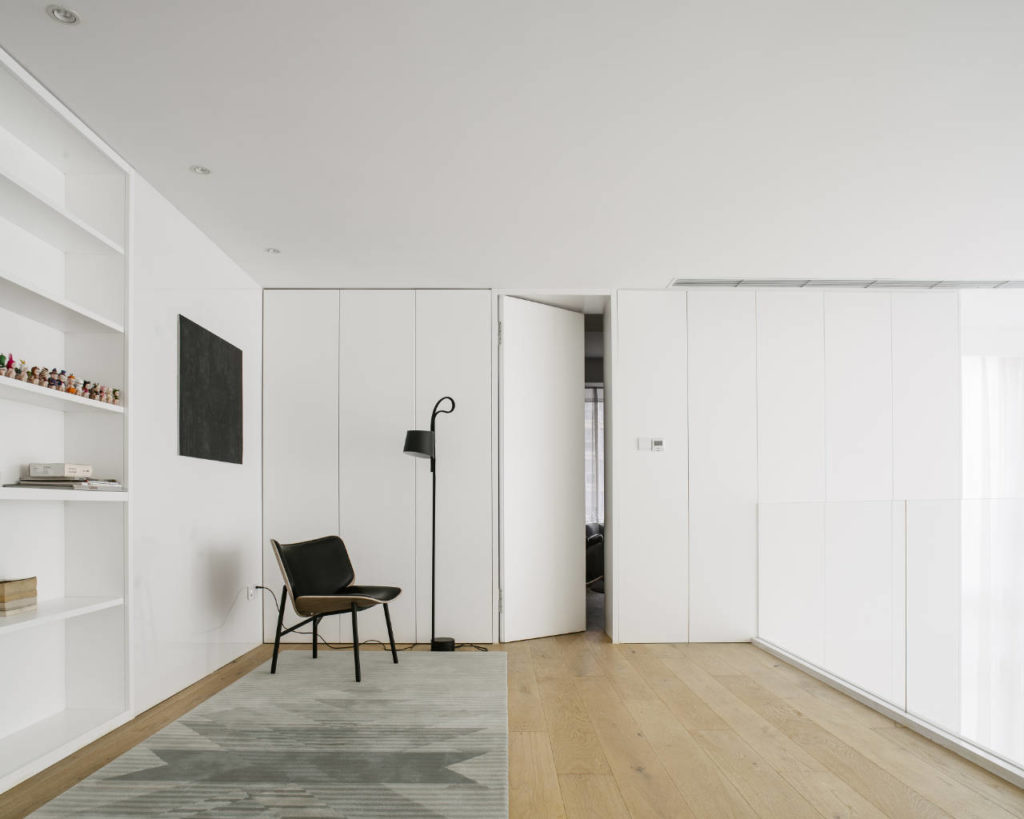
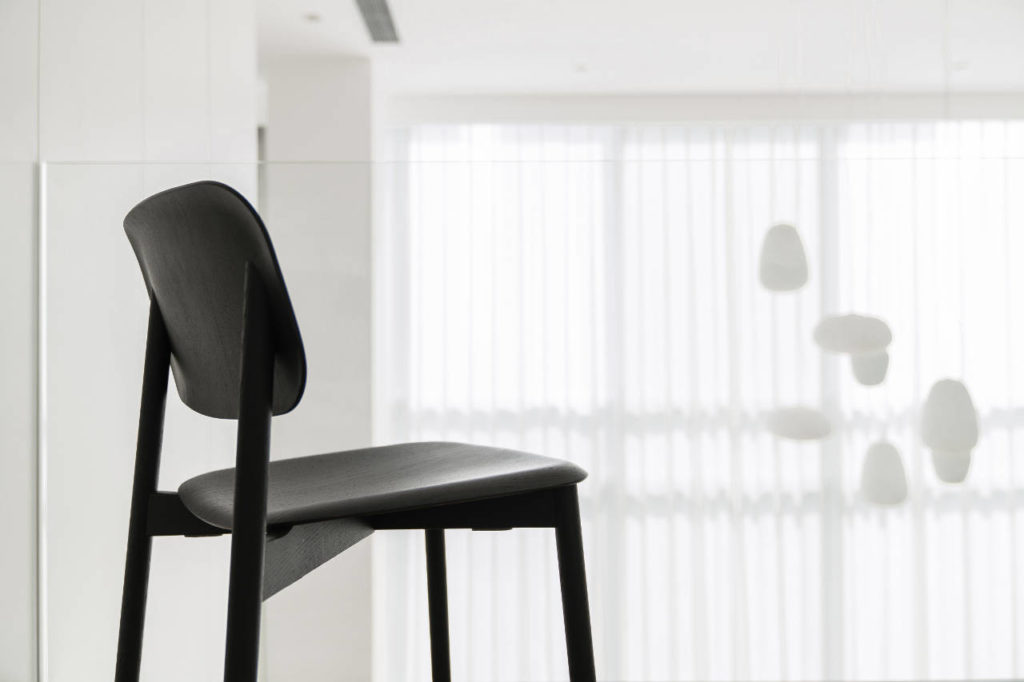
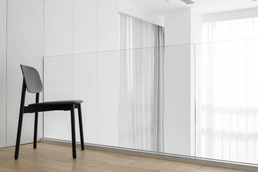
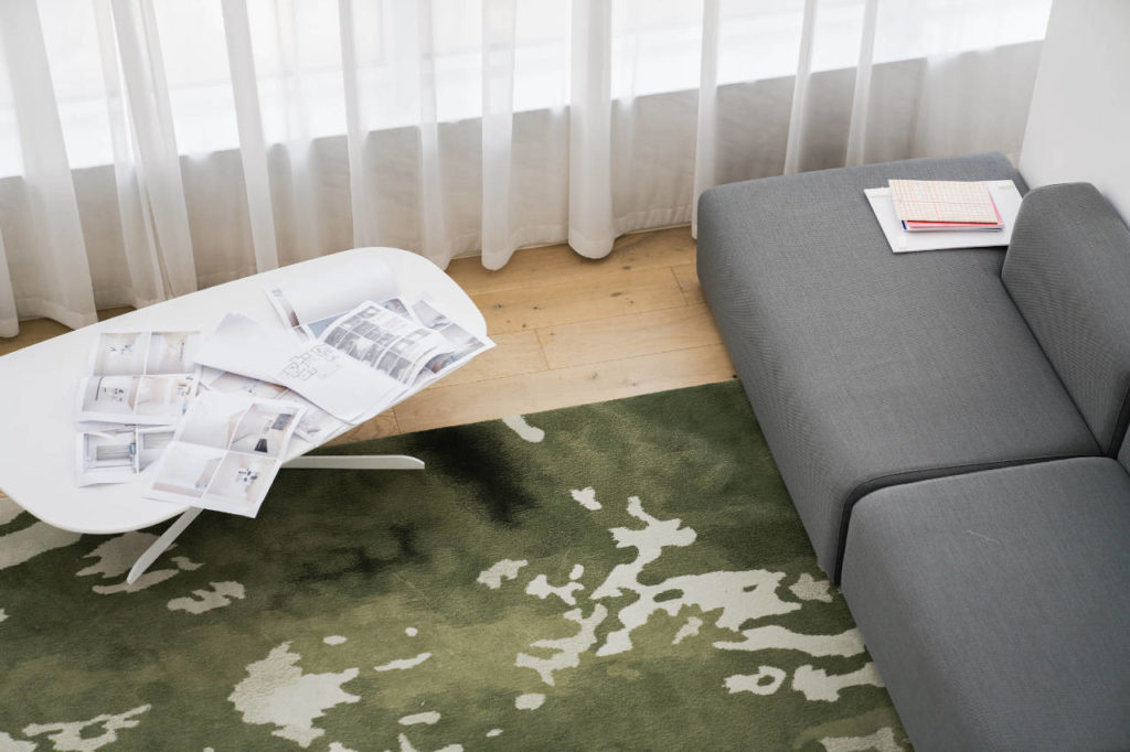
The neutral colour pallet of the project features large expanses of white, with accents of grey and black. Office Zhu also introduced large blocks of nature-inspired colour to add warmth to the space and reference the clients’ bubbly personality. A carefully considered pallet of browns, pinks and greens in muted tones were placed sparingly across the horizontal plane, continuing the visual unity of the apartment.
Statement pieces in the form of seats and lamps with vibrant silhouettes add visual interest and variation to the clean lines dominating the rest of the design. The client also gave a final personal touch, producing a series of small sculptures and paintings to adorn the space.
With a simple and clear design strategy, Office ZHU has succeeded in delivering a warm and inviting space for the whole family.


comments