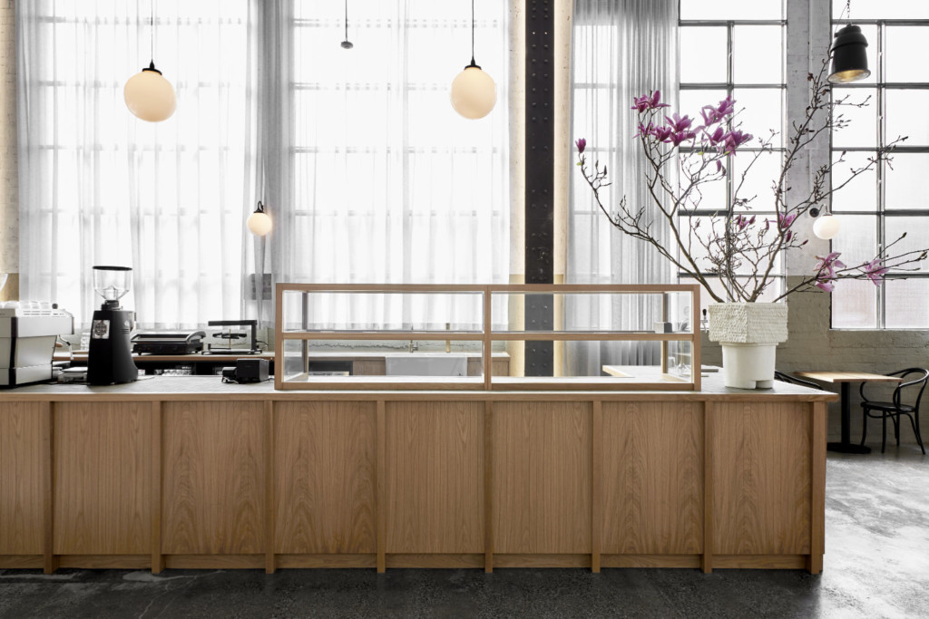
Conceived as a shared meeting place, There Cafe is an uplifting and authentic hospitality proposition harnessed by the strength of its architectural setting.
Housed in a 19th-century wool store, the pared-back interior celebrates the site’s industrial character while softly layering new interventions; an evolution of its historic identity.
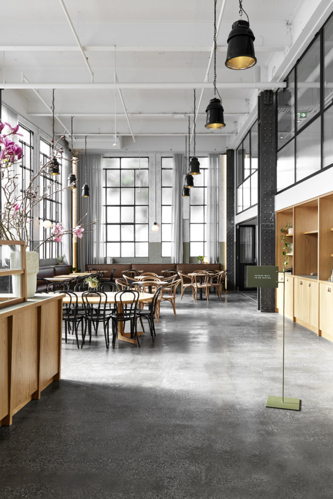
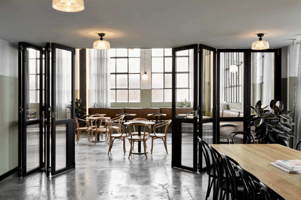
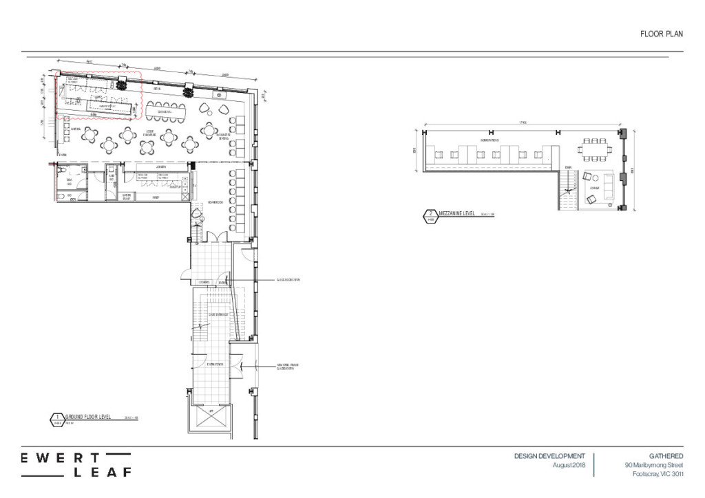
The site’s grand, cathedral-like windows, raw steel columns and soaring ceilings create a rich architectural canvas, sparking narratives around restraint, authenticity and time. A coffee counter lined with panelled oak leads visitors through to the heart of the lofty warehouse, where leatherlined banquettes sweep the perimeter, addressing an expansive dining area.
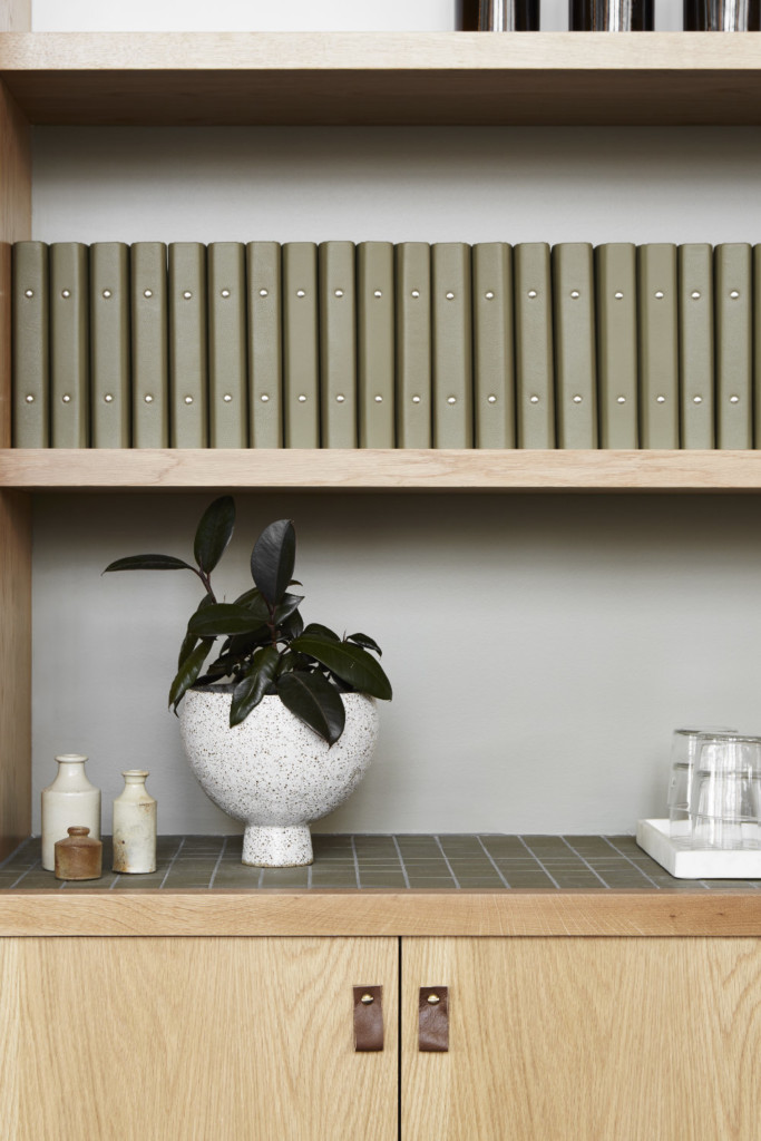
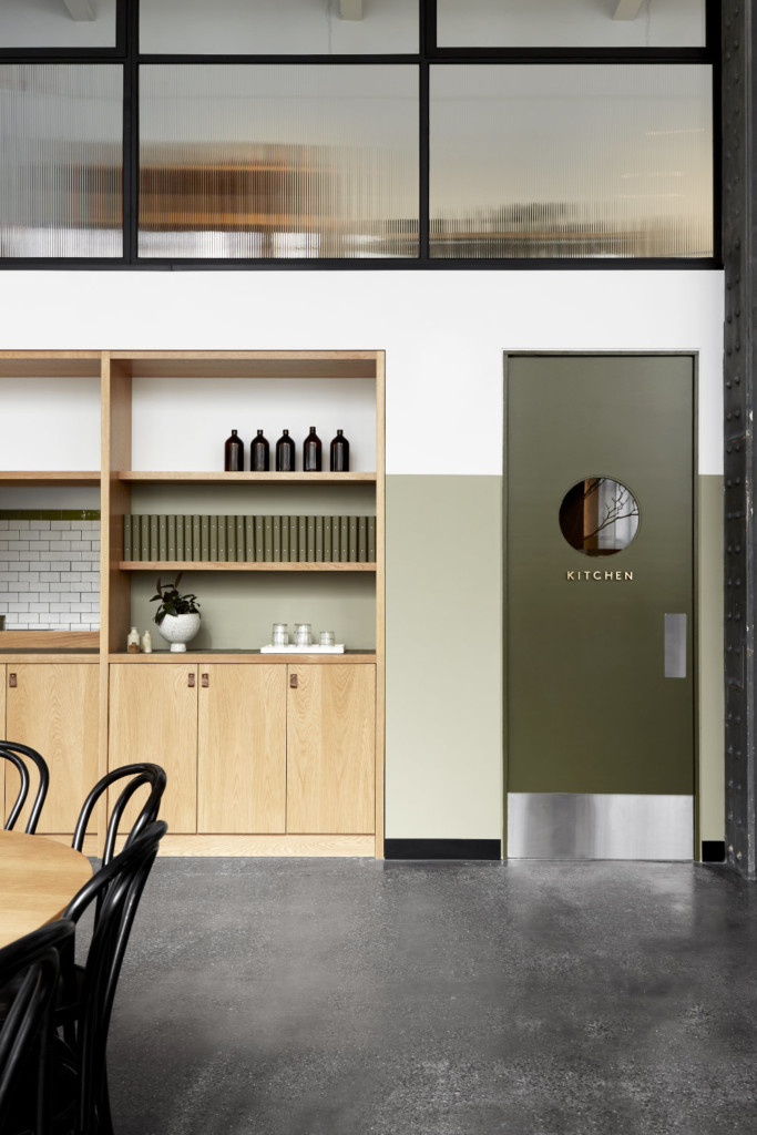
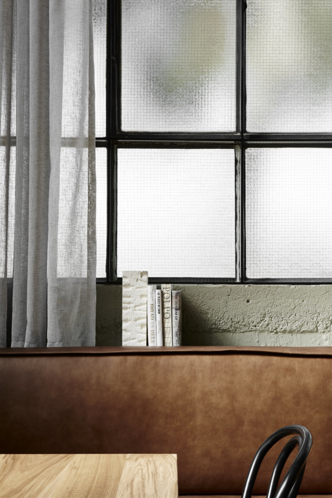
Thonet bentwood chairs and blackened steel pendants impart a sense of nostalgia and familiarity, while delicately detailed joinery takes cues from modernist furniture. The rigid envelope is softened by sheer linen drapery accentuating the site’s verticality, while antique brass embellishments and tactile finishes give a hand-crafted quality befitting of the There brand.
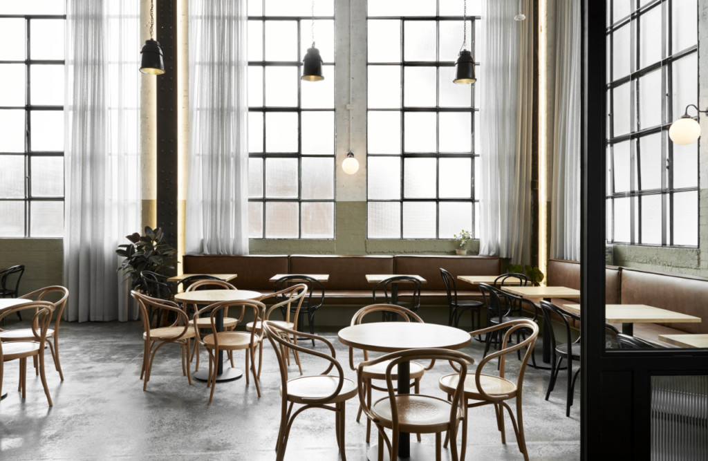
Starting with a vision to transform the iconic heritage building into a welcoming venue, the brief from the Gant’s (Pot & Pan, Gather & Tailor) was threefold; to honour the qualities of the warehouse, foster a sense of community and contribute to the surrounding mixed-use development.
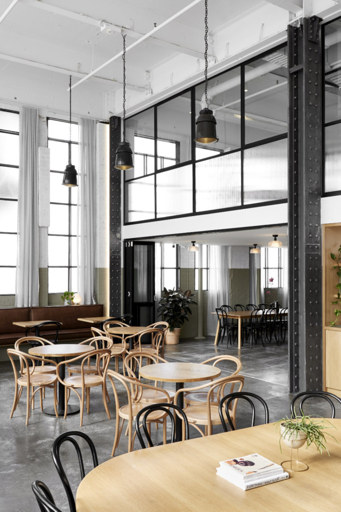
From its varied industrial origins to its more recent use as the headquarters of Lonely Planet, the
warehouse has been well utilised.
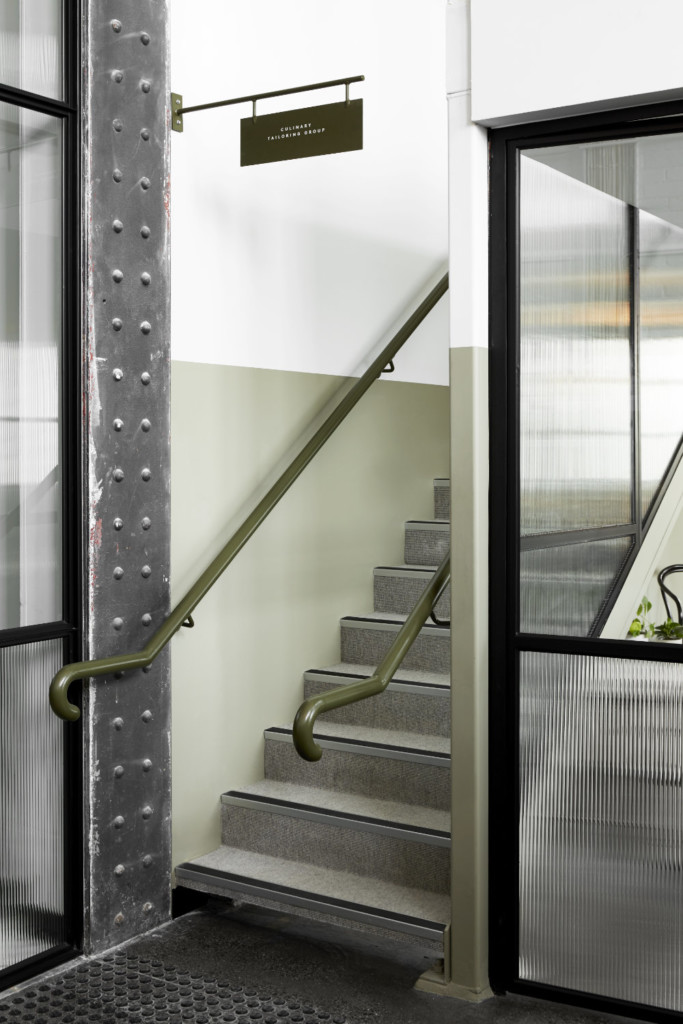
The site’s grand, cathedral-like windows, raw steel columns and soaring 6-metre-high ceilings presented a rich architectural canvas, driving the design team to develop a narrative around restraint, authenticity and time. The striking architectural features and lack of direct outlook drove the spatial planning to have an intentionally inward focus.
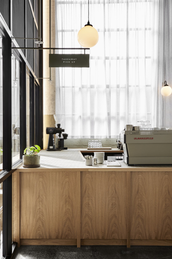
A reduced palette of honest finishes, including crown-cut oak, antique brass and natural leather, sits in harmony with the site’s raw material profiles. A coffee counter lined with panelled oak leads visitors through to the heart of the lofty warehouse, where leather-lined banquettes sweeps the perimeter, addressing an expansive dining area.
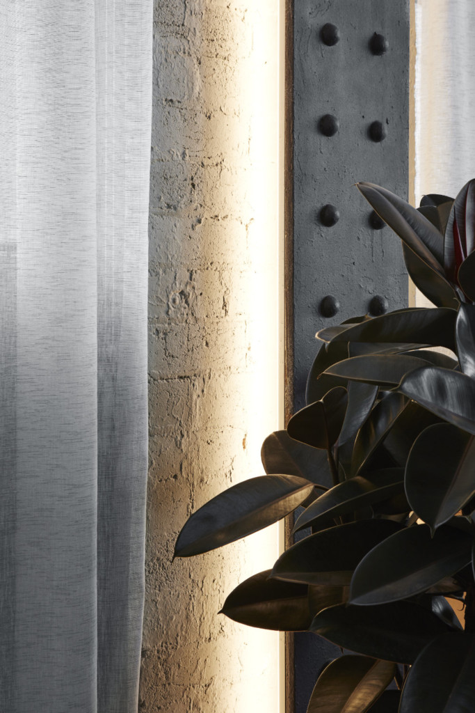
Thonet bentwood chairs and blackened steel pendants impart a sense of nostalgia and familiarity, while delicately detailed joinery takes cues from modernist furniture, providing a contemporary counter-balance. The rigid envelope is softened by sheer linen drapery sheathing the windows, accentuating the site’s verticality and tempering the abundant natural light.
The new design not only works respectfully within the parameters of the existing building, but brings to life its innate beauty. The untreated industrial qualities of the building are embraced rather than clouded by the new intervention, thoughtfully distinguishing old from new.




comments