Text provided by the architects
Logistics of this working family required them to stay tethered to their home for longer periods than each would prefer. This became become disruptive to wellness due to too much time at school, work and home spent indoors. The homeowners began to contemplate, like many families do, whether they would move to the suburbs to exchange proximity to great public parks and amenities for a larger backyard as outdoor access. Rather than moving far away, they decided to make a bold change by building a new house that flipped the script on indoor home life within a small urban lot.
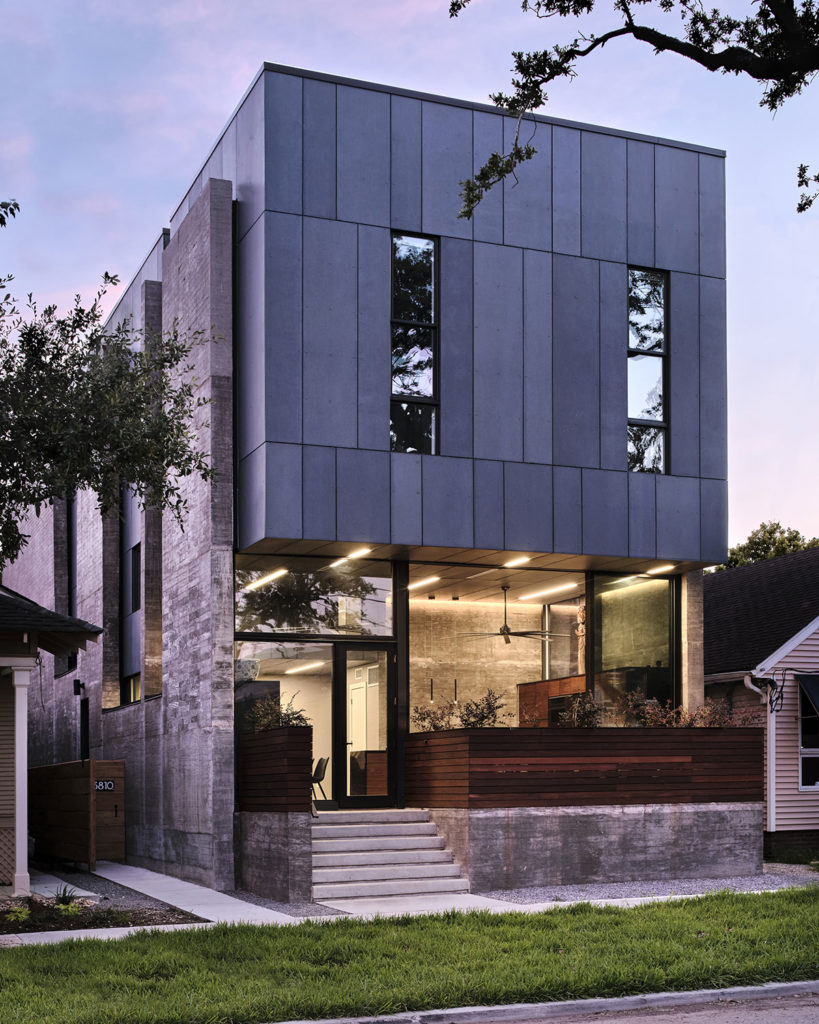
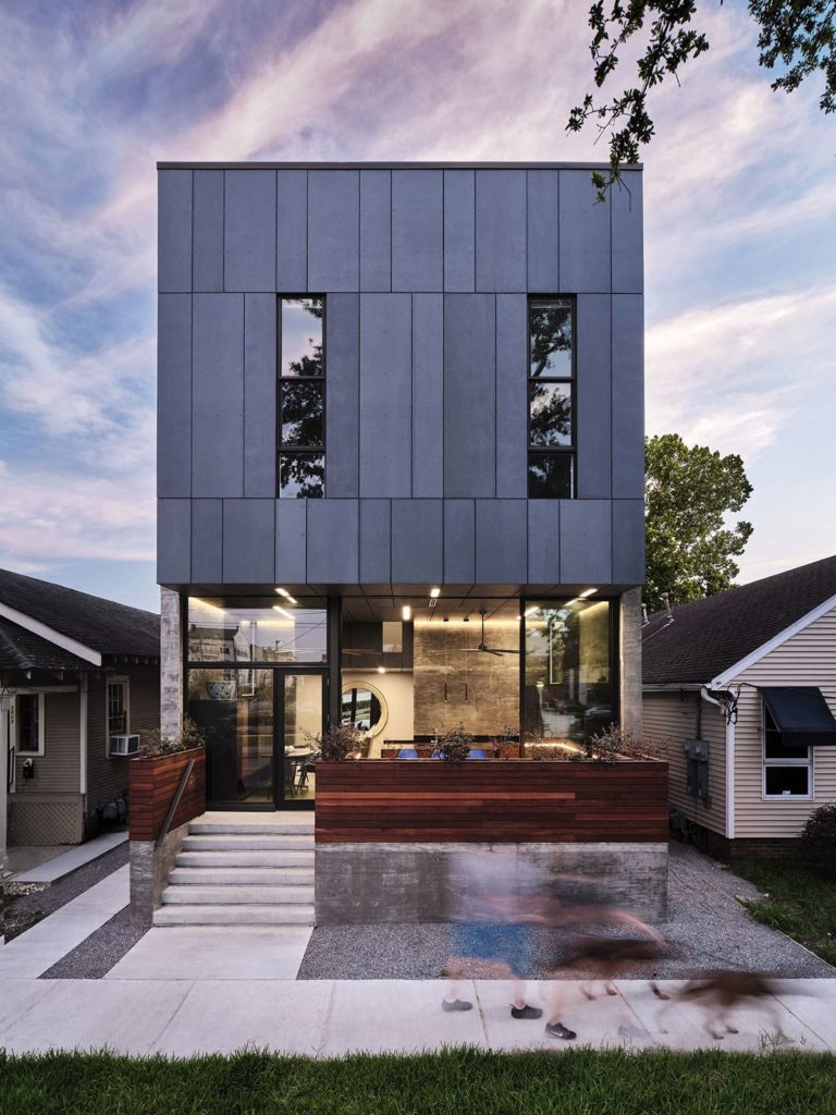
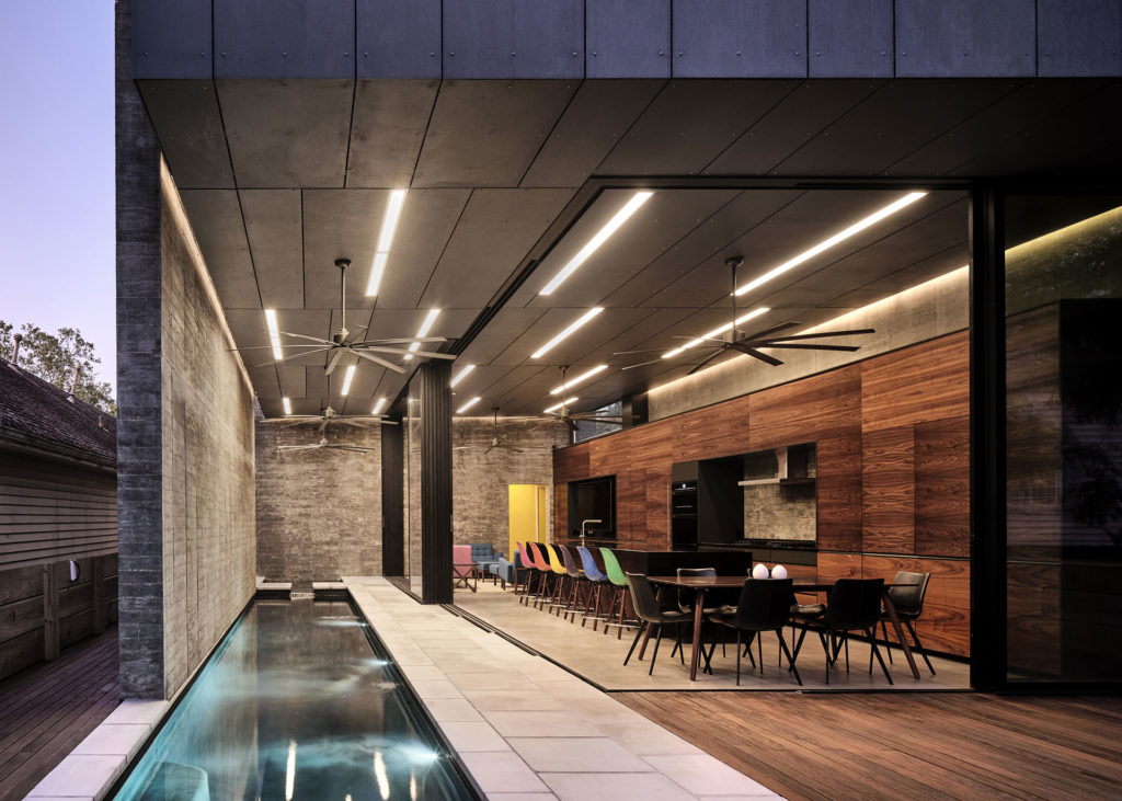
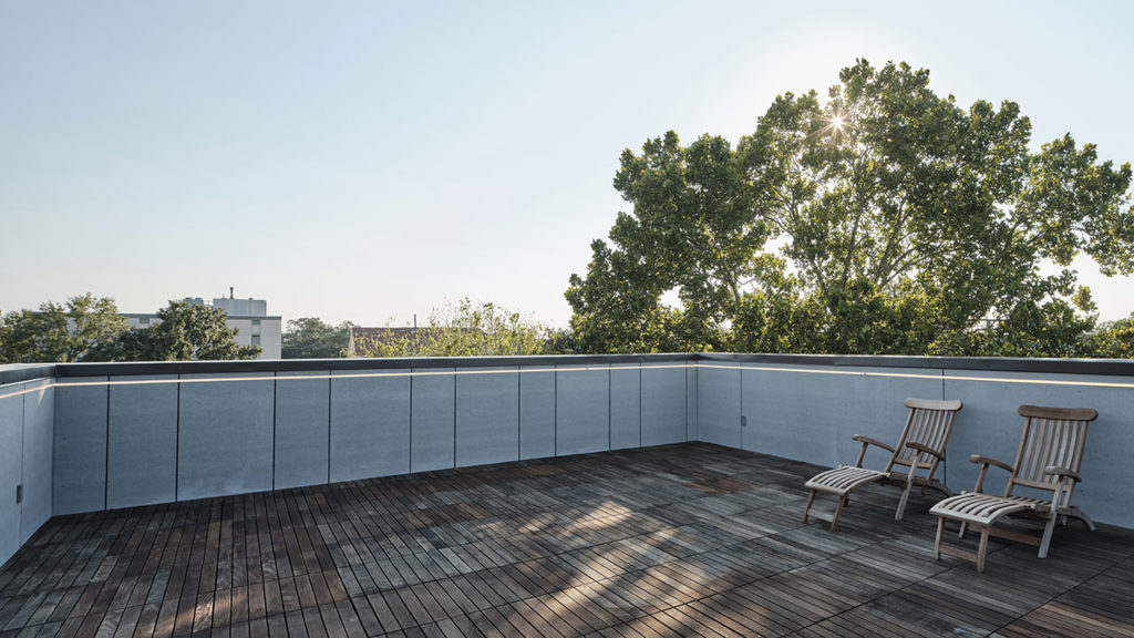
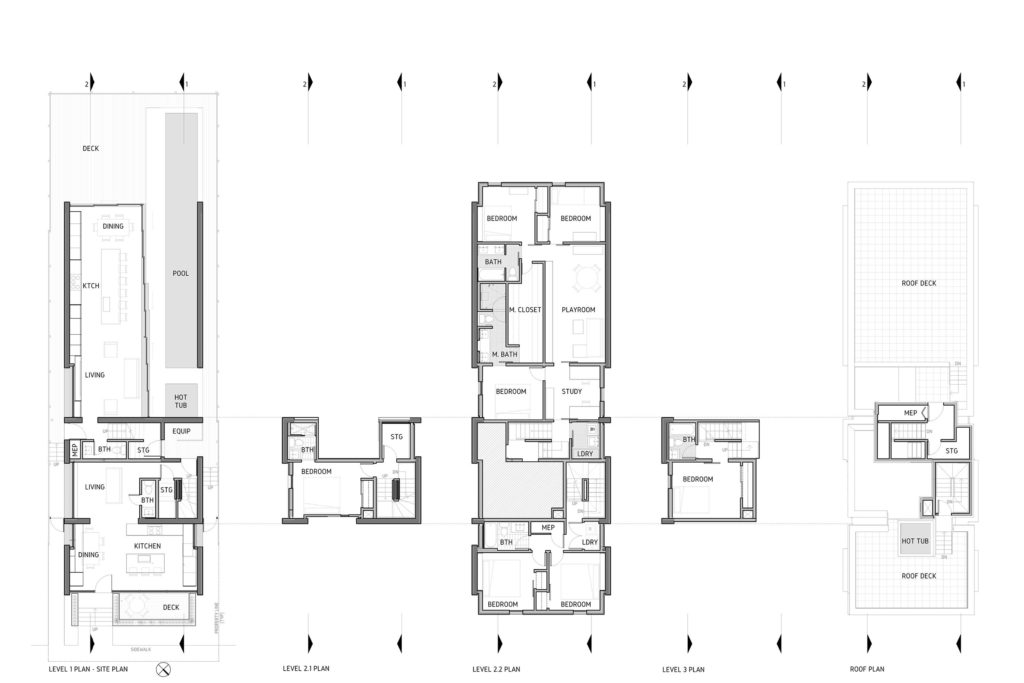
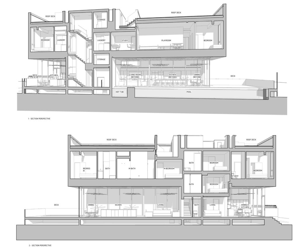
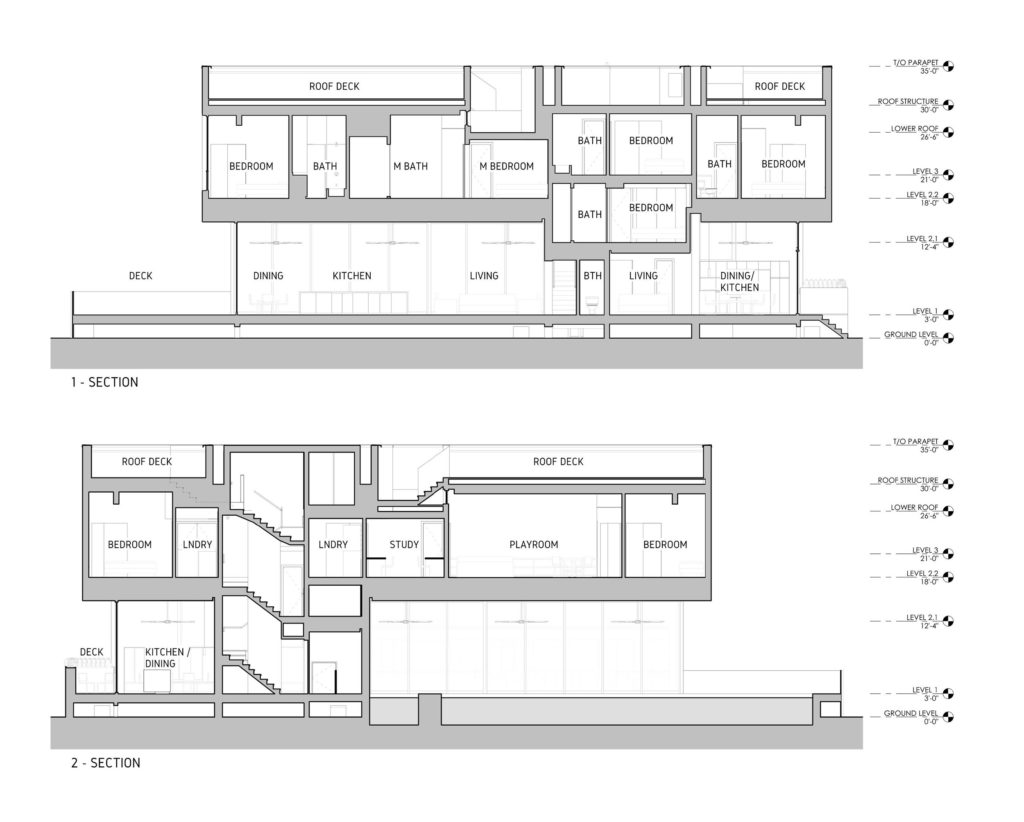
The duplex is designed to maximize the use of the lot (32’x105’) with suitable space for separate, large families (or groups of people) in each unit. The central goal of the design was to configure communal spaces in a way that best accesses outdoor light, air and volume despite the density of required spaces. The rear unit consists of four bedrooms with 3 ½ baths and the front unit is a short-term rental with three bedrooms and 2 ½ baths. The layout orients the rental unit as its public face, actively engaging travelers with the city, while mirroring the position of the primary unit to connect with the rear yard to favor seclusion.

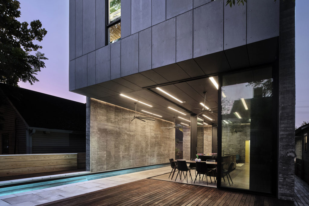
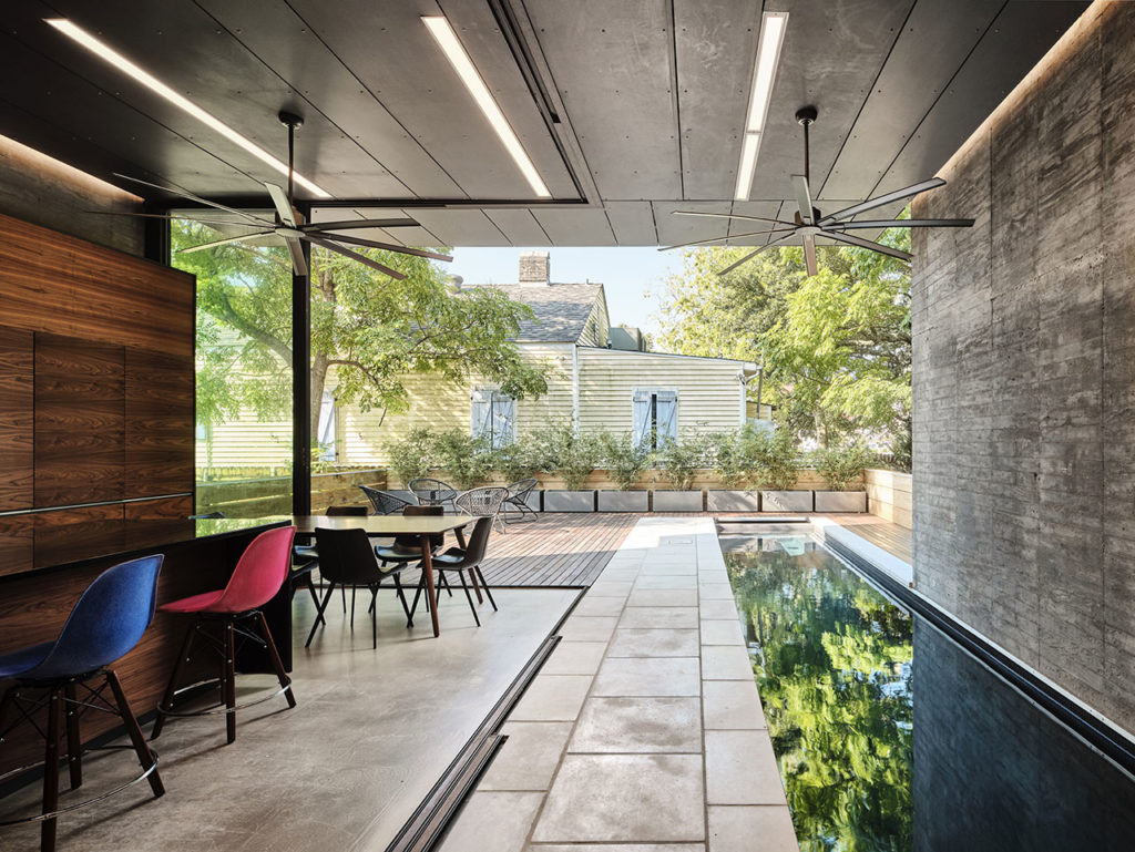
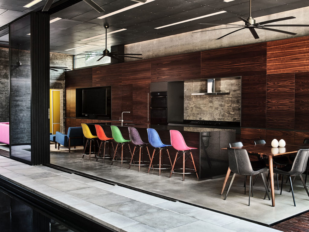
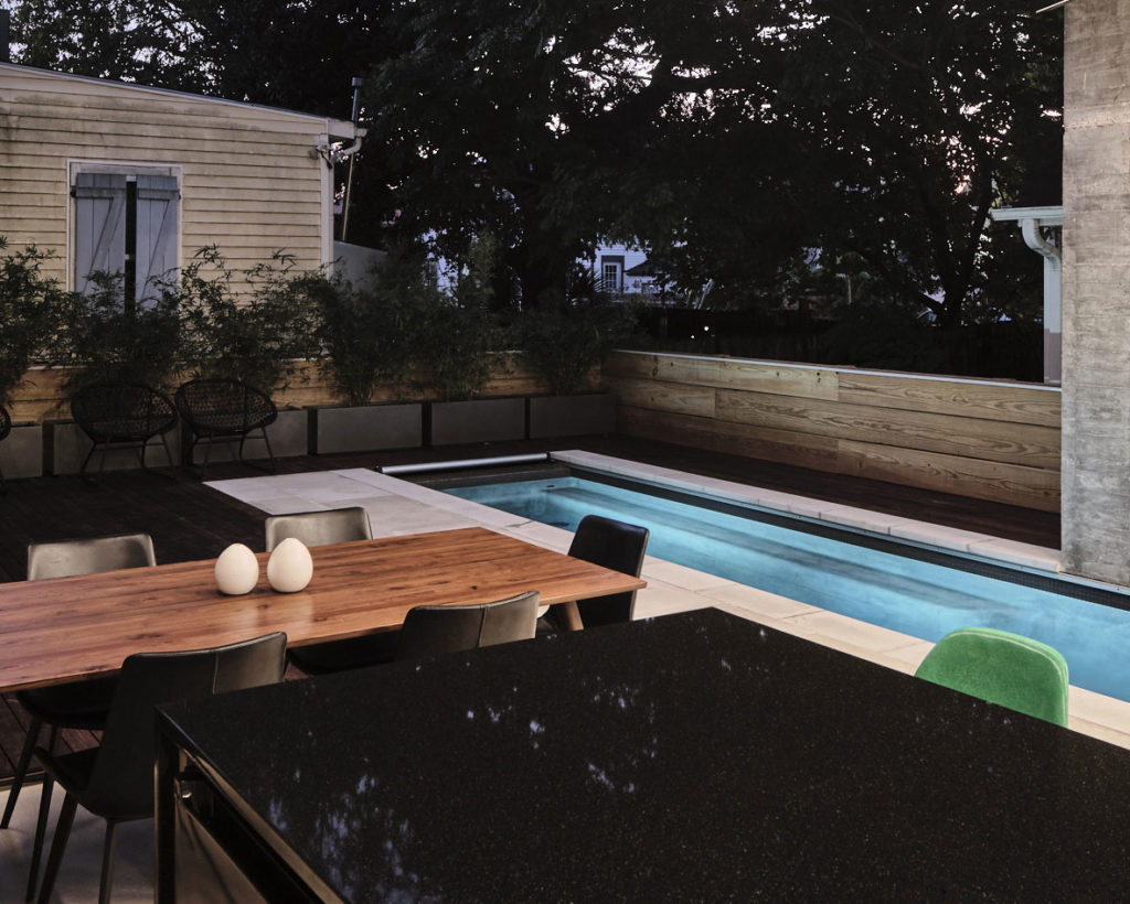
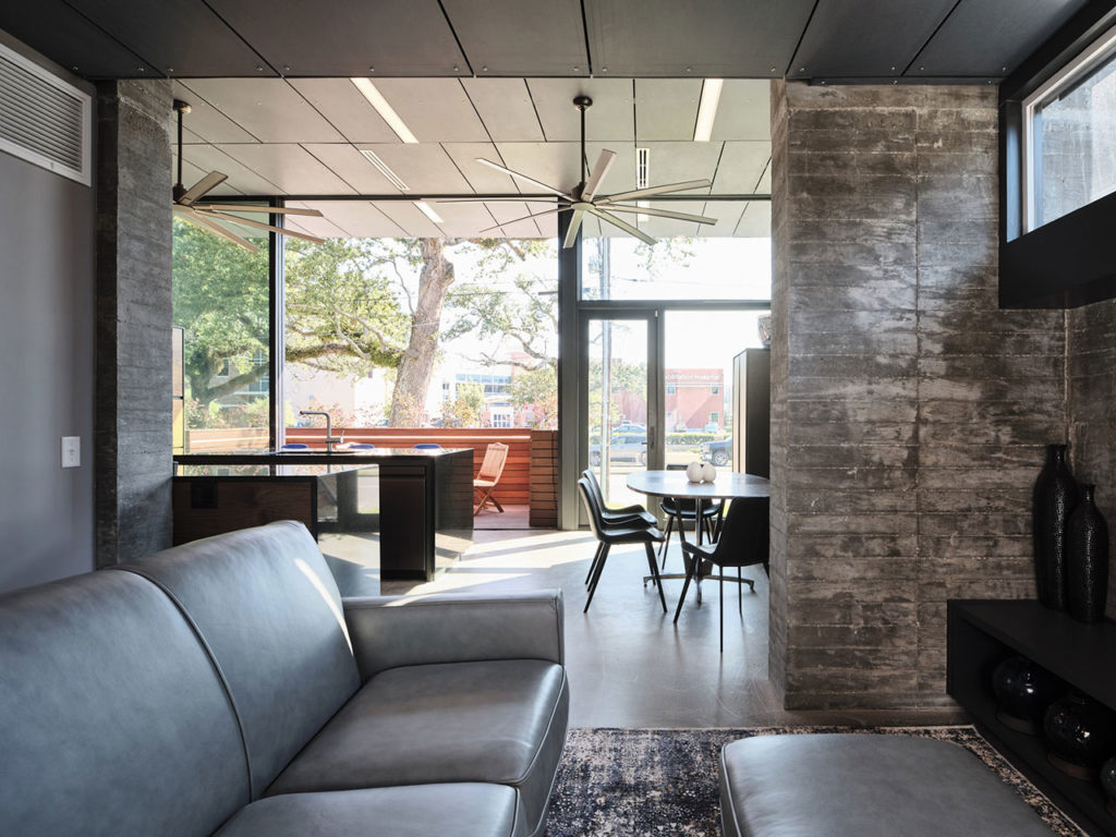
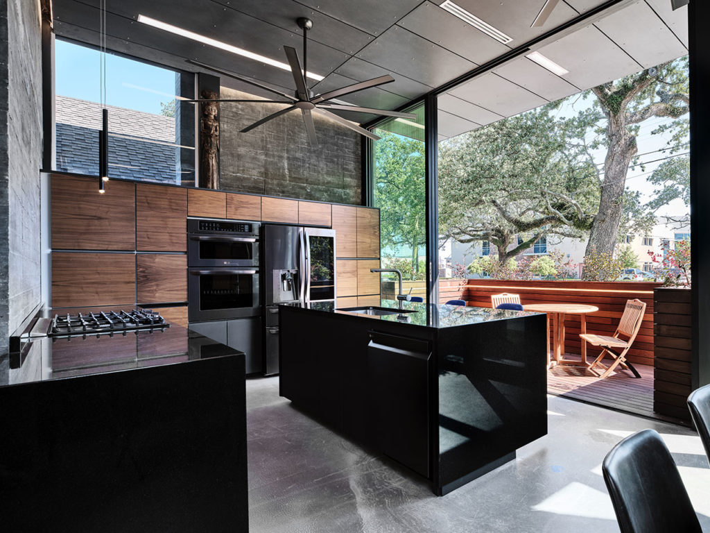
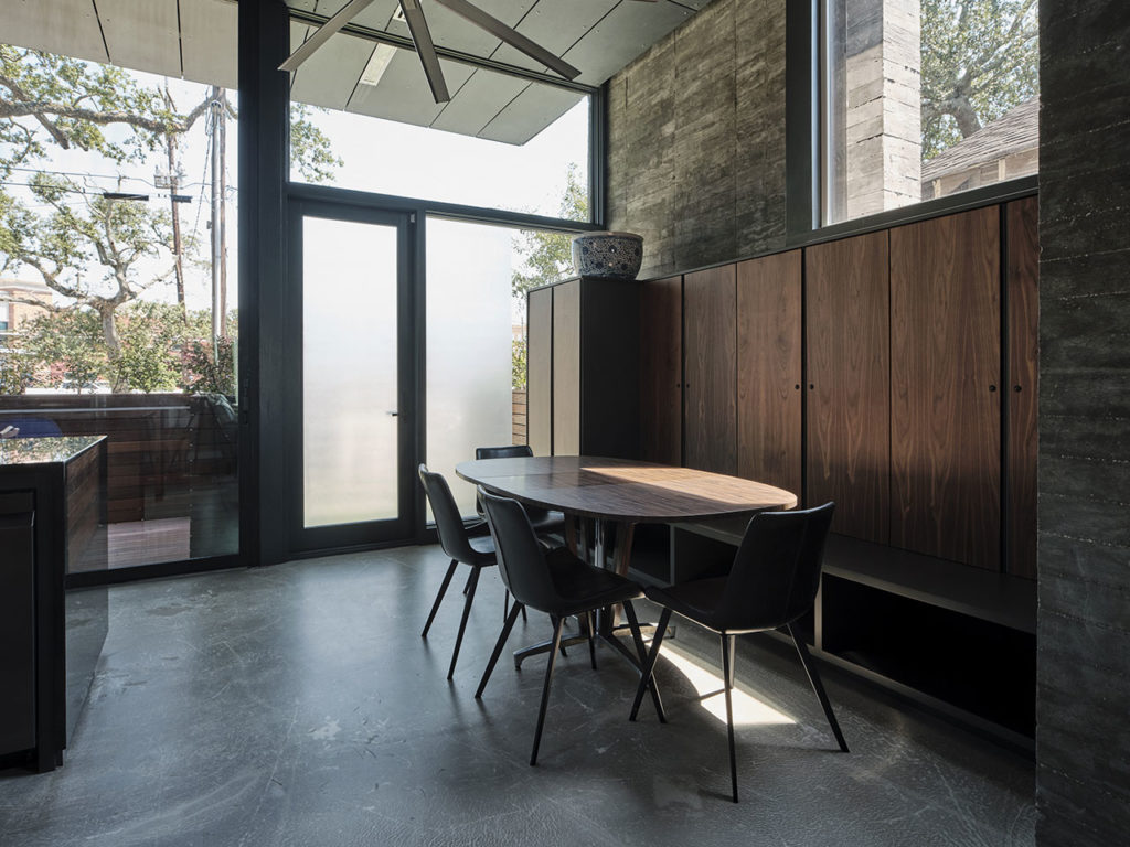
The first floor was designed to be voluminous with 12’ ceilings and stairs compressed as much as possible to maximize the square footage of the communal spaces. In the rear unit, an exterior deck continues from the interior communal space over the entire rear yard and extends under part of the upper floor volume along with a raised pool. Two sliding glass walls open to enlarge both interior and exterior spaces. The front unit sees a sliding glass wall to provide greater aperture to the exterior and leads to a deck flanking the front sidewalk. A raised planter wraps the front deck with enough height to provide inhabitants inside with privacy but is short enough for engagement with passersby.

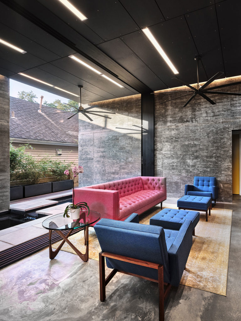
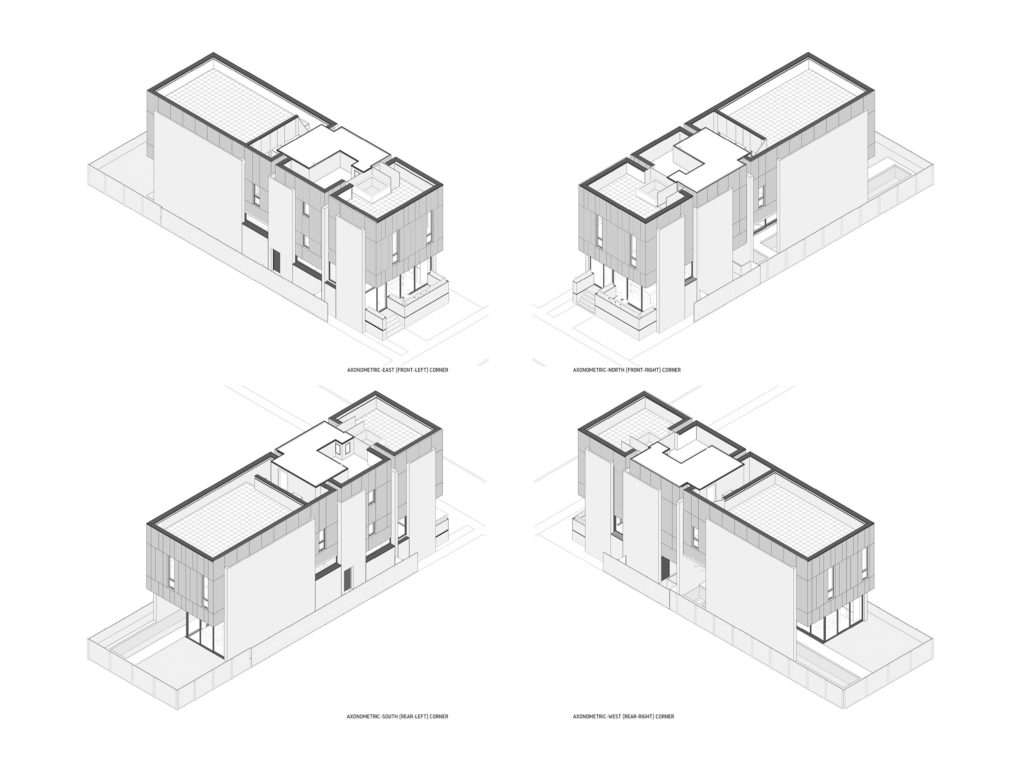
Architectural forms are configured to accentuate the transparency between the interior spaces of the first floor and the exterior. The upper floors contain more private spaces and are wrapped by exterior surfaces forming an echelon of suspended cubic forms legible from multiple viewpoints including the underside. The exterior cladding wraps horizontally as the interior ceiling of 1st Floor Spaces to conveying a sense of outside within. The walls supporting the cubic forms are a series of monolithic, exposed concrete walls with a narrow gap between the walls and the cubic form to render each (the wall and cubes) distinctly. The static forms juxtapose the more animated interior space as a frame, reinforcing the transparency.

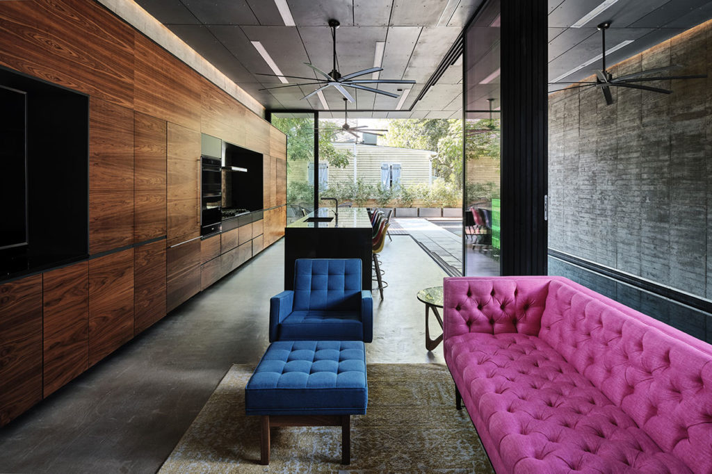
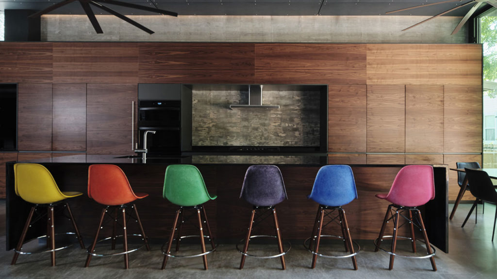
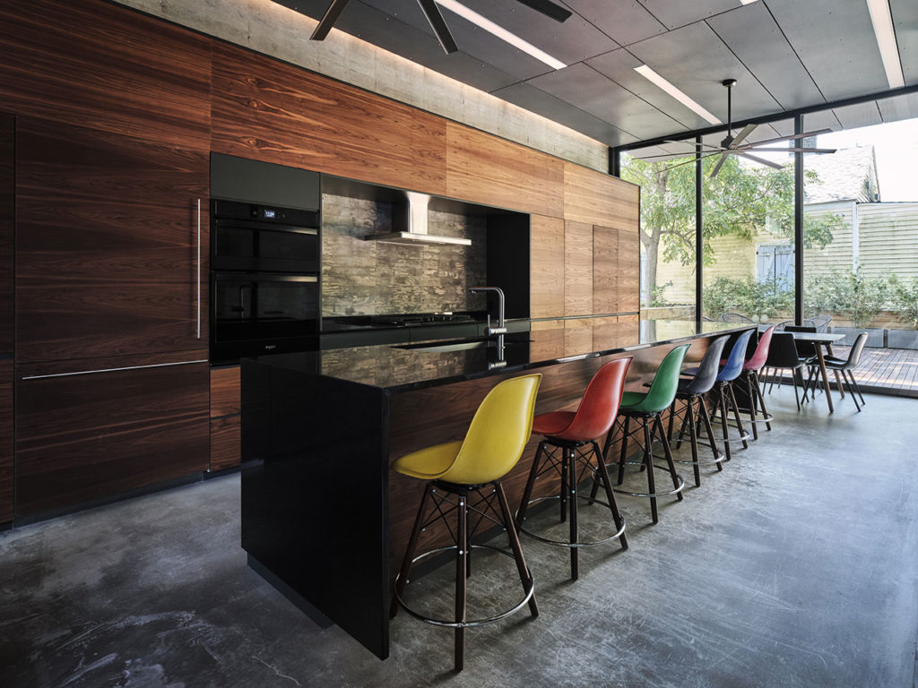
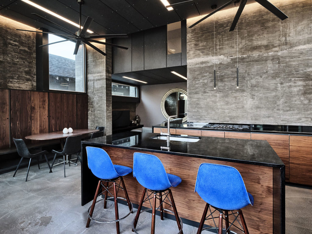
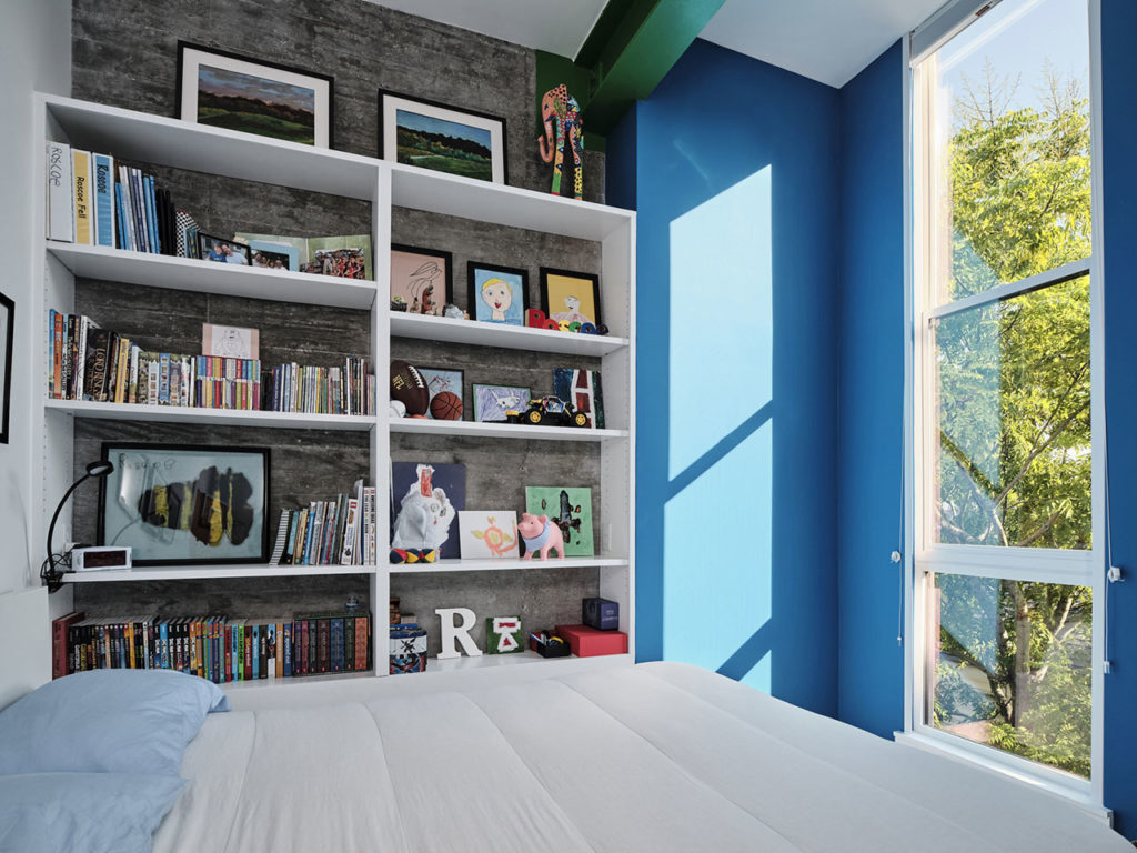
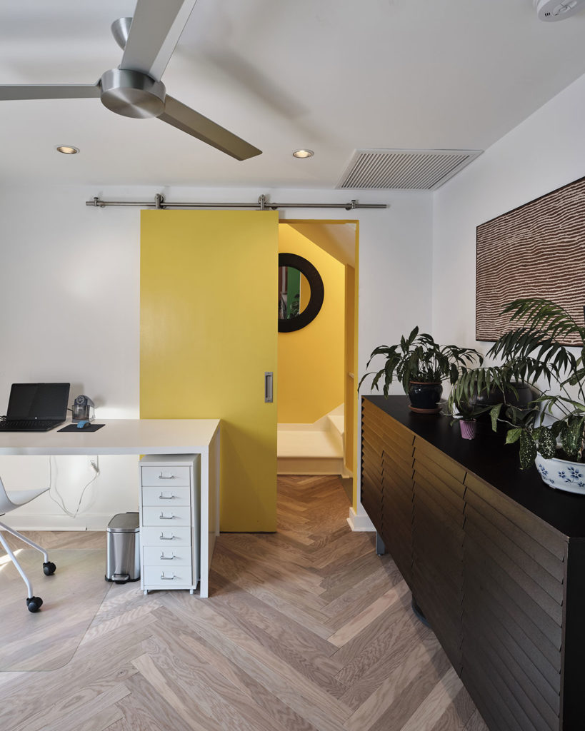
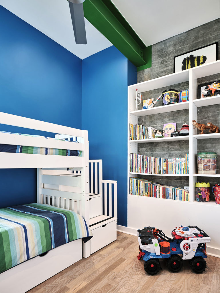
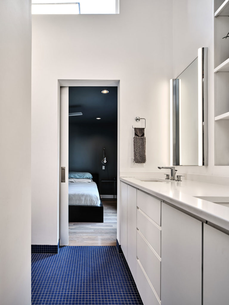
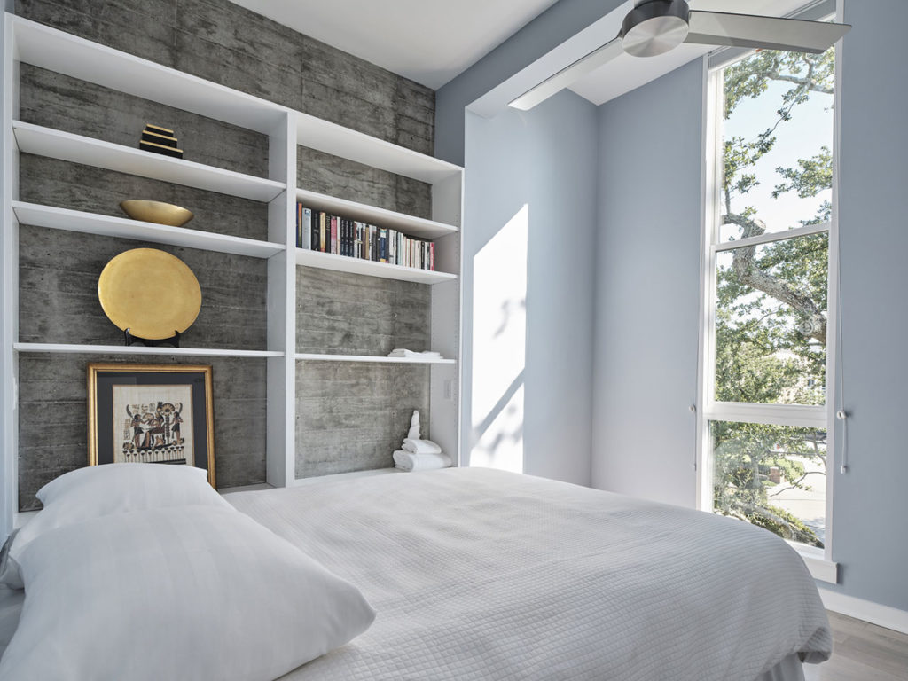
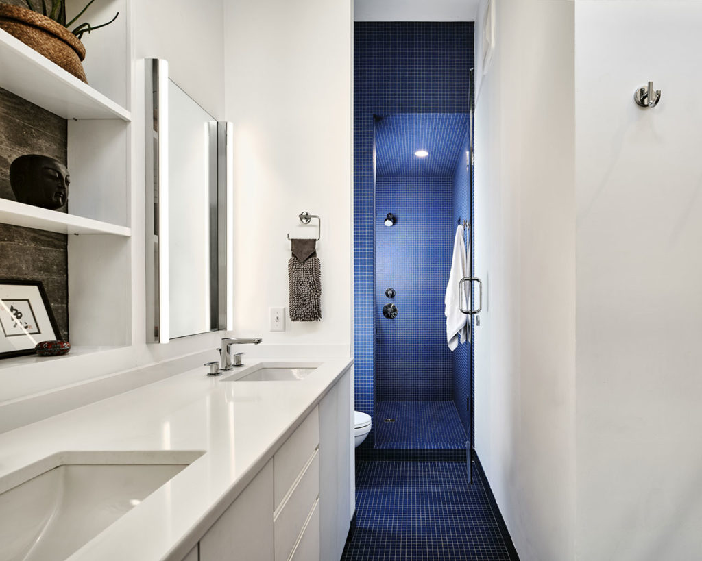
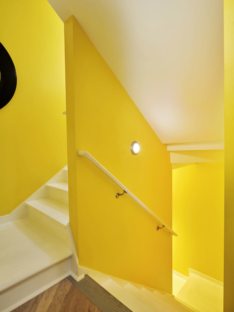
Finishes on the first floor are raw and exposed, serving as a backdrop to render activity and furnishing more vividly. Concrete walls are exposed where possible and kitchen cabinets are clear stained walnut with handles routed into horizontal edges. Finishes on the upper floors, by contrast, are more static and colorful. A series of multi-colored accent walls are inserted to embolden the defined use of each distinct space.











comments