Gabinete Veintiuno is a psychology buffet located in Elda, Alicante. The project stems from the need for a space where a person will feel calm and tranquil. The distribution before the reforms, which occupies a surface of 100m2, transmitted feelings quite contrary to those required, being spaces which were very divided and lit by small openings in the façade. We organised the new floor to suit function and we took advantage of the integral reform to carry out a great enlargement of the openings in the façade.

In order to reappraise the inherited premises and to provide the interior of the buffets with greater spaciousness and illumination, the new façade is made with large floor to ceiling windows. On the exterior, the old façade is given a much more transparent and elegant appearance, using in its facing white Carrara marble. Included in the design are filters in the way of blinds, necessary for the privacy required in the interior with respect to the transparency of the façade.

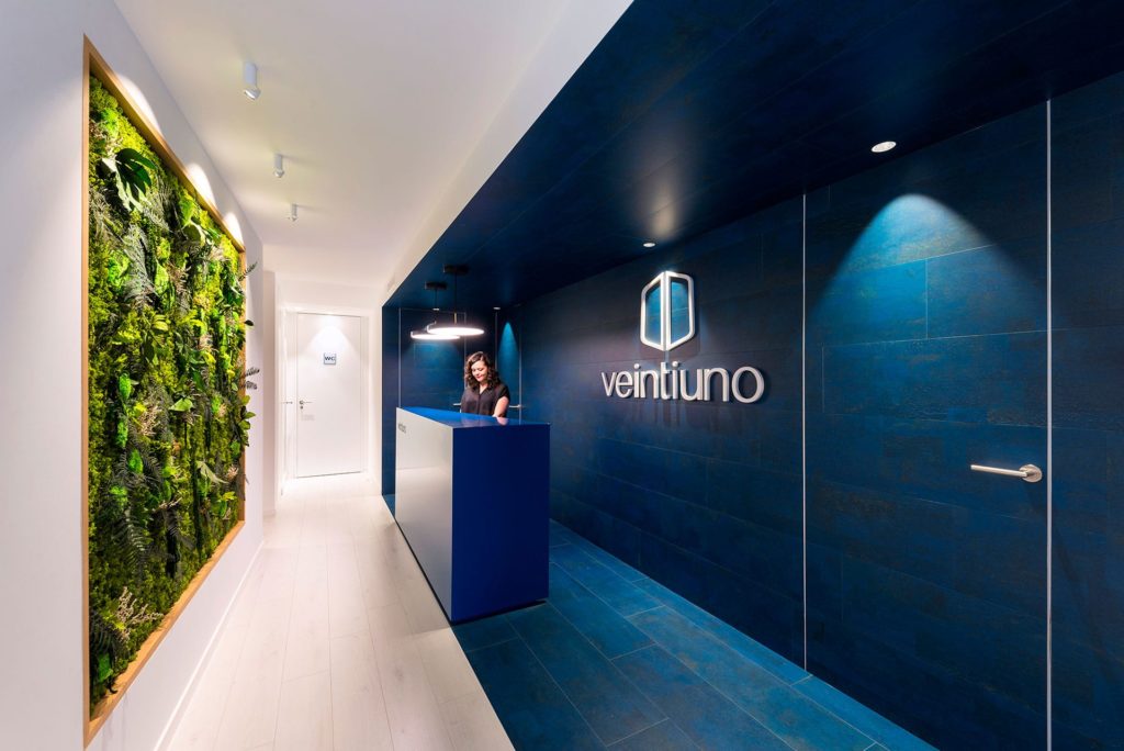
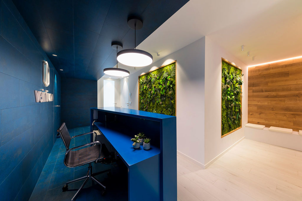
On entering Gabinete Veintiuno, the visitor will be impressed at first sight in the reception area by a double space which reflects, in the same way as the two hemispheres of the brain, the intention to combine a clear, ordered environment with a more artistic and colourful environment. One part is faced in its entirety with natural cork in blue tones, thus evoking creativity and imagination. In contrast, and in the same way as occurs in our brain, there is another part of the reception that alludes to calmness and reasoning, using materials which are more neutral and minimalist in whites and light colours.

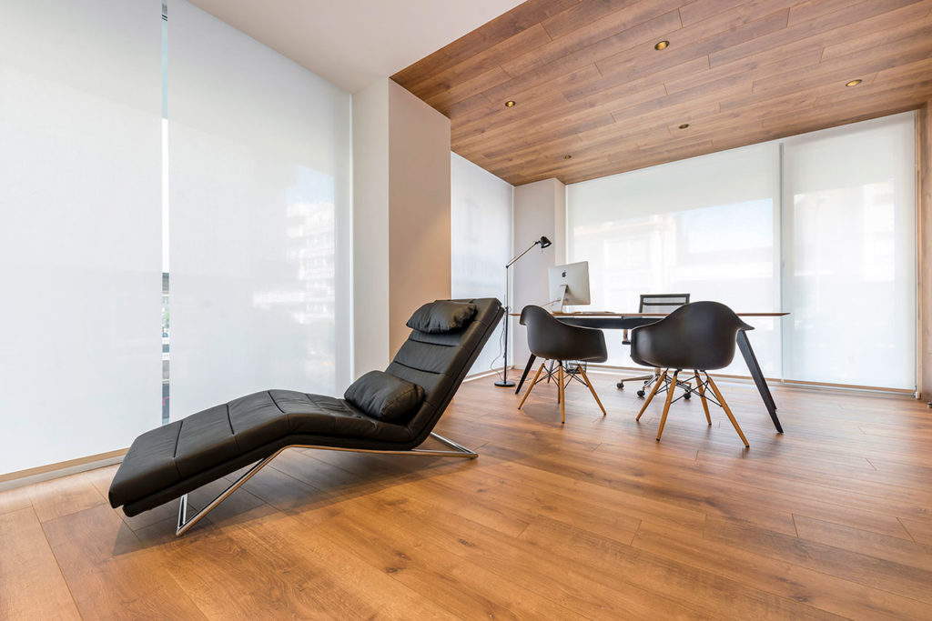
Also, in the reception and waiting room plants are incorporated by using vertical gardens. In the buffets a light neutral atmosphere is used along with wood flooring which offers warmth and aims to ensure the patient finds the place agreeable and welcoming. In several places the effect brought about by the wood is increased by using it to face walls and ceilings, as happens in the waiting room and in the main buffet. In this way, we convert the architecture, the choice of materials and the furnishings into an ally so that the user feels in harmony with the space and finds comfort.
[…] surfaces and materials, we used a warm color palette, in combination with white glass, which refers to the marble lining in the lobby. Oak flooring, […]