
Text description provided by the architects
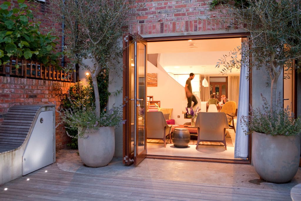
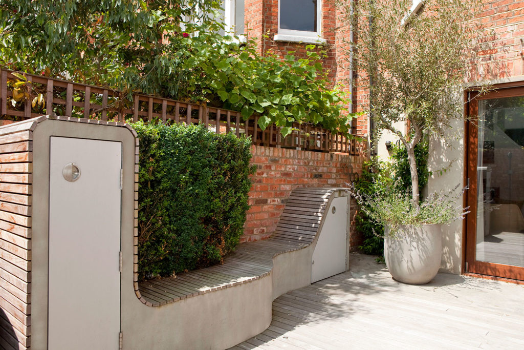
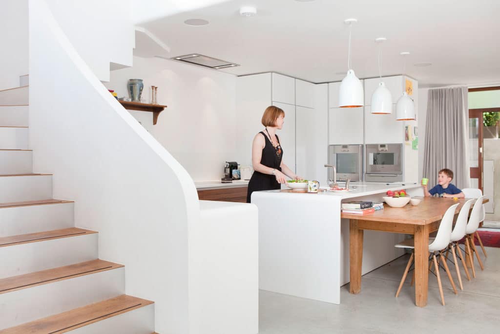
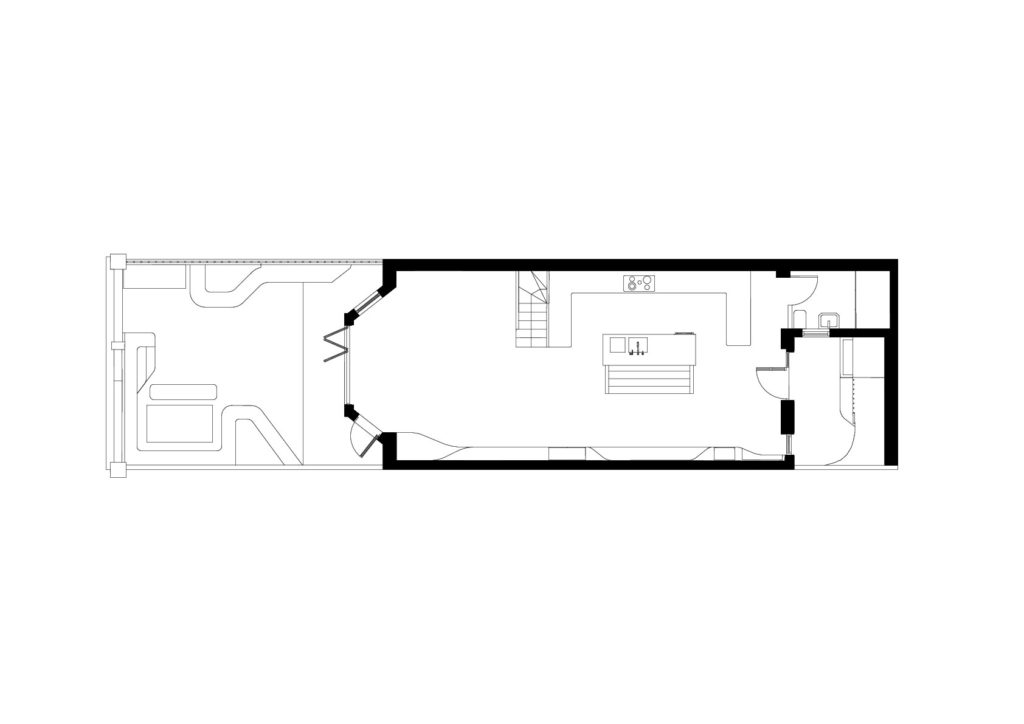
At just 4.4 meters wide, this Georgian house in a London conservation area was prohibitively narrow for the ambitions of our clients. The ground and lower ground floors required full renovations and the lower ground had to house a new kitchen, dining area and sitting room without feeling like series of claustrophobic rooms. We achieved this by extending the house to the rear and utilizing every available corner on the lower ground floor. We maximised space under the stairs, designed furnishings into the walls and inserted large glazed panels into the roof to allow in light and emphasise width. Out of respect for the facades and neighbourhood continuity, we employed a light touch to the exterior design.

What was the brief?
An analysis of the client’s habitation scenarios and daily routines exposed issues with the existing space and the new design emerged from the need to create a personal space to accommodate their lifestyle.
As in many Victorian terrace houses, the majority of time was spent at the Lower ground/garden level of the house where the kitchen and dining area were located, whilst the generously sized two reception rooms at ground floor above, were seldom used. In fact, a careful analysis revealed that an astonishing 90% of the time is spent in just 10% of the space. Moreover, the unused ground floor receptions rooms enjoyed great sun and natural light while the basement was the darkest in the whole house.

What were the solutions?
The design intent was to interlink the unused ground floor to the areas below while bringing as much natural light down to the Lower Ground floor, and to relieve the cluttered Lower ground level of some of its uses (cooking, eating, playing, admin, entertaining, etc…)

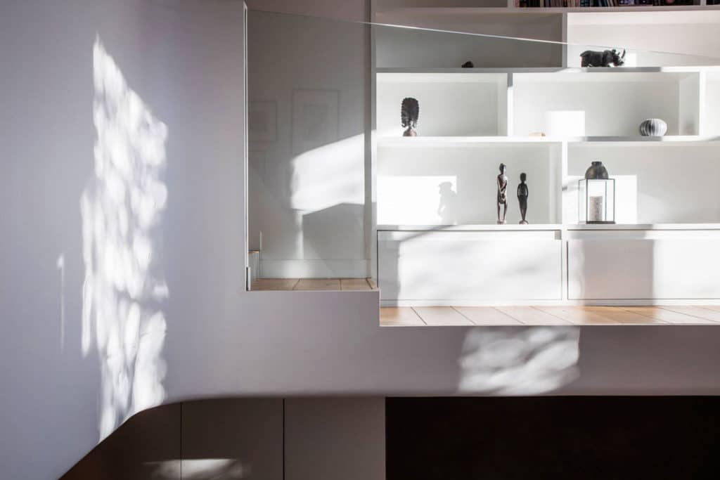
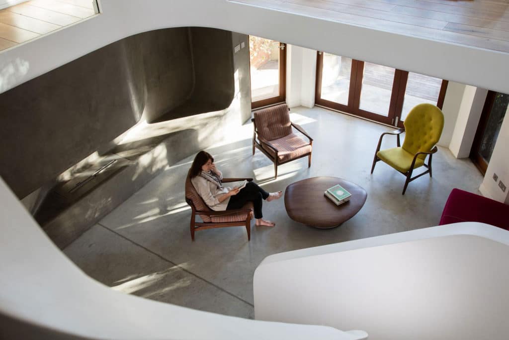
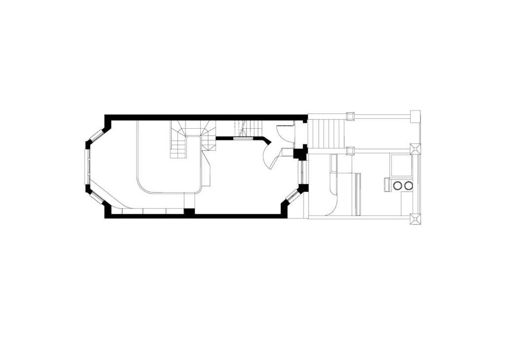
A cut through the ground floor, and relocation of the staircase, proved to be a simple and effective solution. It created a mezzanine level offering visual and physical connection of the two floors and natural vertical flow of movement. The cut is located in such way to allow the maximum amount of daylight down to the lower ground level.
How is the project unique?
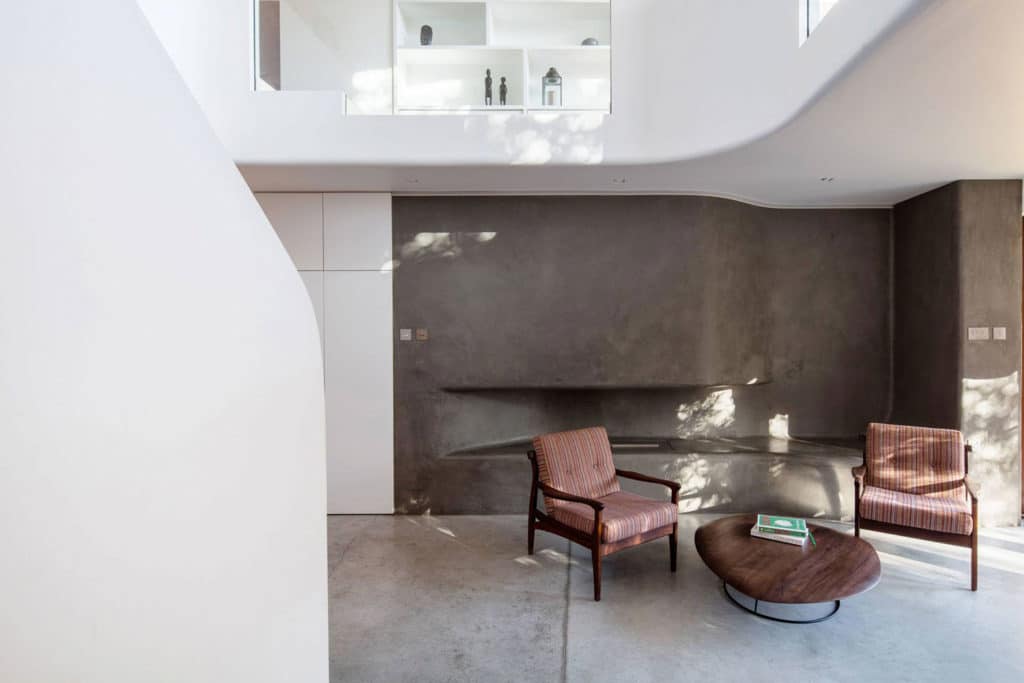
A feature wall running the length of the house front to back seamlessly changes, responding to the different activities of the area it’s in. It evolves from providing space for coat hanging shoe rack, into cupboards for additional storage, a bench to sit additional guests during larger dinner parties, a second cupboard and then into a fireplace with integrated seating at the other side of the stairs in the sitting area.
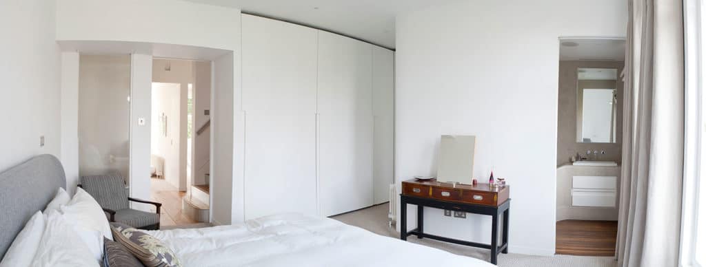
The en-suite master bathroom is another unique feature. A Japanese style soaking bath is integrated into a continuous tile-free surface that accommodates the basin and storage unit, all seamlessly integrating into / emerging out of the walls. This Geometry presented a challenge in production. The solution combined digital production techniques with traditional finish. The shape of the bath was CNC cut, and assembled on site. A water proofed layer was applied manually and so was the traditional Moroccan plaster finish.









comments