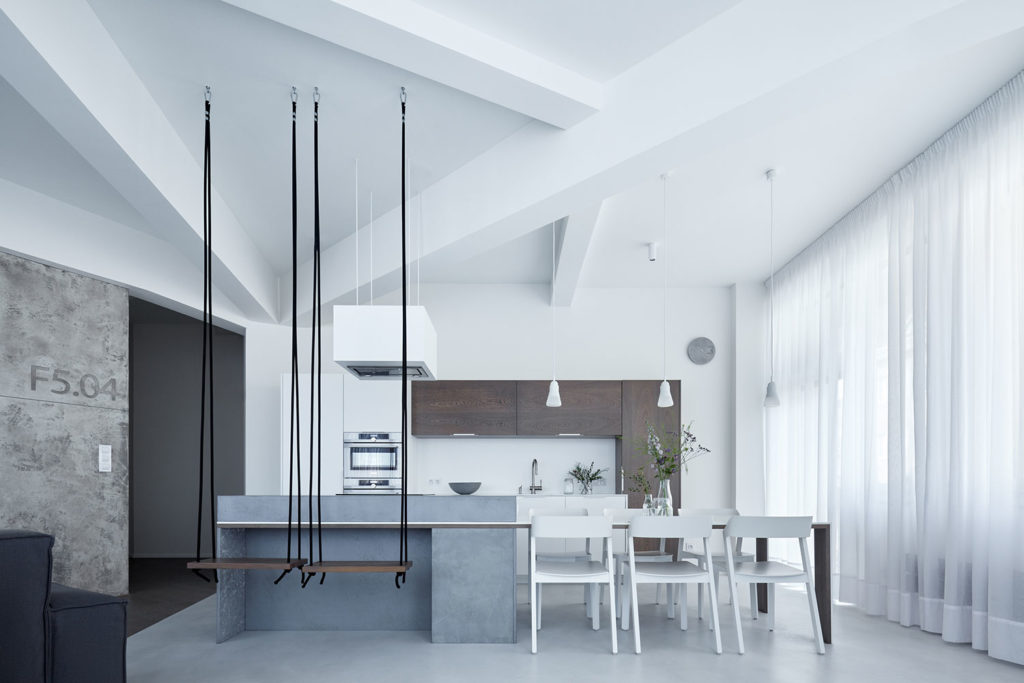
When the chance to buy an apartment in the former factory ETA Regula arose for its prospective owners, they did not hesitate for a minute. After a long search of an apartment offering both interesting and atypical elements, and located in central Prague, this proved to be an ideal choice. Time management was perfect, and the arrangement with the developer was that the apartment would be made over as shell and core, meeting only the most basic approval standards. The owners also addressed our studio ahead of time, providing us with enough time to think about the project in detail. As soon as the owners were handed the keys to the apartment, we were ready to begin with the changes.
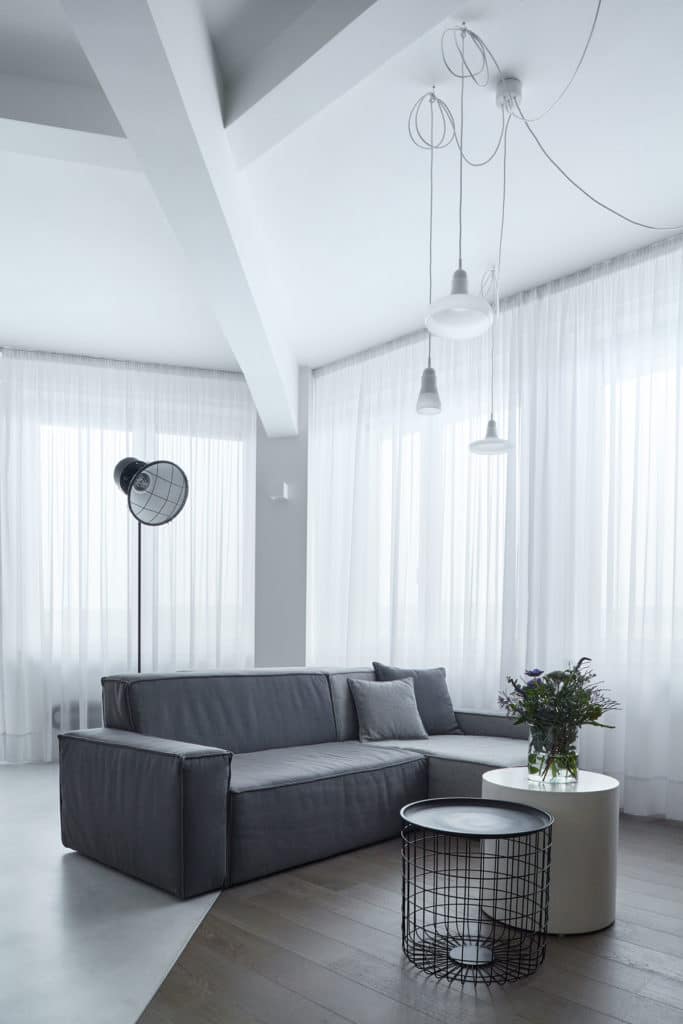
Upon our first visit of the apartment, we faced an unpleasant surprise – the windows. The industrial design was replaced with plastic windows, although the developer had committed to keeping the original design. Since this was a corner apartment and windows played a key role in the interior, the change had unfortunately altered its overall character, despite the extraordinary size of the windows. Our goal was to restore the industrial ambiance of the place and supress the impact of the windows.
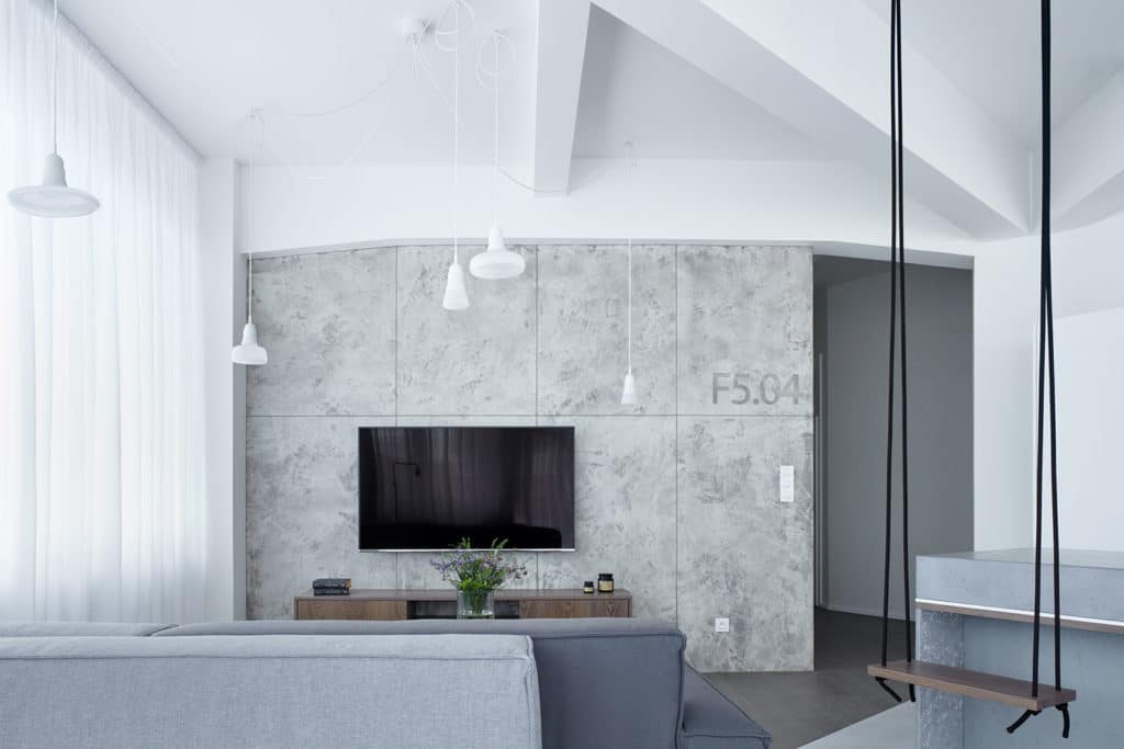
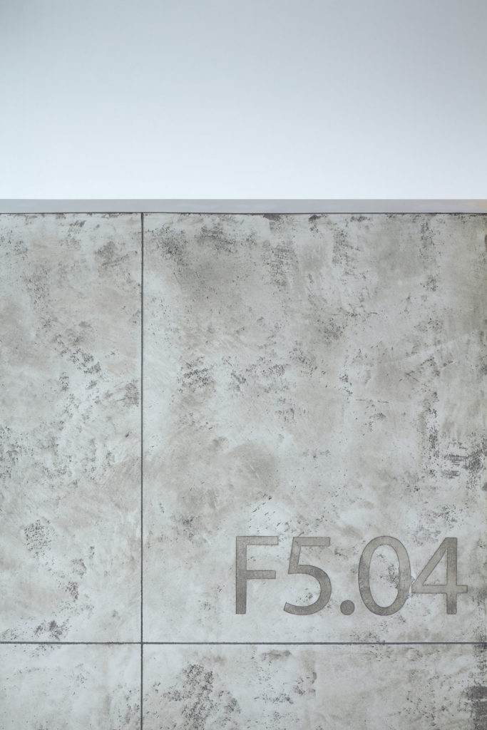
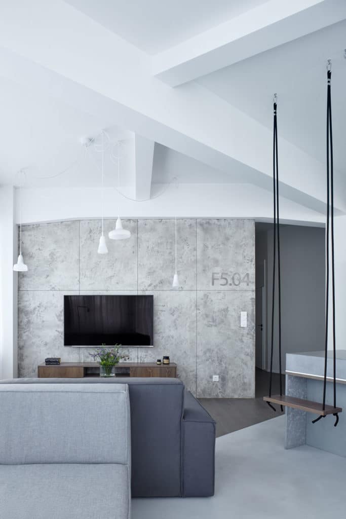
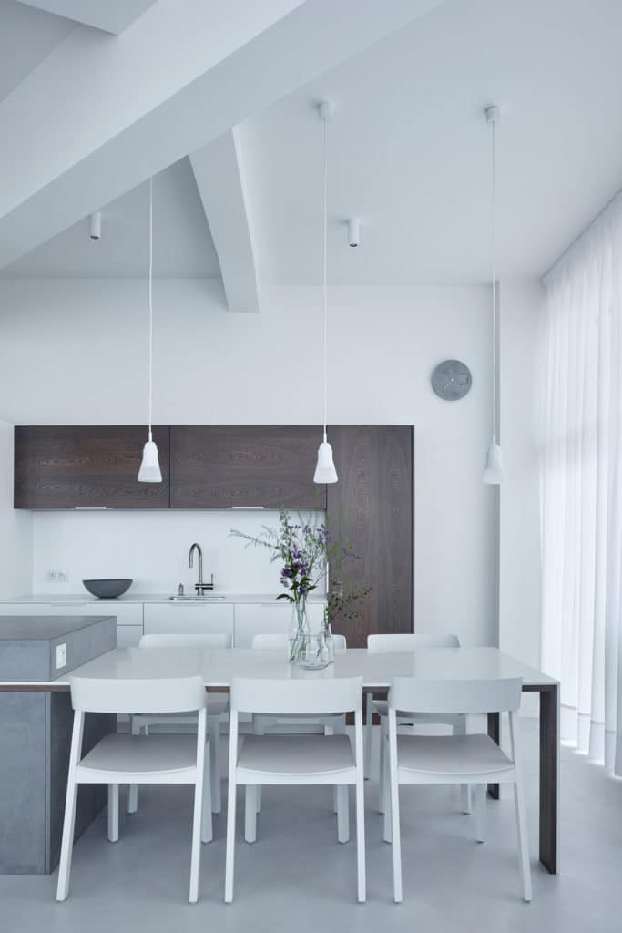
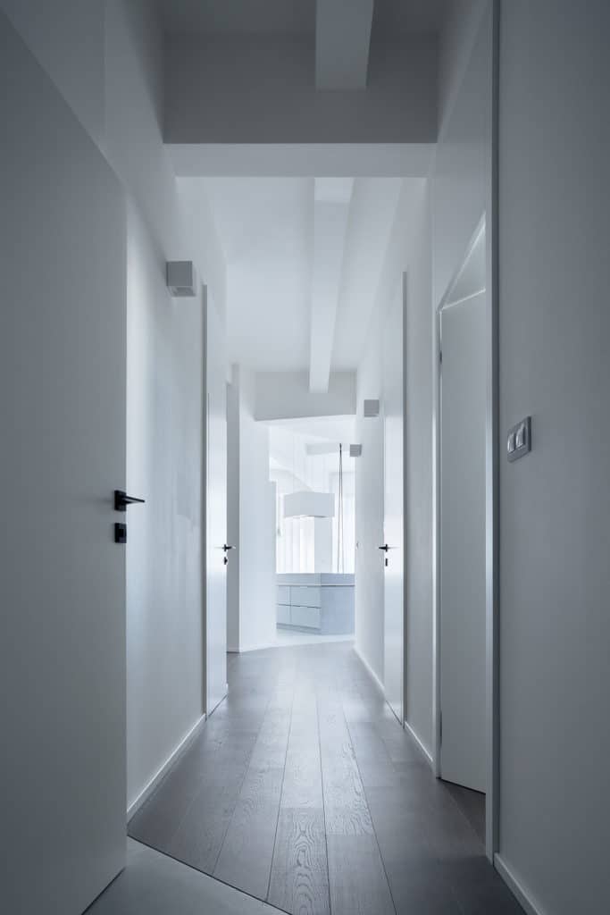
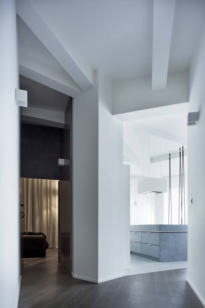
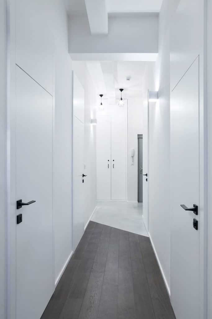
The main residential space was opened into the entering area as much as possible. We let the central column show to good advantage, as well as the ribs leading out of it. These form the basic construction of the entire building and create an interesting structure on the ceiling. The structure has impact on the overall shape of the apartment, which is not rectangular. We pursued this irregularity in the floor which is made of two materials, skim coat and wooden boards, depending on the floor’s functionality – the poured skim coat in the entrance hall and in the kitchen, the wood in the hallway, the rooms and the main living room by the TV set. The joints of the floors follow the direction of the ribs. The apartment was to appear as clean and light, that is why the ribs are not visible on the original ferro-cement construction, but the principal colour was white in this case. Concrete was used only marginally in the form of exposed concrete in the living room behind the TV set and on piece furniture.
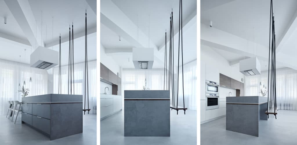
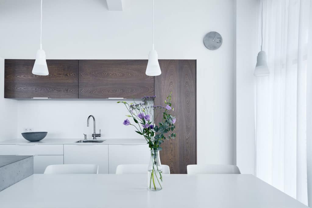
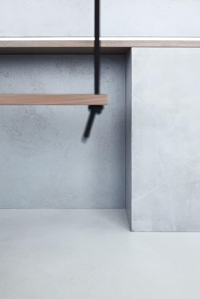
The dominant feature of the main residential space was a concrete island. A built-in narrow board made of wood and Corian passes through it, forming the dining table. Grey-stained wood, Corian and concrete are materials repeated on other pieces of furniture in the main residential area. The island is the central point of not only the living room, but of the whole apartment. It emphasizes atypical bar seating in the form of suspended swings. Also, because of the interior openings, one can spot it upon entering the apartment.
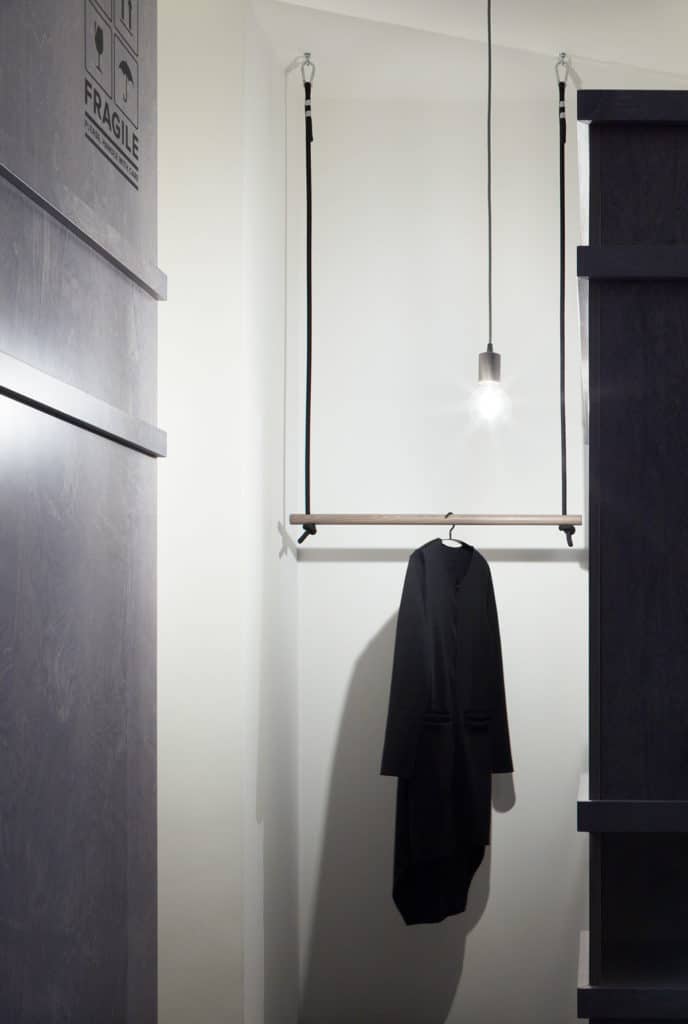
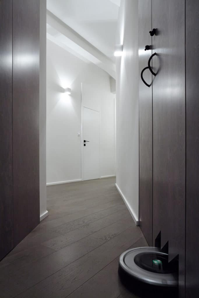
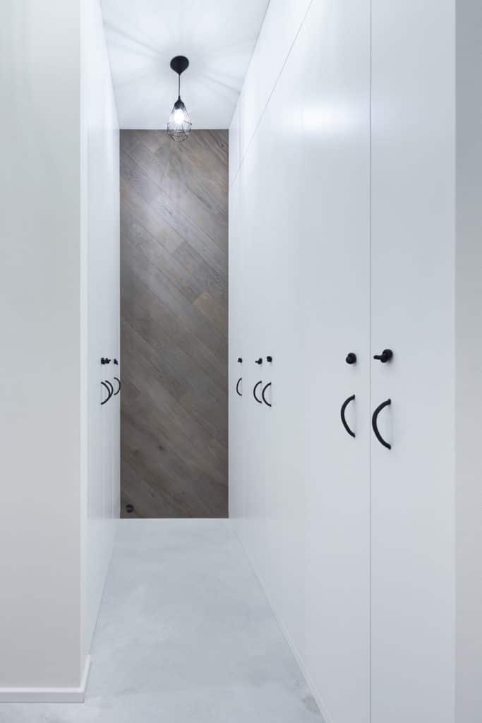
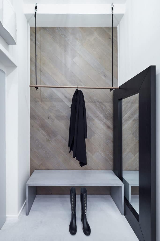
The element of black is apparent in the entire apartment and can be seen in the entrance hall (the coat hanger), in the wardrobe or on the handles of fitted closets. The swings and the rope curtains also stress the atypical height of the interior, which is 3,3 metres.
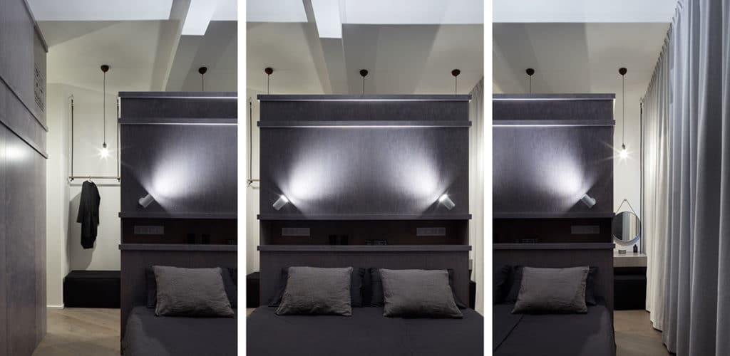
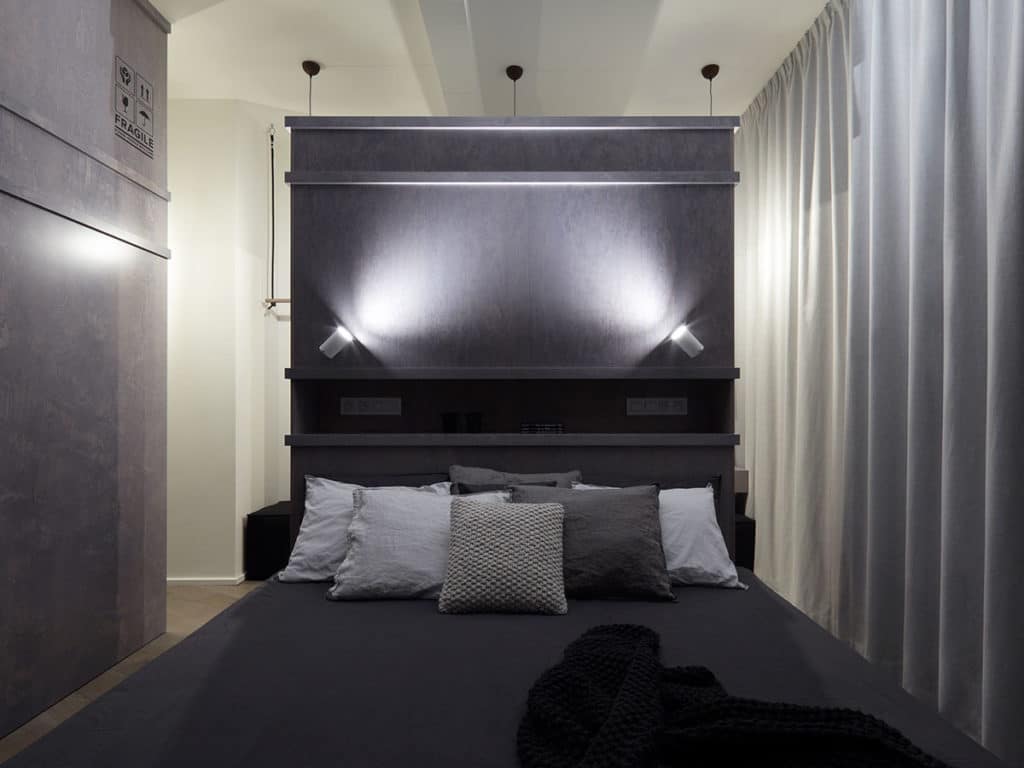
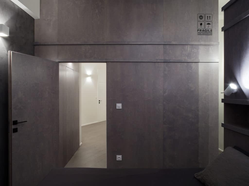
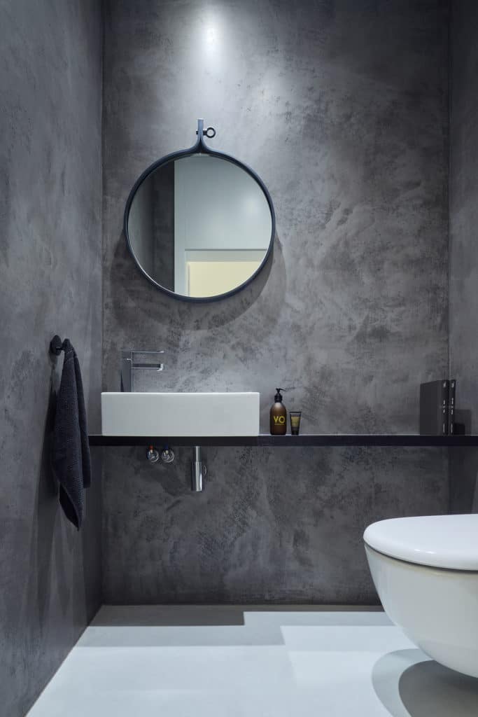
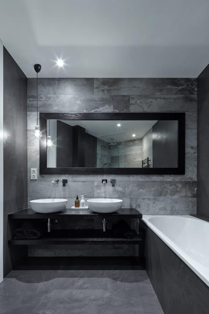
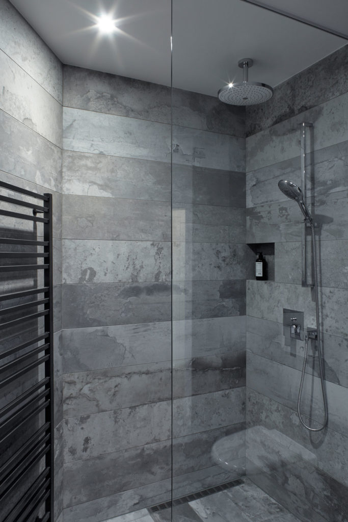
When walking through the apartment, it gives the impression of a very clean and light interior. The bedroom and the bathroom, however, are in contrast with this impression – much darker material was used there, as these rooms serve for rest and relaxation. The wardrobe and the boarding of the bedroom wall, which also conceals the technical room with a washing machine and a drier, should evoke shipping containers. For this reason they are made of plywood, only lightly stained in grey.



comments