
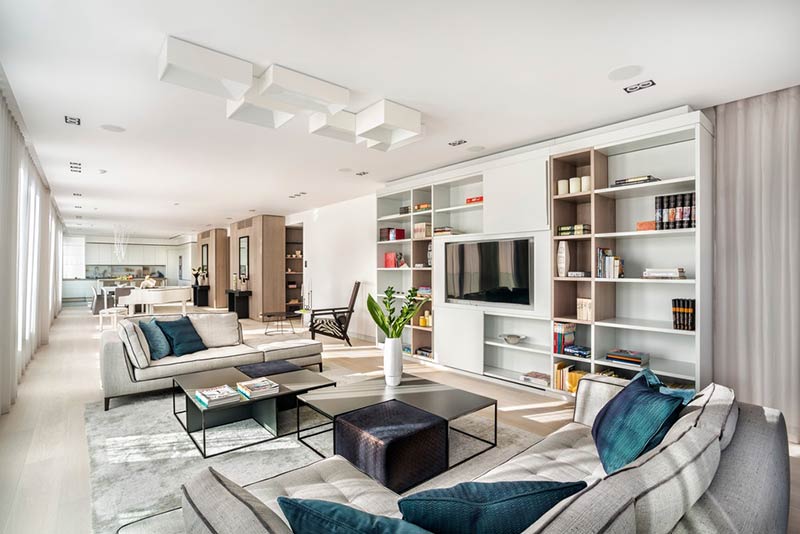
KNOF design (based in London and founded by New York designer Susan Knof) has completed its first major commission: the remodelling of a spectacular 360° penthouse in the Bulgarian capital of Sofia, uniting two separate apartments into a single 3,600 sq ft space. The new, one-storey penthouse features floor-to-ceiling glazing all the way round and offers its owners incredible panoramic views over the city and adjacent mountains with all the benefits of continuous natural light, from sunrise through to sunset.
The light-privacy balance in the penthouse was achieved by fitting soft voiles all the way around the 360° glazing, as well as black-out blinds, so that the owners have the choice of completely open living; light-filled but private living using the voiles or else blocking the light out completely – perfect for watching movies for example.
The Brief
The brief from the client was to merge two existing properties (an east and west apartment) to create a single, open living environment that allowed for an unobstructed kitchen, dining, living and entertaining space, where full advantage could be taken of the views, whilst also providing private areas for the master bedroom and children’s areas.
Interior Design Language
‘On entering the apartment, the language of the interior scheme is immediately apparent’, commented Susan Knof. ‘The elegant, yet subdued, use of soft natural materials greets you in the primary entrance hall. As you proceed past the natural-dyed, grey-veneered walls, the open space is subtle and sophisticated and allows the gorgeous mountainous natural environment beyond to take centre stage.’
Architectural Challenges
From an interior architectural standpoint, the main challenge of the project was the original planning of the overall building – especially the existing plumbing stacks, which allowed little possibility for exploration of different bathroom locations and the new design very much had to work around that. Structurally, there were also given core walls that had to remain in place. In addition, the full height windows also offered limited space for new ceiling and lighting logistics, and, most restrictive of all, the M&E services were planned along the perimeter full height glazing walls, seemingly blocking the views and the implementation of sheer or black-out curtaining. This was overcome by re-coordinating the mechanical layouts and plans, so that the air handling units were brought inside the internal core walls and concealed in custom joinery units.
Design Walk-Though
The entrance hall features gentle grey-toned marble flooring with subtle and beautiful natural striations. There are full-height, natural-dyed, grey veneered walls which wrap the existing building core, plus a new, flush, integrated and linear bespoke lighting detail which demarcates the space as you step beyond to enter the grand, light-filled main space.
The main open kitchen, dining, entertaining and living area features a consistent and elegant approach with the external environment providing colour, light and drama. The kitchen is from the sleek contemporary white Molteni Dada Trim range with custom detailing, along with an acid-etched backsplash, which is fully operable, allowing for concealed kitchen storage.
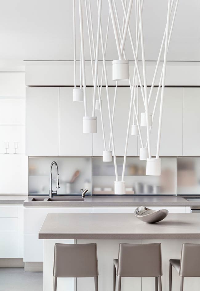
‘As the kitchen is part of the overall open living plan’ Susan Knof explained, ‘it was essential for it to be both aesthetically-pleasing and functional and the chosen solution therefore allows for clean living at the slide of a panel. Although the design sought to maximise light and views here, the client also wanted the adjoining children’s playroom to be private and so we included a glass light panel at the far left of the kitchen area, which seals off views into the space, but still allows for the flow of light.’
Adjacent to the kitchen is an open dining area with table seating for ten. A dramatic custom sculptural lighting piece (called ‘Match’) above the table, by Vibia, adds subtle drama to the space and allows for spot lighting across the full dining surface. Alongside the main dining table is a white piano, which was purchased by the mother of the family both for her own use and for the lessons for the children for their lessons. The entrance walls run alongside, containing not only the concealed air handling units, but also featuring large-scale mirrors to reflect the natural landscape so that the views and light can be enjoyed in no matter where on is sitting. Two elegant and Japanese-influenced Miyabi console tables sit below the mirrors and are from Interius arredamenti.
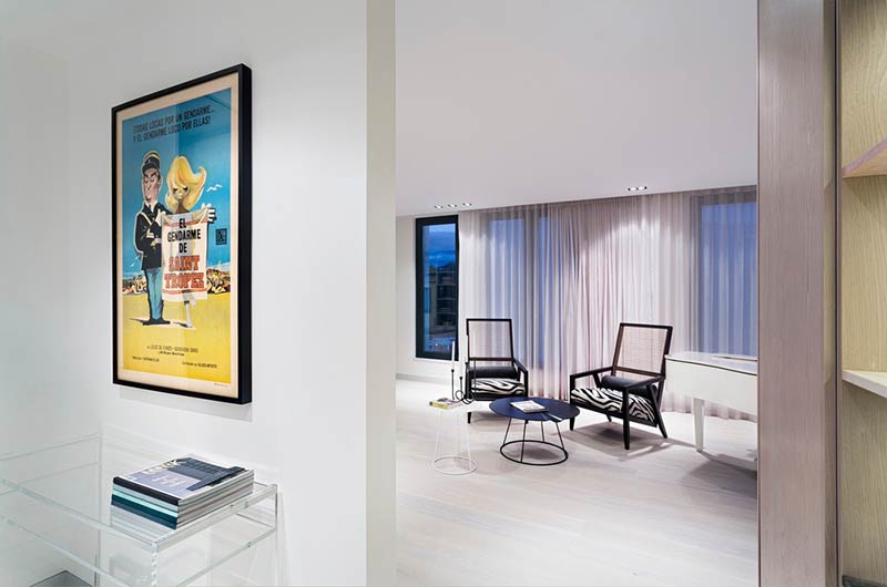
Next to the piano comes a flexible seating area comprised of two, contemporary, wenge-stained oak open-backed chairs with custom zebra print fabric from Dedar and two incidental tables - a black and a white Skandium ripple table – which add contrast to the overall soft, grey-toned environment. The main living area has two custom upholstered B + B Italia sofas with a dark grey velvet accent piping detail. The seating area is grounded with two large-scale tables with integrated ottomans in custom metallic embossed leather by Moore and Giles. A three-dimensional custom lighting configuration directly above (the Link light, again by Vibia) provides a sculptural element, giving soft diffused light to the overall area, whilst custom cushions by KNOF design (using fabric by Weitzner) add colour and texture. The television and apartment’s state-of-the-art audio-visual system are integrated into the bespoke, full-height joinery (by KNOF design) in a subtle reuse of the dyed grey veneer. Soft voile ‘Meander’ curtaining by Weitzner is located along the full perimeter to add a soft elegant effect and diffused light.
Located off of the main living area are the master bedroom and study spaces. The circulation area leading to the master suite is a continuation of the natural dyed grey timber veneered panels with storage behind. An existing overhead structural beam is received by an open shelving detail incorporating varying toned dyed natural veneers in natural dyed pink, bird’s eye maple, grey walnut, eucalyptus and natural Tay (koto).
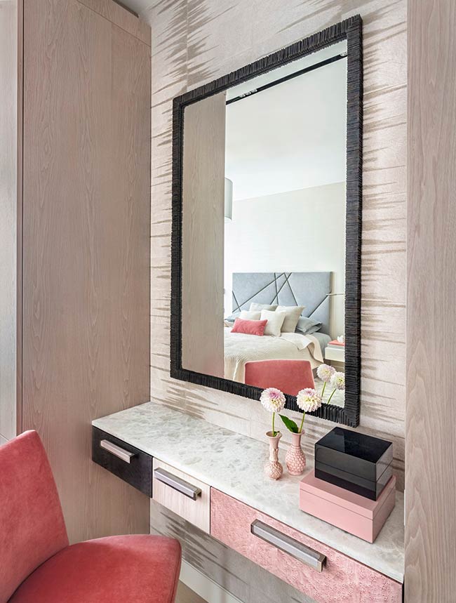
In the master bedroom, the fabrics and finishes continue in the same soothing grey and natural cream tones with soft textural details and an added bright coral accent. An exquisite fully-bespoke vanity, wardrobe, and media unit is the highlight of the space. The existing core walls came into play here and so it was important for the joinery to work around and with this given constraint. The bespoke-designed unit by KNOF design features a built in vanity with a white quartzite work surface and small, individually-sized storage drawers in varying toned dyed veneers, all with brushed satin stainless handles with grey leather inlay by Holland and Sherry. The backdrop to the vanity is a carefully-laid, textural, ikat-printed wall covering with a large scale, centrally-placed, bronze-embossed framed mirror by Porta Romana. A bright plush velvet coral chair offsets the soft tones.
‘A very important aspect of this scheme’, Susan Knof explained, ‘was using materials in such a way as to allow for individuality whilst still adhering to the client’s budget. I always seek to make use of every available space and have beautifully-integrated furniture with a real attention to detail. It’s what really makes the difference. The small intimate spaces that get used on a daily basis do not go unnoticed. It’s my intention to make the user feel special every time the apartment is in use.’
Another notable detail in the master bedroom is the custom-designed, fully-upholstered soft grey nova suede headboard by KNOF design with an abstract, criss-cross, deep nailing pattern, picking up on the crossed legs of the Poliform white, matte-lacquered side tables. Full-length, flowing voiles and curtaining by Weitzner provides the expected level of luxury, with an overall feel of understated sophistication.
The shared open master walk-in wardrobe is located off the master bedroom and provides direct access to the individual his-and-hers ensuites. It is a subtle, elegant space with open wardrobes anchored by a centrally-located pendant light with a bespoke joinery unit below. The small storage joinery unit is made of a white satin matte lacquer finish with inlaid leather top and brushed satin stainless handles, again by Holland and Sherry. ‘His’ master ensuite is fully-tiled in custom-cut, small, rectilinear natural limestone tiles. A surface-mounted basin rests on top of a custom vanity with a honed quartzite top, a dyed timber drawer front and open stone shelf below. ‘Her’ ensuite is a glamorous space with all walls clad in a soft pink rosa egeo marble with bright white Thassos marble stone flooring. Inset opal white marble stone shelves provide some open towel and display storage, whilst a large-scale bowl shaped basin sits on a white quilted front lacquered vanity.
Joinery in the study is by Molteni and C and is crisp and contemporary with a full height charcoal glass sliding wardrobe door. There is a combination of open and closed storage, along with an open TV and an integrated desk, which can be easily closed off. The dark joinery is offset by an exquisite two-tone textured wall covering in a mid-toned grey finish. The ensuite has a newly-integrated, full-height, acid-etched glass fixed panel, allowing passive light into the internal space. All ensuite walls are clad in metallic copper penny round mosaics by Ann Sacks with a custom white carrera marble vanity with a mitered drawer front and dark grey timber veneer shelf below. As in the main reception room, the nature of this space is multifunctional, aligned with the client’s wishes.
On the alternate side of the plan sit the guest toilet and children’s rooms. The guest toilet is neatly tucked into the circulation and continues the soft grey cream and soft pink colour palette. Sleek Boffi tapware adds to the clean modern layout. The main wall is fully clad in a subtle patchwork of varying tonal porcelain patterned tiles by Patricia Urquiola. A textured round bronzed mirror and decorative branch shaped wall sconce add to the gently organic feel of the room.
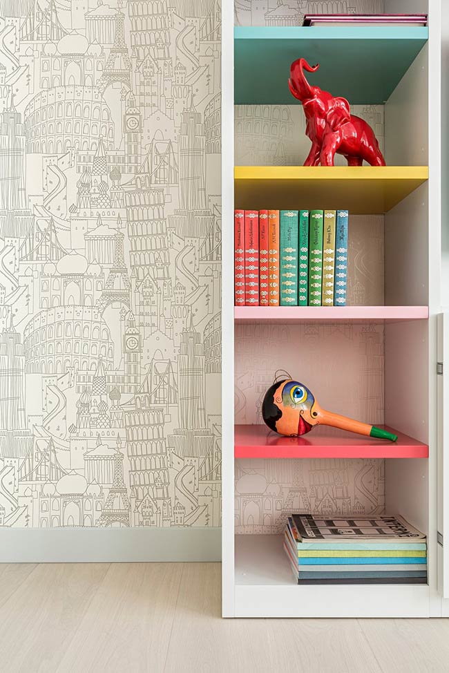
The two children’s rooms offer bright, colourful, and youthful interiors with a variety of specialty details allowing for creative and individual spaces. The bedroom along the south façade uses a medley of greens, yellows, and purple tones with small-scale patterning.
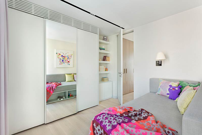
The other bedroom and ensuite feature soft pinks and peaches with a pearlised floral wall covering and built-in joinery. The ensuite here is a brightly-coloured and well-lit space with full-height walls covered in glass mosaics that transition from dark to soft pink in a gradient manner. Like its sister bathroom, it features a custom vanity mirror which is playful, painterly and back-etched.
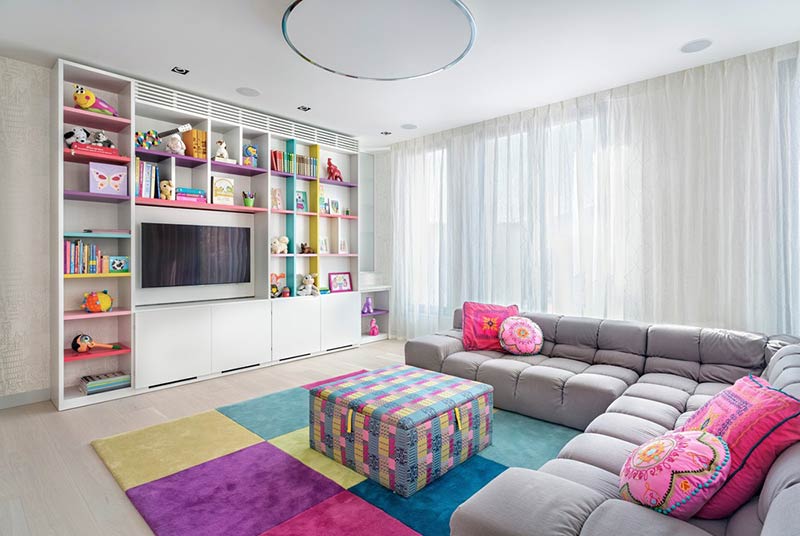
The children’s TV lounge area is located in the southwest corner with a custom, full-height media and storage unit by Molteni and C. At the end of the unit is an integrated, acid-etched glass panel, which connects back to the adjacent kitchen. A soft grey corner ‘tufty time’ sofa by B + B Italia rests on a brightly coloured custom-designed wool rug by KNOF design, which adds to the relaxed and playful vibe.
Project Details:
Location: Sofia, Bulgaria
Design: KNOF design - Susan Knof
Photographs: Assen Emilov
comments