
Text description provided by the architects
This beautiful 1920's Melbourne home had been renovated in the 70's & after years of being a family holiday home in the Dandenong Ranges, was bought by a new family with young children as their family home. It had great bones but was tired & worn out after almost 40 years of use. It needed cosmetic love to bring back its former glory. It needed better lighting, some key furniture pieces & better & stronger colours to offset the interiors in their lush green garden setting.
Drawing Room Architecture started by adding a palette of warm, earthy & energising new paint colours to every room. Furniture fit for an active young family was added & custom new joinery was built to add storage & new play spaces for the children.
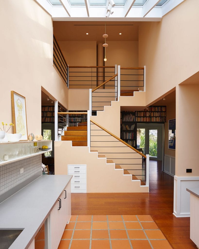
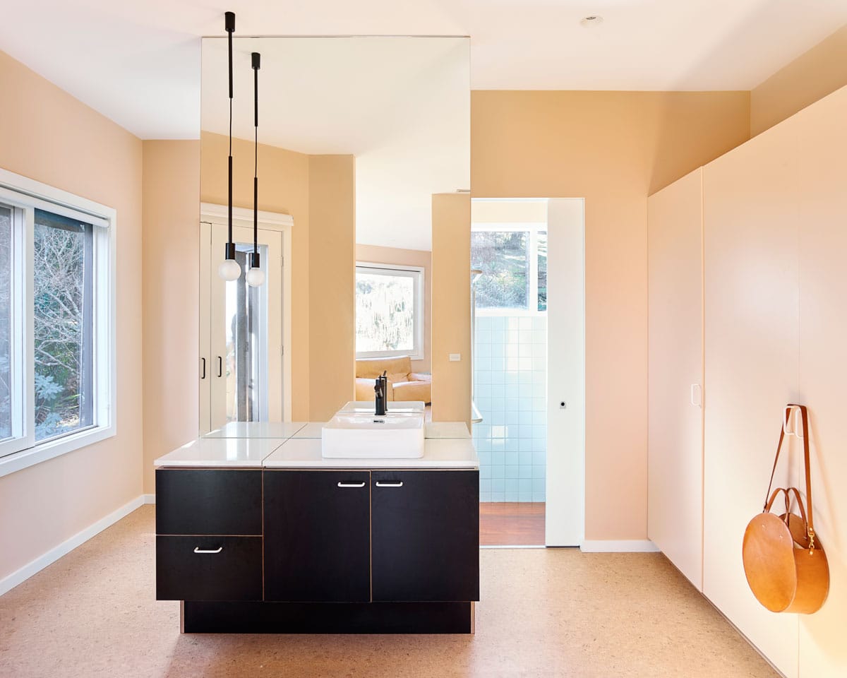
The existing windows were large & plentiful giving an ample amount of natural daylight however considered internal & external lighting was needed to balance the scale of the rooms with the tasks of the occupants. New cork floorboards soften & add texture to the bedroom floors & are robust & durable when play, pets & kids are abundant.
What were the solutions?
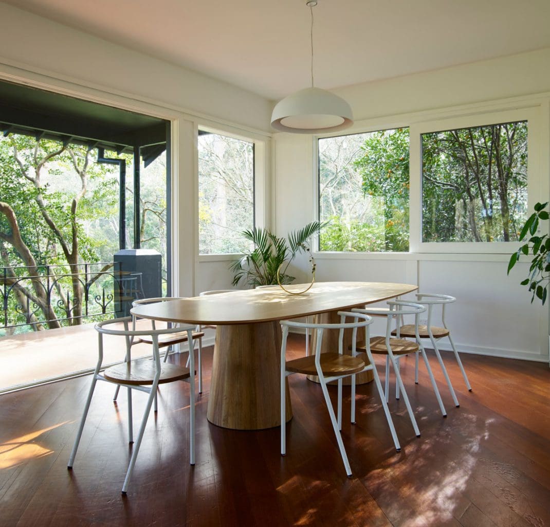
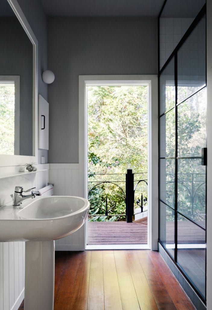
Draw on its incredible garden setting. Its long & arresting views & dramatic natural daylight. Strip all the details back to basics; all skirting, cornices, architraves, stair trims, windows trims & door frames where painted white. This bought more light in & as the daylights shadows play on the details throughout the day, a cohesive story of history is bought subtly to attention.
Give each room its own character; a warm, playful, rich colour with the overall effect being one of vibrancy & delight.

Considering where & how the occupants would use the spaces, we used light fixtures to set up settings & highlight a contemporary update throughout.
One of the existing bedrooms was so big, it could easily be the bedroom for both children. A custom shelving unit became a screen as well as a series of shelves, nooks & desk spaces.
What was the brief?
Bring a worn & tired house that had good bones back to its form glory. Give the house a new beginning for its new occupants. Turn it from a dark cluttered house to a light inviting home.
What were the key challenges?
Initially it was full of years of clutter, lighting fixtures that had no cohesive style or finish, DIY tweaks that held meaning to the former occupants but sat awkwardly alongside decades of changes & updates that overwhelmed the interiors & made them look smaller & darker than they in fact were. There were traditional Arts & Crafts details alongside late 7identityful memphis inspired details. It's central identify was confusing, it was a house that held many stories but they were muffled & haphazardly layered one over another. We needed to pick these pieces apart & put them back together in harmony.


comments